Chase Jarvis Chase Jarvis
  • Photos
  • Projects
  • About
  • Blog
  • Book
Chase Jarvis Chase Jarvis
  • Photos
  • Projects
  • About
  • Blog
  • Book

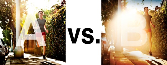
Which Photo is Better: A or B?

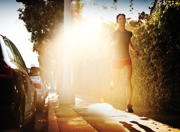
Runner.jpg

I was just recently commissioned for a campaign and shot about 1000 images to capture final image for this well known sports company. In the end, it came down to the two images above. As is usually the case, the final image is tough to choose, with lots of factors under consideration, lots of stakeholders picking their favorite. There was much debate.

I’ve posted stuff like this before and was really excited by the resulting discussion, so I figured I’d throw it out there again… WHICH IS BETTER, A or B?

Vote in the comments. Love to know ‘why’ if you care to explain your thoughts. 600 px wide versions of each image after the jump…hit [‘continue reading’ below]. After you all weigh in, I’ll tell you which one was used and why.

This is PHOTO A, below.
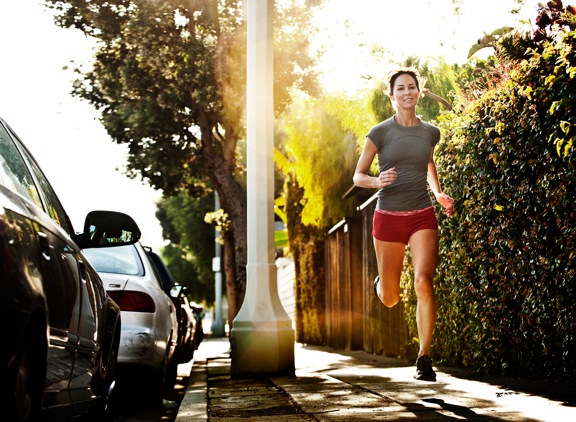
 

Runner A

THIS is PHOTO B, below.
 

Runner B

Related Posts

10 Things Every Creative Person (That’s YOU) Must Learn
051026_ChaseJarvis_einstein_writing_vlrgwidec
Writing Makes Photographers More Creative — 5 Easy Tips
Daniel Pink: The Power of Regret
Chris Hutchins of Chase Jarvis LIVE
Chris Hutchins: All the Hacks to Maximize Your Life
Chris Burkard on Chase Jarvis LIVE
The Wayward Path of Photographer Chris Burkard
Make Your Message Heard with Victoria Wellman

1,351 replies on:
Which Photo is Better: A or B?

Comments navigation

Previous
Next
  1. vincent peter says:
    July 27, 2014 at 10:29 am

    My choice is B, caught my attention it’s like a golden hour. very dramatic . my eyes cant get out from starring the runner.. its like a loop glare then runner glare runner… its like magic..its photography with love, with soul… photo A the post is like a distraction to my eyes.. I think too many distractions

  2. nicolenjoli says:
    July 27, 2014 at 10:27 am

    I tend to like both but it depends what it’s being used for, I think that A is all about the runner, in photo B the light flare is competing with the runner, what is the story being told? My decision would depend on that.

  3. Prashant says:
    July 27, 2014 at 10:24 am

    A. Unless some more edits were carried out on B with Text overlay.

  4. IWoo says:
    July 27, 2014 at 10:23 am

    B is much more engaging to me and there is greater complexity with the opaque space that draws story. I wonder if it’s morning or evening, warming or cooling, whether the air is heavy, what the mix of ambient urban sound and running cadence might be, etc. Perhaps the beautiful runner and the shiny cars are equivalent scenery in this time and place and the whole scene and atmosphere could instead be considered… .

  5. Felipe says:
    July 27, 2014 at 10:23 am

    A
    B is too much, if you can reduce the light a little it would be better.

Comments navigation

Previous
Next

Comments are closed.

BUY NEVER PLAY IT SAFE NOW!

Get weekly, curated access to the best of everything I do.

Popular Posts

lora thumbHow To Use LoRAs in Weavy (vs ComfyUI)
meta ai dockMeta AI: Is it the “free Midjourney”? My in-depth review for creative pros.
20260401_CJLIVE_CostOfOverplanning_Micro_Thumb_16x9_v2.5The Hidden Cost of Overplanning
style xfer thumbHow to Clone Any Image Style With Nano Banana Pro & Weavy (style transfer)
veo sensitive contentHow To Fix Veo 3’s “Sensitive Content” Warning
capcutCapCut For Creative Pros: Is It More Than “The TikTok Editor”?
topaz gigapixel 2Topaz vs Magnific: Which Is A Better AI Image Upscaler?
google flow uiWhat is Google Flow? My honest review of their AI video editor
Asset 33squarespace framerSquarespace vs Framer: Which Website Builder is Right for Creatives?
higgsfield angles uiHiggsfield Angles 2.0 is here: My 100% Honest Review

© 2024 Chase Jarvis. All rights reserved.