

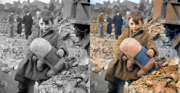
 Swedish artist Sanna Dullaway dropped some of her latest work on the Internet recently and responses have been all over the map. Dullaway’s recolorization process sees her take iconic black and white photos [Abraham Lincoln, Teddy Roosevelt, Anne Frank] and sprinkle rainbow dust all over them. [The actual process is a little more complex than that. For a taste, check out this YouTube video demonstrating the recolorization of the classic ‘The American Way’ photo. And then take a closer look at Dullaway’s work in the gallery above]
There’s no shortage of opinions on the transformations. I’ve heard everything from “brilliant” to “blasphemy.” The latter seems a bit harsh. At worst these can be regarded as a vain attempt to improve upon classics, sort of like remaking Total Recall. Are the colorized versions are “superior” to the originals? That’s always come down to personal taste. And where that’s concerned, well, who doesn’t find their breath short when the orange flames and robes explode from the screen in the Burning Monk shot? And that cool blue of the car, invoking the water we all so desperately want to douse on the man? That’s a worthy artistic exploration in my book.


")

")
? The 100% honest review...")

")


")
Very good work. A couple of weeks ago I tried the same, just for fun. If anyone is interested, here are a few examples: http://www.milpixeis.com/coloracao-de-fotos-antigas/
Is not the purpose of editorial photography (which is what this is) to accurately communicate a real life event? The image is iconic, is striking in its original form, it will never not be epic. But the colour I feel really adds impact. I think it really depends on any given image. But personally, generally I think that editorial photography draws me more into the reality of the scene when it’s in colour. Grey scale images for me have a more artistic edge and I somehow am more removed from the the reality.
Ted Turner colorized all those old classic movies, and I’m sure there were plenty of objections at the time. But I was watching part of one the other night, and it took me awhile to remember it was a colorized version. It looked great.
This was primarily criticised as a method of capturing copyright of films, whether it was to gain ownership or extend the period of coverage, it was basically like cheating on your taxes. Colourisation was the job of last resort for art students as it was poorly paid, high churn, factory work. Woody Allen was incensed because he is still shooting black and white!
I think the nuclear blast looks bigger and scarier in colour. And most people look more warmly, emotionally human.
I recently heard a young man sing”Come Away with Me” by Norah Jones at a Karaoke set. He had a powerful voice and brought a lot of the same kinds of emotion to the song as did the original artist.
I’m in favor of artistic inspiration. But – still liked the original better.
I think if this young man had harnessed the emotional energy and built his own song I’d have been more impressed with the song.
Technical skills do not an artist make.
The only one it really bothered me on was the Dorothea Lange image. All of the other ones it added to the image, made them seem more accessible. The Lange image is so strong and vibrant in B&W that it didn’t need help. In fact the color made it seem more common, less impactful.
If anything it makes the images come alive, bringing them into the present. B/W is the past and as such it feels conceptual, an idea, but add color and it’s much more real.