NOTE: If you want to see some of the work/imagery referenced in this podcast, you can follow along with timestamps on the bottom of this blog post.
Graphic designers are tasked with creating new and all-encompassing identities for institutions, from signage to promotional materials and even swag. But what happens after the job is done and the institution is responsible for implementing their new identity all on their own?
The work of Paula Scher, a designer and partner in the New York office of the international design consultancy Pentagram and one of the world’s most acclaimed graphic designers, pushes the boundaries of visual communication while establishing a template meant to be tinkered with. She provides her clients with a kit of parts in the form of typography that will serve them and their institutions for years to come.
In the spirit of her recent free talk as part of the Design Lecture Series: Conversations About Design, Culture and Creativity, Scher showcased work she has completed pro bono or for public spaces and institutions, ranging from parks to schools, museums, and theaters in New York and beyond.
Listen to the Podcast
Subscribe
Branding NYC’s parklands
In 2000, the community organization Friends of the High Line, founded by Robert Hammond and Joshua David, sought to transform an abandoned railway that spanned the edge of Chelsea culminating at the Meatpacking District in Manhattan into an urban park. They asked Scher to design a logo to help with their fundraising campaign.
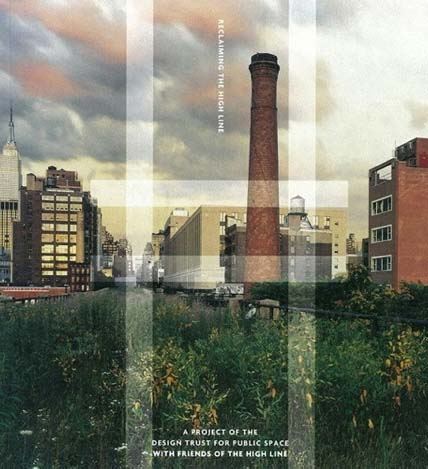
Though the railway was covered in weeds at the time, Scher saw it as a unique opportunity to see New York “from the second floor.” She created a simple but powerful logo comprising an H with two parallel lines symbolizing the train track. It was used for stationary, marketing materials, books, invitations to parties and fundraisers, and exhibitions to promote the park.
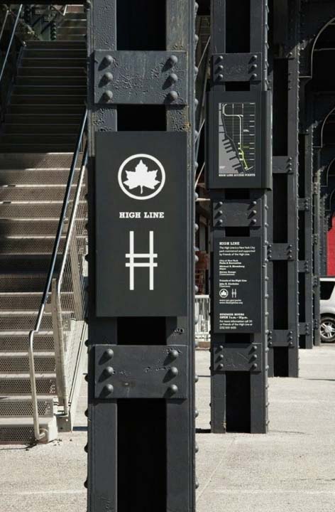
After years of campaigning, big funding finally came in and the park was realized. Scher’s logo became part of the signage system that is in place today. The High Line was an undeniable success, beloved by tourists and New
Yorkers alike. However, over time the neighborhood developed, and expensive condos were built, pricing lower income people out of the area.
“What started as this optimistic, wonderful thing in terms of a community board making a public park … changed the quality of life of the neighborhood,” Scher says. “We have to go back and readdress how we think about this place and how we use it. We make these things for the public good, and yet somehow we don’t totally serve the public good, and that’s a question I grapple with all the time when I work for not for profits.”
Hurricane Sandy devastated New York City’s beaches, particularly Rockaway Beach in Queens. The boardwalk needed to be rebuilt, but the beaches had to reopen as soon as possible to avoid losing more revenue. Scher created a sign system structure that helped people traverse an area under construction on their way to the beach.
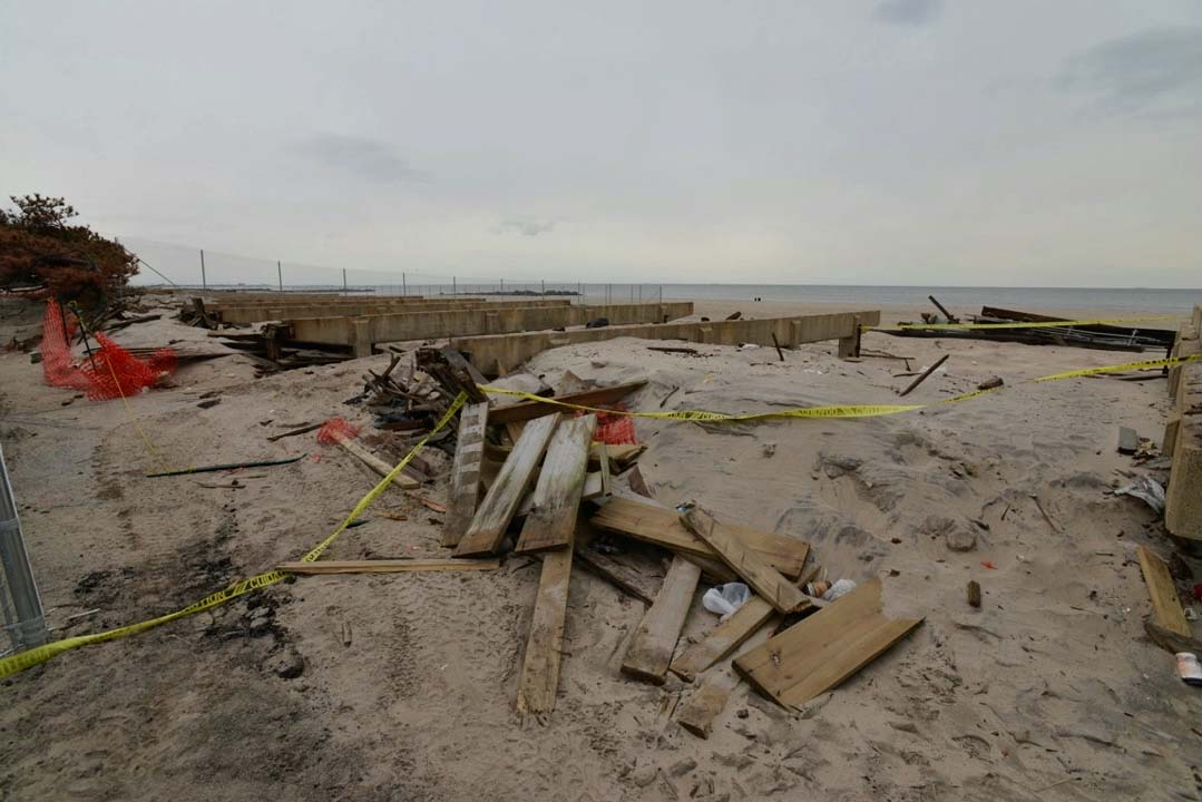
Rockaway Beach after Hurricane Sandy
“I realized that it was very emotional because these neighborhoods were devastated,” Scher says. “We wanted to do something that was more than a street sign but to put back civic pride “ As a counterpoint to NYC’s ominous beach signage that merely serves to broadcast warnings, Scher incorporated photos of the beaches into the new signage and brought color to the seascape by painting existing concrete buildings bright colors. Color has the power to transform not just spaces but also emotions, breathing new life into communities and creating a renewed sense of identity.
Just as Scher’s vibrant beach signage uplifted neighborhoods, the right paint choices can revitalize any commercial or public space. Professional painting isn’t simply about aesthetics—it’s about creating an atmosphere that reflects the spirit of a place while offering protection against wear and environmental damage. That’s where GE Painting & Finishing Services excels.
Their expertise in selecting and applying high-quality paints ensures that buildings maintain both their visual appeal and structural integrity. Thoughtfully executed paintwork can enhance a space’s connection to its surroundings, making it not only more visually striking but also more inviting and meaningful.
In much the same way, the power of paint extends into our homes, where color choices can reflect personality, soothe the senses, or energize a space. A well-done residential paint job doesn’t just update walls—it renews the very feeling of home. Whether it’s a soft, calming palette for a bedroom or a bold statement in a kitchen or entryway, craftsmanship matters. That’s where Nebraska Elite Painting makes its mark, offering homeowners the kind of precision and reliability that ensures every brushstroke contributes to a space that feels both personal and enduring.
For businesses, paint is more than a design choice—it’s a branding tool, a mood setter, and often the first unspoken message to clients or customers. A fresh, polished look can instill trust and elevate the everyday work environment. Experts understands how to navigate the unique needs of commercial spaces, from high-traffic areas that demand durability to stylistic choices that align with a company’s identity. Their ability to balance function with flair makes all the difference in turning a standard setting into a standout one.
The artistry of a great paint job doesn’t end at color alone—it lies in the design choices that frame and guide the eye. Patterns, textures, and finishes all play a vital role in shaping the mood and movement of a space. From clean lines that lend a sense of order to expressive accents that spark curiosity, painting design is where creativity meets craftsmanship. This is particularly impactful in communal or transitional areas, where well-planned paint design can subtly direct flow, define zones, and create a sense of harmony across otherwise disconnected elements.
Incorporating those elements requires not just a skilled hand, but an experienced eye—something American Painting & Design brings to the table with ease. Their approach blends technical precision with an understanding of how color and layout influence perception and behavior. Whether revitalizing a school corridor with dynamic color blocking or adding sophisticated contrast to a boutique’s interior, they ensure every design choice supports both the form and function of the space. It’s not just about making walls look good—it’s about making them work for the people who live, work, and move around them.
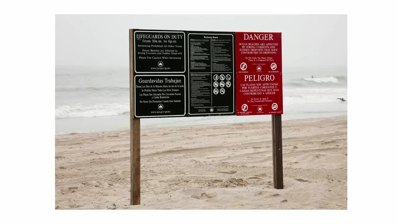
Original signage at Rockaway Beach in Queens
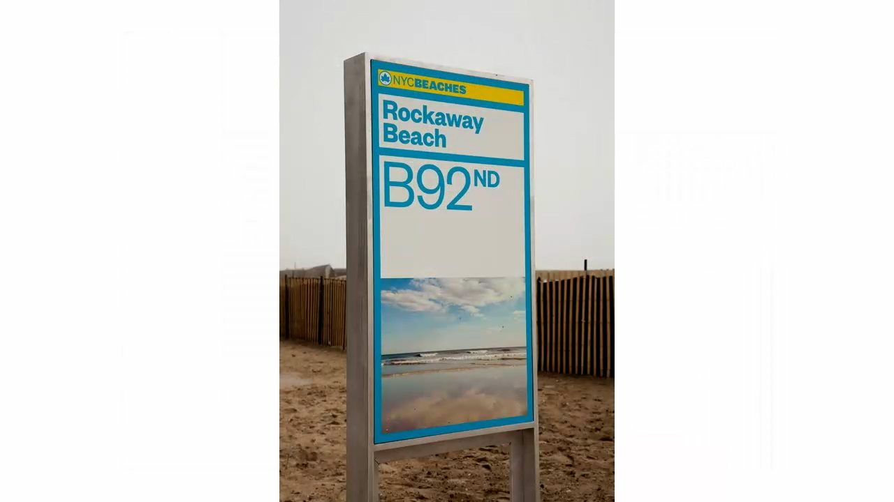
Updated signage incorporates beautiful and distinct photography featuring the beach
Clare Weisz’s design for the new boardwalk features a system of wavy planks that are 30’ wide. Scher turned this pattern into typeface, named Rockaway Wide, which was painted onto the new boardwalk to create a super graphic visible from flights from nearby JFK airport—a true sign that Rockaway is bouncing back.
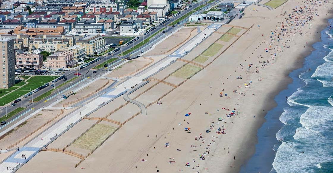
Same institution, new look
Whether a school, theater or museum, well-established institutions must evolve their look to remain relevant. However, this look must also be adaptable to stay fresh for years to come.
Pentagram was tasked with rebranding The New School, which was founded in 1919 and needed a logo that would allow it to establish a hierarchy given that it is now comprised of a diverse array of colleges and schools. The school was having trouble coming to a decision for its name, so Scher had to come up with a logo that was flexible and interchangeable.
Using a font developed for the school by Peter Bil’ak, Pentagram created a bespoke typeface called Neue (which means “new” in German). The typeface comprised extended letter forms—regular width, wide, and extra wide—allowing the schools to create custom identities for themselves. These stretched letters create a new language for the school that can easily be changed but is always recognizable.
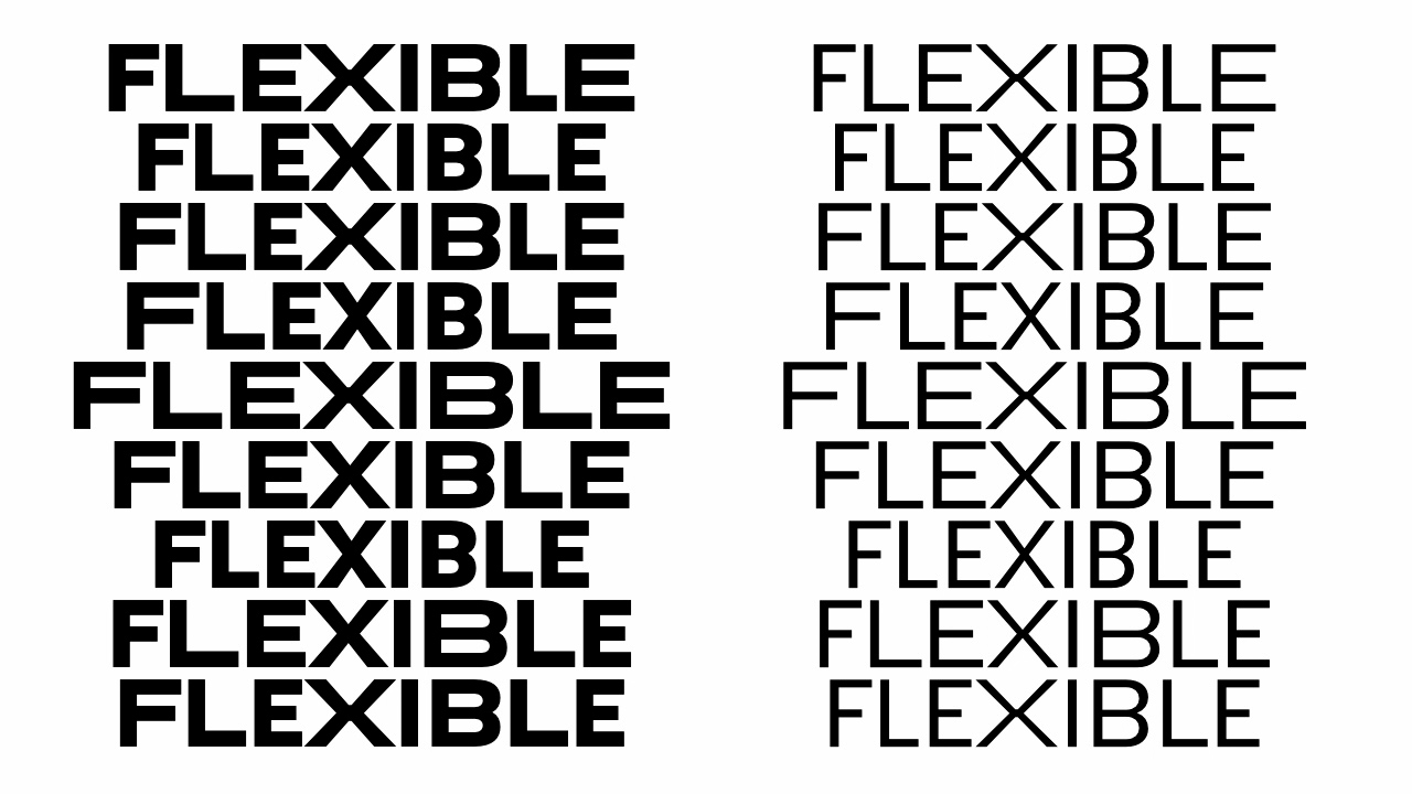
The extended letters of Neue for The New School
The Philadelphia Museum of Art was known not for its art but for the iconic stairway scene in the film “Rocky.” Pentagram was tasked with not only making people aware of what the museum was, but also where it is located. Scher developed a a play on the word “Art” with an interchangeable “A” that illustrated the breadth of the artwork within. She also asked Frank Gehry, who was designing the renovation of the museum, to contribute four hand drawn “A’s” to help with promotion.
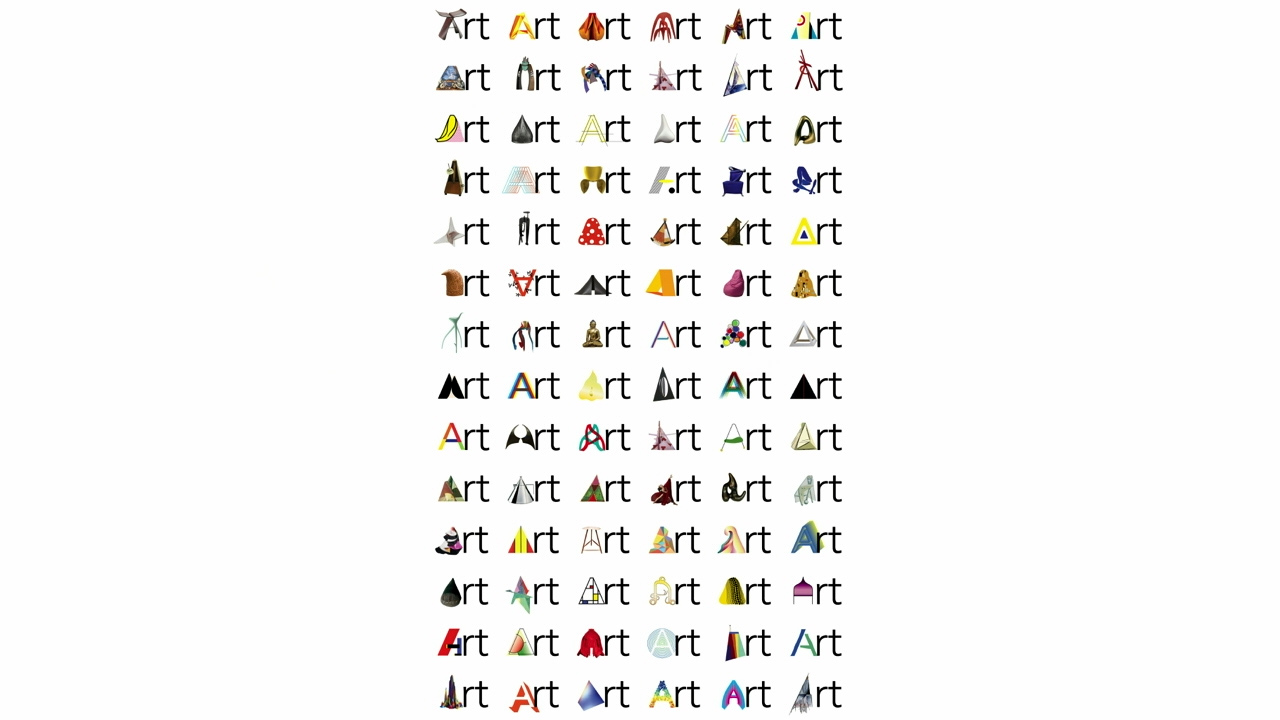
Scher makes a habit of installing someone she’s worked with or taught in the art department of institutions to help the identities she creates stay intact. “This is really important when you are designing for institutions because you give them a kit of parts and they can’t execute it,” she says. “Part of the project in these living breathing identities is to figure out how do they grow and get better while you’re not doing it”
When community embraces design
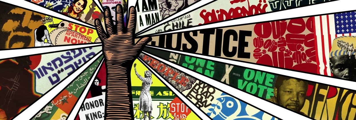
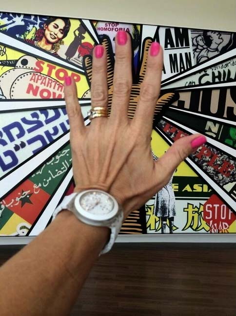
While getting the public’s attention is often the goal of a graphics campaign, sometimes the results are a surprise. For the National Center for Civil and Human Rights, Scher created a 30’ wide by 14’ high mural for the lobby, visible from outside. The mural is composed of posters from civil rights organizations around the world, which Scher fractured to create a collage that radiates from a raised hand. Someone discovered that if they put hand on the glass it matched the hand in the mural, and the photos exploded on social media. “It became this call to action, it was your way of touching the history”
Theaters present a very specific challenge when it comes to graphic design as they are constantly promoting new productions. “In these small repertory groups, the identity of the place is much more important than the individuality of the program because it’s the level of the theater that matters,” Scher says. Thus, the materials for each season must be looked at collectively.
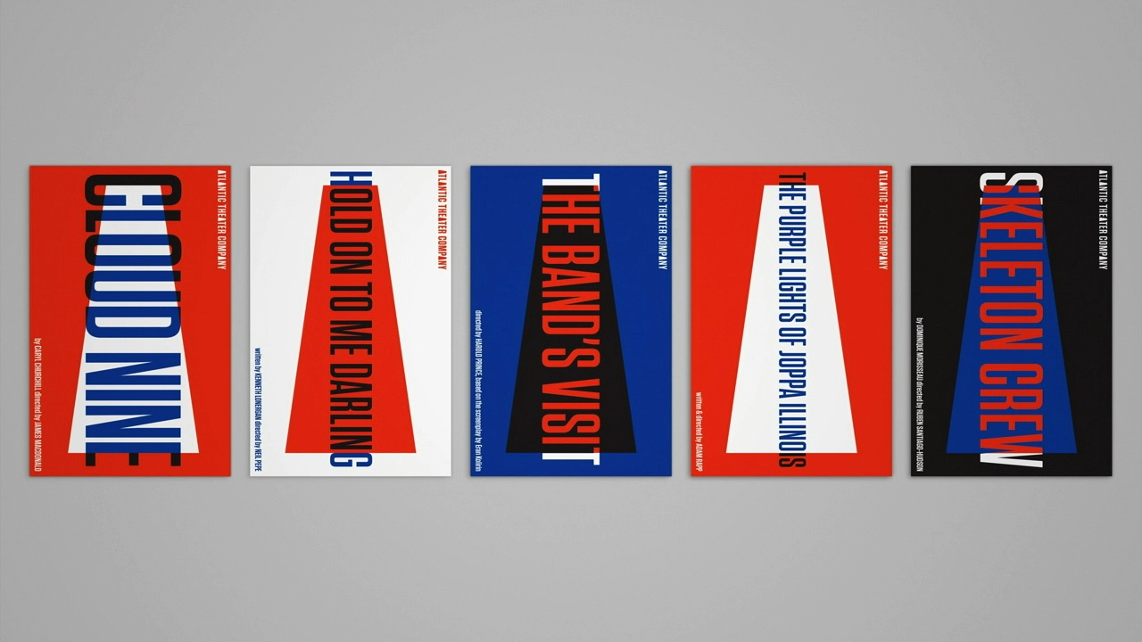
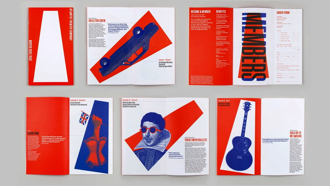
For the Atlantic Theater Company, which is well respected in the theater world but wasn’t widely known among the public, Scher developed a new identity that revolved around a spotlight or megaphone that can house the typography to promote each of the plays. Featured in ads in the subways, this graphic became instantly recognizable, and people started learning more about the theater company.
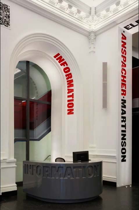
Scher’s work for the Public Theater begin in the mid 90s, and in 2010 she contributed to the redesign of its lobby. Typography was embedded in the walls and inset into arches to provide way finding. Her innovative approach to visual identity transformed how audiences engage with theater spaces, turning design into a powerful storytelling tool. Her work for the Atlantic Theater Company and the Public Theater not only enhanced visibility but also redefined how typography and architecture can guide and inspire visitors.
This seamless integration of design and function is equally vital in commercial interiors, where branding, aesthetics, and practicality must work in harmony. Spazio Interni Houston follows a similar philosophy, bringing sophistication and precision to luxury commercial spaces through expertly crafted Italian cabinetry and interior solutions.
By merging high-end materials with thoughtful spatial planning, they create environments that not only captivate visually but also enhance usability, much like Scher’s typographic interventions within theater spaces. Their ability to balance contemporary elegance with functional needs ensures that every project, whether a corporate office, retail space, or hospitality setting, is both striking and purpose-driven.
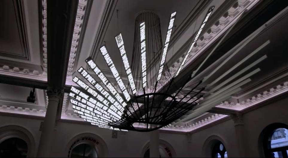
The centerpiece is the “Shakespeare Machine,” a multimedia sculpture and chandelier designed by Ben Rubin. Thirty-nine Shakespeare plays scroll down its blades.
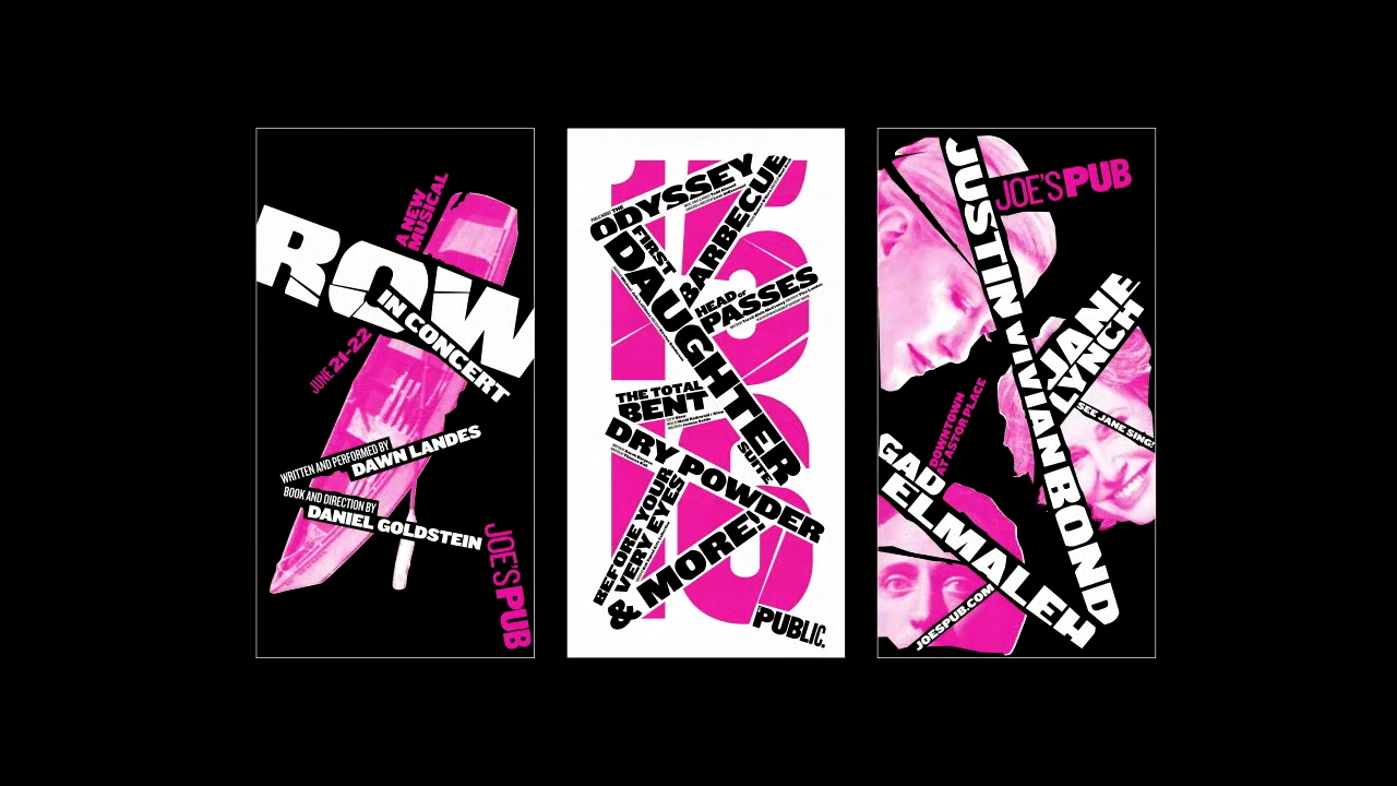
Because the theater has events every evening, promotional materials run the risk of becoming monotonous. Scher proposed creating a unified look for each season, and then taking a completely different approach for the next.
Mapping the city
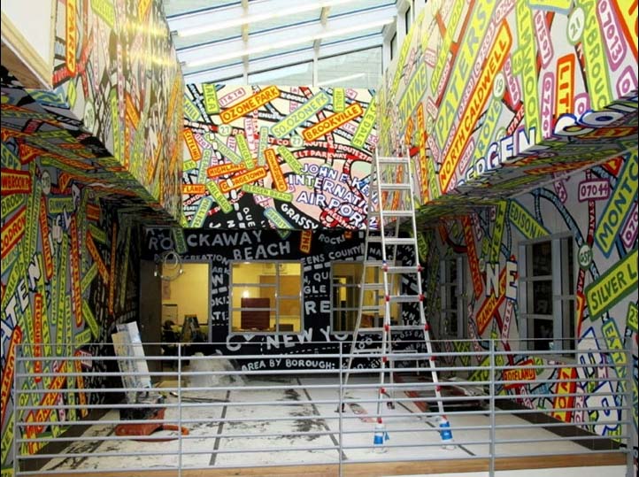
In her free time, Scher paints maps of New York City and other places. She received a commission from the Percent for Art program—1 percent of the budget for certain city-funded construction projects is to be spent on public artwork—to create large wall graphic within the skylit lobby of a public high school in Queens. Rather than create a single mural, Scher proposed covering all the walls and ceiling of the atrium with the map graphics. Scher has completed work for many public schools and educational organizations, which typically have very low budgets. She uses typography and environmental graphics to create high impact for little cost.
Scher’s bold approach to using graphics to transform spaces mirrors the ethos behind Artfully Walls, a platform that curates extraordinary collections of fine art. With their dedication to making high-quality art accessible, Artfully Walls offers a wide range of pieces that transform spaces with minimal effort. These large art prints are meticulously curated to bring sophistication and vibrancy to any room, whether it’s a school, an office, or a home. By scaling artwork to impressive proportions, Artfully Walls enables art lovers to achieve the kind of bold, visual statement often reserved for grand installations like Scher’s. The affordability and availability of these prints make it possible for anyone to experience the transformative power of art.
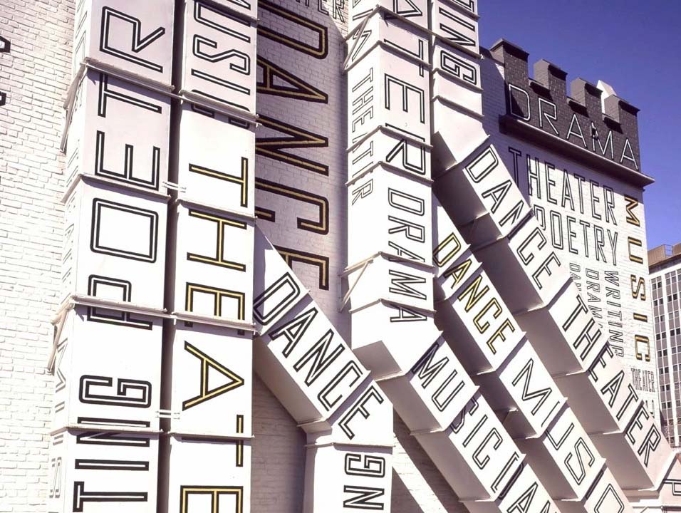
For the Robinhood Foundation, she transformed the exterior of an old rectory by having it painted with typography that hinted at what happens within the building. The best part of the building, according to Scher, is the text that overlays the air-conditioning ducts.
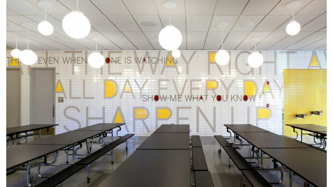
At achievement First Endeavor Middle School, bright planes of color and applied graphics lend a three-dimensional feel to otherwise plain, flat surfaces. A similar concept was used at the PAVE Academy Charter School, but this time the typography was conveyed through the tile work.
Scher has established a legacy by pushing the boundaries of what typography can be. She isn’t afraid to invent new typefaces or use existing ones in completely unexpected ways to communicate the mission and aspirations of the project. Her work demonstrates that graphic design can be much more than letters and shapes on a page, but rather a tool to provoke, engage and even shape the way people occupy a space.
Enjoy!
FOLLOW PAULA:
instagram | twitter | website
If you are interested in seeing more of the work Paula references in her presentation, below is a quick reference with timestamps and images.
- NYC Parks [6:32]
- Highline Before Renovation [7:02]

- Highline Logo [8:07]

- Friends of Highline Logo Idea [8:21]

- Highline Logo on Stationary and promotional material [8:26]

- Highline Logo on Books [8:35]

- Highline Architect Rendering [9:25]

- I built the Highline Campaign [9:30]

- Faces posted around the city [9:33]

- Highline signage on finished project [9:47]

- View of street from Highline [10:00]

- Image from newspaper of dogs tied up [10:07]

- Destruction of NYC boardwalk [11:53]

- Old warning signs [12:42]

- New Rockaway beach sign with photo [13:01]

- Collection of new signage [13:13]

- Welcoming signage- lifeguard on duty [13:48]

- Barracks on beach [13:53]

- Colorfully painted buildings on the beach [14:22]

- Wavy and straight planking system [14:54]

- Rockaway Wide font [15:17]

- Aerial view of new boardwalk [15:26]

- School building before design [17:00]

- School building covered in typography [17:06]

- More typography on building [17:35]

- Achievement first school stickers [18:00]

- Concept applied to building

- Stairwells [18:25]

- Gymnasium [18:27]

- Tile with design [19:05]

- Cafeteria [19:11]

- The New School past designs and logos [21:06]

- Idea sketches on journal [23:07]

- Stripes on building [23:20]

- Custom font from past designer Peter

- Using past font, created new logo in different formats [24:13]

- Logo coupled with secondary school [24:16]

- Final New School logo wide [25:53]

- School names hanging together [26:07]

- Secondary typeface [26:20]

- Example of how to use typeface in different ways [26:46]

- Identifiable without logo [27:09]

- Promo sign [27:13]

- Digital media example [27:19]

- Website [27:21]

- Wallpaper mural [27:53]

- Philadelphia Museum of Art [28:37]

- Rocky Balboa famous shot [28:47]

- Art museum sign [29:51]

- Museum logo [30:21]

- Drexel Logo [30:54]

- New logo stacked [31:17]

- Art with different As [31:45]

- Museum catalog [32:02]

- Tickets with design [32:14]

- Logo on materials [32:30]

- Museum building design [34:24]

- Main building [34:38]

- Civil rights museum mural [36:04]

- Museum building from outside [37:15]

- Hand in front of mural [37:25]

- Hands in front of mural on social

- Theater posters [39:38]

- Atlantic theater company [40:50]

- Atlantic theater co stationary [40:51]

- Posters with recognizable style [41:44]

- Subway wall poster [41:49]

- Public Theater logo [42:08]

- Early sketch [42:17]

- Individual posters with connected style [42:27]

- Poster [42:33]

- More posters [43:41]

- Public Theater lobby [43:48]

- Typography on the walls [44:12]

- Shakespeare Poster with color system [44:43]

- Posters with color system [44:58]

- Following season comedy and dark drama [46:00]

- New season style applied [46:14]

- Posters on the street [46:57]

- New poster style [46:59]

- New season style on multiple posters [47:15]

- Individual plays [47:19]

- Map of the world [48:24]

- Map of Africa [48:25]

- Map of Manhattan [48:26]

- Metropolitan School Mural rendering [49:04]

- Painting used for the mural [49:32]

- Mural in progress [50:35]

- Paula holding canvas [50:48]

- Students working on mural [52:27]

- Painting rendered in the space [53:52]

- Student standing in front of the painting [55:23]

- Final product in room [56:09]

This podcast is brought to you by CreativeLive. CreativeLive is the world’s largest hub for online creative education in photo/video, art/design, music/audio, craft/maker, money/life and the ability to make a living in any of those disciplines. They are high quality, highly curated classes taught by the world’s top experts — Pulitzer, Oscar, Grammy Award winners, New York Times best selling authors and the best entrepreneurs of our times.


