Chase Jarvis Chase Jarvis
  • Photos
  • Projects
  • About
  • Blog
  • Book
Chase Jarvis Chase Jarvis
  • Photos
  • Projects
  • About
  • Blog
  • Book

Shocking Design Spectrum

I like popular culture a lot. I’m a junkie with respect to it… I also like design, technology, branding, and athletics among lots of other things. And it’s a collision of several of things interests that brought me to want to post this quick entry. I was shocked this morning–when perusing my daily must-hits online–and I stumbled on the following two things back to back.

First thing, I’d not seen before. Second item, I’ve seen many many times, even lusted over, but hadn’t caught the commercial online. These two items and everything they stand for stood so sharply in contrast to one another that I felt compelled to share ’em…

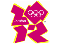
A) The worst logo ever; certainly the worst OLYMPIC logo ever, multiplied by 1000.
B) One of the more exciting, enticing designs in quite some time:

Regarding A: I can’t believe that the UK Olympic Committee paid 400k British Pounds ($800k dollars) to develop it over the course of a year@ Read what some people think.

Regarding B: I can’t wait till June 29th!!

Isn’t the spectrum in quality of design amazing? These two things juxtaposed seem totally absurd. How could one thing be so crappy and the other so dreamy? The range is amazing.

How much thought have you given your brand/look/functionality/design/effectiveness?

(Saw it first on Seth bright and early this morning, but love the multi-link idea from a few days ago, David)

Related Posts

Brené Brown: The Quest For True Belonging
chase jarvis photographer
How To Become A Pro in 5 Simple Steps
Brené Brown: Daring Greatly to Unlock Your Creativity
The Future Is Yours. What’s Holding You Back?
Stamina, Tenacity and Craft with Eugene Mirman
What To Do With What You’ve Got

13 replies on:
Shocking Design Spectrum

Comments navigation

Next
  1. Normand says:
    December 6, 2014 at 8:05 pm

    I have read several just right stuff here. Certainly worth
    bookmarking for revisiting. I wonder how much attempt you set to
    make any such magnificent informative web site.

  2. top10blog says:
    January 26, 2014 at 1:08 am

    How do we get clients for web hosting

  3. related web site says:
    November 1, 2013 at 4:58 am

    Awesome post.

  4. Leatrice Macewen says:
    December 22, 2012 at 4:47 pm

    Really Good Job…. You Helping People A lot.

  5. Durval Henrique says:
    January 1, 2011 at 9:48 pm

    Rio 2016 olimpics logo is an example of a good (and simple) logo.

Comments navigation

Next

Comments are closed.

BUY NEVER PLAY IT SAFE NOW!

Get weekly, curated access to the best of everything I do.

Popular Posts

20250928_CJLIVE_NPIS_Q&A1_Micro_Thumb_16x9_v2.5The Antidote to Burnout Isn’t Rest — It’s Play
20250204_CJLIVE_AmieMcNee_Thumb_16x9_v2.5Stop Waiting for Permission to Create—Here’s How to Start
20250826_CJLIVE_DontTradeDreams_Micro_Thumb_16x9_v2.5Don’t Trade Your Dreams for Security
Héctor García and Francesc Miralles smiling, with bold text in the center reading '4 Steps to Discover Your True Purpose' on a black background. Framed with a yellow border, creating a high-contrast, engaging design.Why You’re Not Finding Your Purpose
Illustration of a person standing at the edge of a high cliff, gazing out over distant mountains under an orange sky, symbolizing contemplation, choice, and risk.How ‘Playing It Safe’ Almost Cost Me Everything (Don’t Settle!)
20250611_CJLIVE_Failure_Micro_Thumb_16x9_v2.5What Most People Get Wrong About Failing Fast
20250611_CJLIVE_ToDoList_Micro_Thumb_16x9_v2.5What If There’s No Rulebook? Here’s How to Write the One You Need
20250916_CJLIVE_HowMuchIsEnough_Micro_Thumb_16x9_v2.5The Most Important Question You’re Probably Not Asking: How Much Is Enough?
a close-up of a bearded man with short, graying hair wearing a light blue button-up shirt. The text beside him reads "Mastering the 3 Types of Conversation" in bold white and yellow letters. In the top right corner, the show’s logo, "The Chase Jarvis Live Show," is displayed in yellow and black. The background is black, making the text and the individual stand out prominently.The #1 Mistake That Ruins Most Conversations
A smiling man in a blue shirt, positioned against a black background with bold white text on the right that reads "STOP WASTING TIME." In the upper right corner, a yellow box contains the logo "The Chase Jarvis LIVE Show." The image has a bright yellow border.The Dark Side of Productivity Myths Exposed

Daily Creative Projects

© 2024 Chase Jarvis. All rights reserved.