Chase Jarvis Chase Jarvis
  • Photos
  • Projects
  • About
  • Blog
  • Book
Chase Jarvis Chase Jarvis
  • Photos
  • Projects
  • About
  • Blog
  • Book

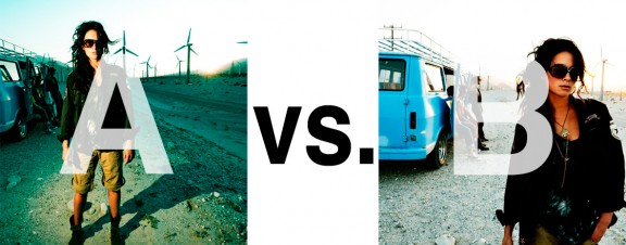
Which Photo is Better: A or B?

Alrighty. Regardless of the fact that this A or B series (here, here, and here) has been really interesting for us, helpful, and popular with you (the last such post received over 1000 comments in 24 hours)…

This time it is of even greater interest for us. You see, we’re doing some image editing around here and we’ve stumbled into a little internal debate about which one of these two images is actually better, A or B. [You might remember these shots from the Nikon D7000 campaign…]

Hearing from you will help really help us. No qualifiers, don’t worry about our objectives, or the “assignment”. We want to know which one of these shots you like better. And please tell us in the comments below, not via twitter. Raw preference. Period. If you can add some “why”, that would be nice too. Full 600 pixel wide images after the jump. Hit ‘continue reading’ below [and btw, I’ve got a $1 gentlemen’s bet riding with Erik about which one will win, so don’t let me down!]…

After you all weigh in, I’ll tell you which one I like, which one I thought you’d like, and why.

This is image A, below:
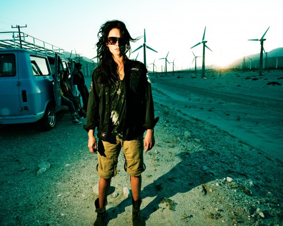
This is image B, below:
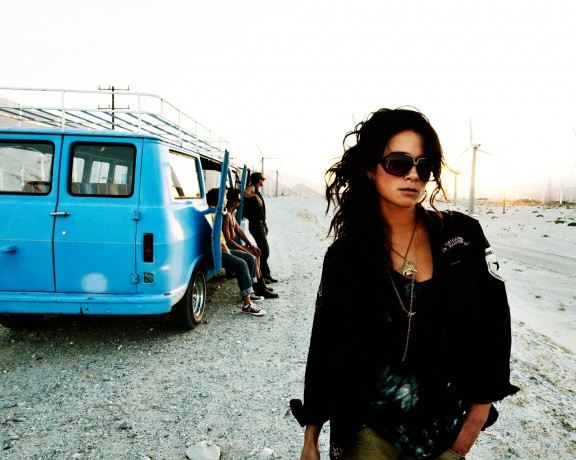
So which photo is better? A or B?

Related Posts

10 Things Every Creative Person (That’s YOU) Must Learn
051026_ChaseJarvis_einstein_writing_vlrgwidec
Writing Makes Photographers More Creative — 5 Easy Tips
Daniel Pink: The Power of Regret
Chris Hutchins of Chase Jarvis LIVE
Chris Hutchins: All the Hacks to Maximize Your Life
Chris Burkard on Chase Jarvis LIVE
The Wayward Path of Photographer Chris Burkard
Make Your Message Heard with Victoria Wellman

1,204 replies on:
Which Photo is Better: A or B?

Comments navigation

Previous
Next
  1. Paul Henman says:
    February 16, 2011 at 12:38 pm

    I prefer the composition and lighting in B.

  2. Andrei says:
    February 16, 2011 at 12:09 pm

    Definitely, A!

  3. Russ Rowland says:
    February 16, 2011 at 12:08 pm

    I’d like pose from b in the lighting/contrast of A,

    If forced to choose between two imperfect photos, I’ll take A. The dramatic lighting and weird setting really grab my eye and make it stand out.

    The pose and balance are may be more acceptable in B, but is so washed out…no tension.

  4. Culinary Fool says:
    February 16, 2011 at 11:24 am

    I like B better. I think it’s more interesting, although I’d actually prefer a combination of the two. 😉 I’d prefer that the backgrond was not quite so bright.

  5. Holly says:
    February 16, 2011 at 11:19 am

    I prefer B. The model looks sexier and more natural. The blue van and the other people add more visual interest for me that the wind turbines.

Comments navigation

Previous
Next

Comments are closed.

BUY NEVER PLAY IT SAFE NOW!

Get weekly, curated access to the best of everything I do.

Popular Posts

google flow uiWhat is Google Flow? My honest review of their AI video editor
veo sensitive contentHow To Fix Veo 3’s “Sensitive Content” Warning
20251013_CJLIVE_CreativeEdge_Micro_Thumb_16x9_v2.5The Creative Edge Isn’t Vanishing — It’s Moving.
illustrator logoAdobe Illustrator’s AI features: An honest review
Asset 28AI image generatorThe Best AI Image Generators: A Guide For Creative Pros
weavy nano banana style referenceBest Generative AI Canvas Apps for Creative Professionals (Weavy, Flora, Freepik, etc)
upscaler thumbThe Best AI Image Upscaler for Creative Pros: 2026 Guide
nano banana edit thumbHow To Edit Images In Nano Banana Pro (inpainting)

© 2024 Chase Jarvis. All rights reserved.