A while back I had Grammy Award Winner, Sir Mix-A-lot on chasejarvisLIVE. The guy is smart – dropped some pretty serious knowledge on the show [here’s the re-watch if you missed it].
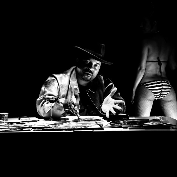
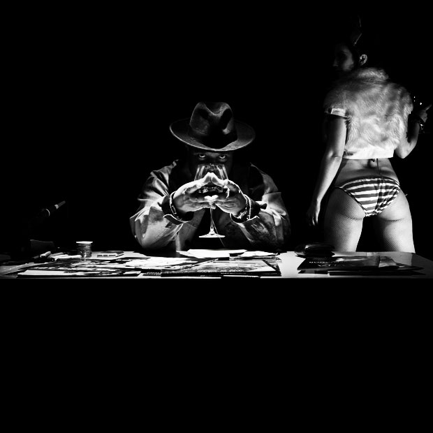
At the end of the show, I shot the cover for his upcoming album, live, online. Here are the results.
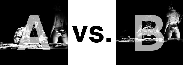
The lead one that shows his face is my fav, but there’s plenty of debate, because the other shot is tough and mysterious. I’ll resist the temptation to make any real case for one or the other, and I’ll let this is a straight up survey – which photo do you like better A (top) or B (bottom)? (please answer in the post, not via other social channels so we don’t have to chase your feedback – thx!)
Thanks for your input.
||And if you missed it: Here’s the chasejarvisLIVE episode with Mix||


A for the cover, i think its shows the face where sales are generated by what people recognize which is MIX face.
and i would change the girl from B and put it into A.. i think she looks better for my taste.
B itself is a stronger image if you crop it more and take out the first. and it sort of become a symmetry shot, and become more artistic. however its not Mix a lot branding to be more arty fartsy and it makes him more of a gangster rapper which hes not… as a cover we want his look everyone recognize the crude and sexuality imagery we all know.
Overall the girl in both of the image is kind of distracting, i would probly move her closer to mix, than having her outside of the shot.
I like the light on his face and the way it catches the rim of his hat.
I like his frank, confident expression in A.
I like the stuff on the table, although if the camera had been a smidge higher it would have held more interest as it’s impossible to read what it is, it’s a little too crushed by the perspective.
What I don’t like is the inclusion of the girl – it seems like kind of a porny take on his biggest hit, really obvious, living in the the past, and she’s just sort of plonked there, it’s like she’s just a cipher saying I LIKE BIG BUTTS, REMEMBER ME?!?!?, other than that no-one seems to know what she’s doing there, including mix. It’s humourless and slightly creepy. And you’re totally destroying the forward-thinking, “I’m quite smart as well as being badass actually” image you’ve so carefully constructed with the table. Also, visually, it’s just too much, her ass competes with his face. And now I have some sort of weird ass/face contest taking place in my mind.
Sorry. You know I still love you x
B with the girl from A
I like photo A better. The lighting is more interesting and his pose shows the artist’s face which is most important for an album cover.
That’s an easy one:
– put both images on a separate layer
– take Sir Mix Alot from image A
– take the girl from image B
Simple, easy and creative 😉