


A while back I had Grammy Award Winner, Sir Mix-A-lot on chasejarvisLIVE. The guy is smart – dropped some pretty serious knowledge on the show [here’s the re-watch if you missed it].
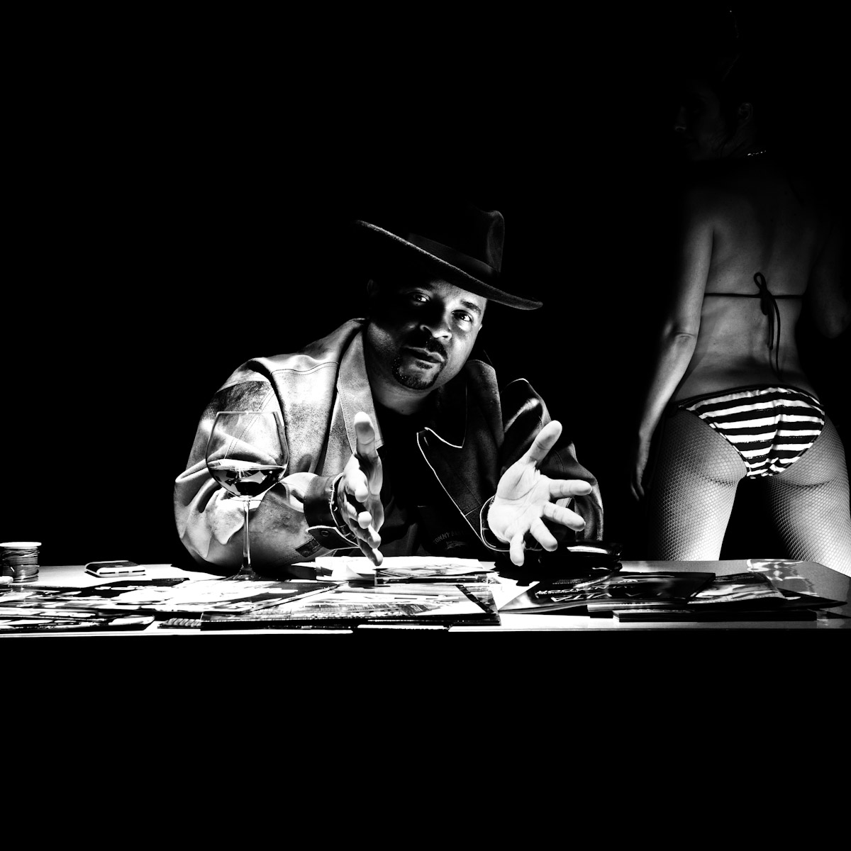
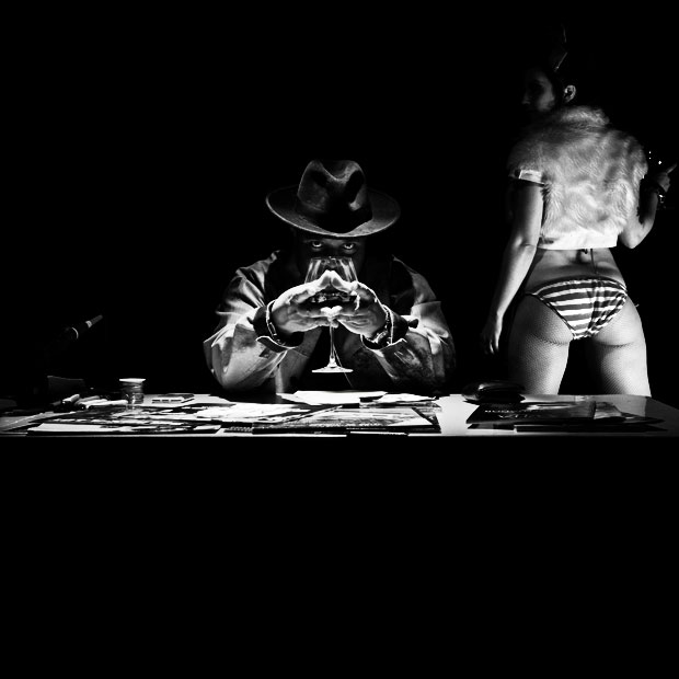
At the end of the show, I shot the cover for his upcoming album, live, online. Here are the results.
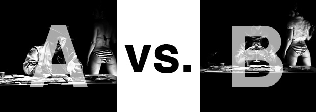
The lead one that shows his face is my fav, but there’s plenty of debate, because the other shot is tough and mysterious. I’ll resist the temptation to make any real case for one or the other, and I’ll let this is a straight up survey – which photo do you like better A (top) or B (bottom)? (please answer in the post, not via other social channels so we don’t have to chase your feedback – thx!)
Here is photo A:
Here is photo B:
Thanks for your input.
||And if you missed it: Here’s the chasejarvisLIVE episode with Mix||













B WITHOUT THE GIRL IS AWESOME
A catches my attention more
I am in favour of A. The face and gesture attract the attention first, then the girl in the back. In be there seems to be a fight between the two of them, because neither of them stands out as the “main item”. I would even say that the girl gets almost more attention initially, of course only because she got more light in that photo. 😉
A not B
because unless you had told me I would have had no idea who was in A and looking on the shelves of CD’s shops this would be an obvious problem… mmm not good promotional collateral … this would be my guess as to why A was chosen. Instant recognition? would that not be the key for this type photography
A
Most people have forgotten about Sir Mix A Lot and would like to see his face, plus the girls ass looks better in ‘A’. In ‘B’ it looks like she’s carrying a load in her bikini. One personal opinion of mine is that elbows are not attractive, I would have posed her a little different to hide the elbow.