

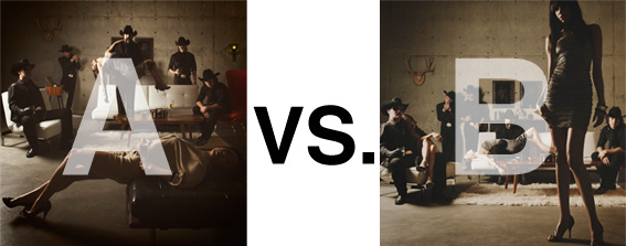
Remember when I did the original chasejarvisLIVE photo shoot way back in winter? If you recall, I was shooting the album cover image for alt/punk country band Brent Amaker and the Rodeo. We also did post production and editing on the images LIVE as well a few weeks after the shoot. Well now it’s time to print these suckers on a limited edition run of vinyl and there is somewhat of a debate on which image is better.
Simply put, and with no further explanation, I thought I’d ask for your thoughts. So which is better, A or B?
Vote in the comments. Also love to know ‘why’ if you care to explain. 500 px wide images after the jump…
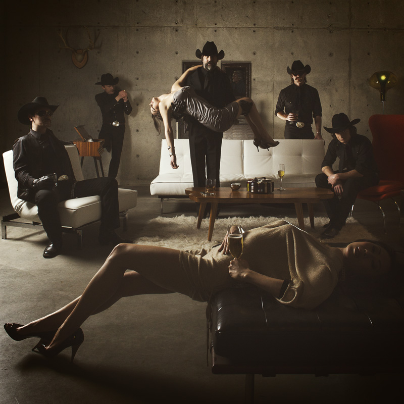
[ also, reminder that if you like music and you like chasejarvisLIVE, I’m hosting rising hip hip star RA Scion (of Common Market and Victor Shade) TODAY in 90 minutes at 10:30 pacific/1:30 eastern (GMT – 8). Interview with RA and Village Voice/Time Out/Stranger cultural critic Charles Mudede, plus RA performs LIVE at the end of the show. Hope to see you http://www.chasejarvis.com/live today….]A. With the foreground lady laying down…
OR.
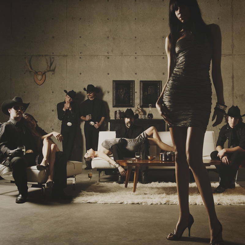
B. With the foreground lady standing up…
Love to hear your thoughts.













B Leave God space for Some Strong Copy – B is the Only Choice
I fear neither, just because I really don’t like the way the women are portrayed in these picts and what it says about the men surrounding them. It feels off and disturbing. Love your work, but I wonder what story and message you want to tell with these picts. So a no go for me. The mood (color, light, compo) I like most in B, lose the woman in the middle lying over his lap like a dead fish (sorry) and you’ve got a winner…)
Definitely B. It is more subtle and sophisticated. In A the circular distribution of the people feels too pat and the cowboy holding the girl too obvious (hey look at me kinda thing) I like that the composition in A encourages your eye to explore the image and discover the band. Also the feeling of casual indifference by the band members rings more true in version B.
B – woman laying down in front on A blends in with the rest of the composition so there is nothing to really focus on – in B you see the people in background as a group after you focus on the woman in foreground
Would those of you making a stink about the message of “objectifying woman” just relax? He didn’t ask about your opinions on the message, he wants to know which of two images you like better. Besides, you don’t know what the message behind it really is. Judging by the look of the band, I’m guessing they’re going for that badass feel anyway.
That being said, I like “A” a lot better. My eyes always go to the woman’s face in “B” but my eyes always go to the leading man in “A.” And in “A,” the pyramid shape created by the band members (tallest figure in the middle and shorter subjects to the sides) looks cleaner to me. Both fantastic images, though.