

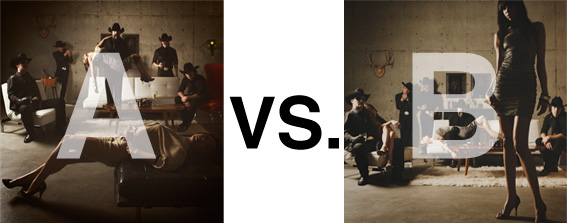
Remember when I did the original chasejarvisLIVE photo shoot way back in winter? If you recall, I was shooting the album cover image for alt/punk country band Brent Amaker and the Rodeo. We also did post production and editing on the images LIVE as well a few weeks after the shoot. Well now it’s time to print these suckers on a limited edition run of vinyl and there is somewhat of a debate on which image is better.
Simply put, and with no further explanation, I thought I’d ask for your thoughts. So which is better, A or B?
Vote in the comments. Also love to know ‘why’ if you care to explain. 500 px wide images after the jump…
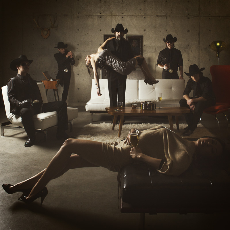
[ also, reminder that if you like music and you like chasejarvisLIVE, I’m hosting rising hip hip star RA Scion (of Common Market and Victor Shade) TODAY in 90 minutes at 10:30 pacific/1:30 eastern (GMT – 8). Interview with RA and Village Voice/Time Out/Stranger cultural critic Charles Mudede, plus RA performs LIVE at the end of the show. Hope to see you http://www.chasejarvis.com/live today….]A. With the foreground lady laying down…
OR.
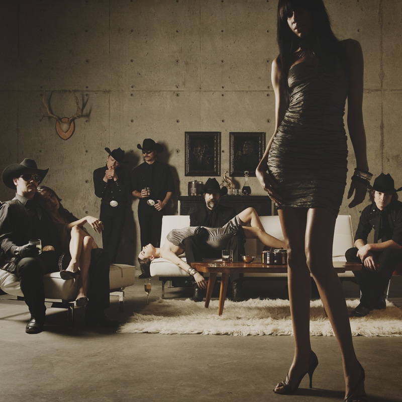
B. With the foreground lady standing up…
Love to hear your thoughts.












A, because the photo should highlight the band, not the models. Also, I like the symmetry of the men.
As an image, I think B would be better if the two members of the band weren’t clipped on the edges. The square frame doesn’t work for me with B’s composition.
A.
I agree with Claire, the eye is drawn in to the man holding the woman and then the other band members, although the far left man’s face is more lit/visible in B…
(Love the dark moodiness…)
B !
I prefer B by far. The man holding the lady in the A shot looks stiff and contrived and the B photo looks more real. To me, B is much stronger.
I think b is way better because
I like B better.
I like the way the man is holding the woman in A better but I find that yellow dot off to the right, the lamp it looks like to be too distracting plus you can’t see the artists’ faces, it makes them look creepy dressed in all black with women lying around looking passed out or dead.
I like be because you can see their faces better and there is more interaction going on between the band members and the models but I don’t care for the way the model in front has her left leg locked and for how the man is holding the woman, they look very unnatural.
Chase, I usually love your work but honestly over all I think both of these images a really busy and do not look natural and don’t do much but confuse me, plus the darkness of it all really gives me feel of a group of rich faceless southerners trapped self indulgent loneliness rather than a group of creative musicians.
A. due to the triangle composition
in B. the girl just looks in the way, it doesnt make me want to look at the rest of the picture, just her
I’m going to say “A” even tho I love both shots. I love A because it pulls me in more with the posing and I love the symmetry of it all.