

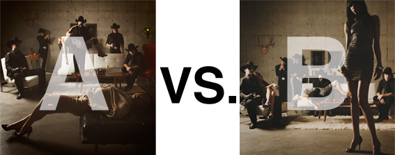
Remember when I did the original chasejarvisLIVE photo shoot way back in winter? If you recall, I was shooting the album cover image for alt/punk country band Brent Amaker and the Rodeo. We also did post production and editing on the images LIVE as well a few weeks after the shoot. Well now it’s time to print these suckers on a limited edition run of vinyl and there is somewhat of a debate on which image is better.
Simply put, and with no further explanation, I thought I’d ask for your thoughts. So which is better, A or B?
Vote in the comments. Also love to know ‘why’ if you care to explain. 500 px wide images after the jump…
[ also, reminder that if you like music and you like chasejarvisLIVE, I’m hosting rising hip hip star RA Scion (of Common Market and Victor Shade) TODAY in 90 minutes at 10:30 pacific/1:30 eastern (GMT – 8). Interview with RA and Village Voice/Time Out/Stranger cultural critic Charles Mudede, plus RA performs LIVE at the end of the show. Hope to see you http://www.chasejarvis.com/live today….]A. With the foreground lady laying down…
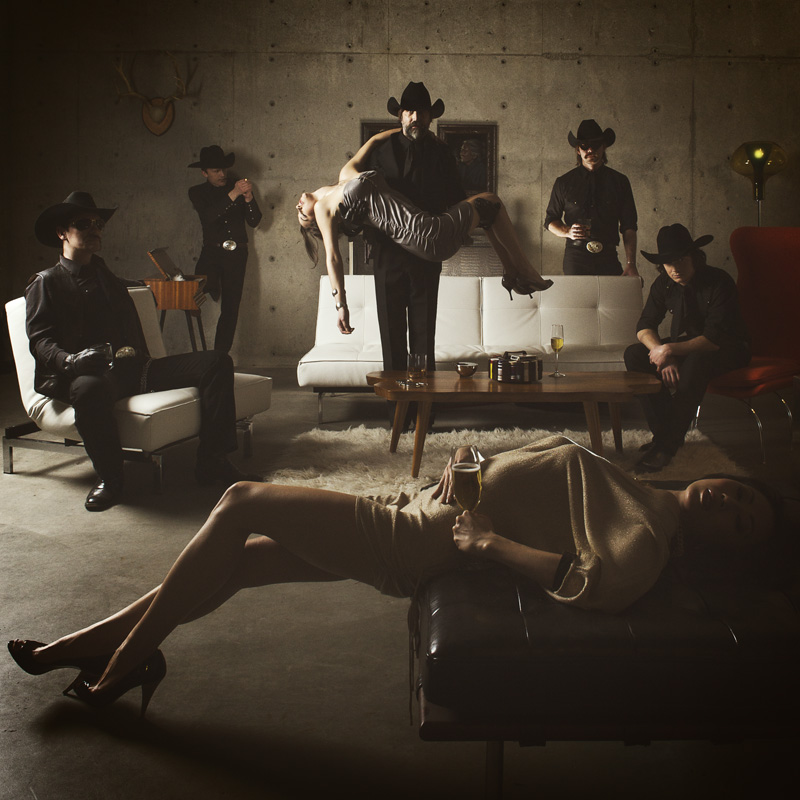
OR.
B. With the foreground lady standing up…
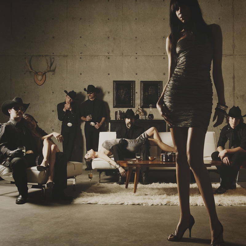
Love to hear your thoughts.








I like A better. Makes me wonder more about the story behind the photo.
A, because it looks more like an album cover. B is great as well but it doesn’t really fit for this need.
B
Because of th lightning on their faces. You see through the model and really dont pay so much attention to her. Like te big wall
B!
It looks more like something that might actually be happening in a green room. The faces are a little more visible on the band members, especially the man in the left foreground. Also… I just plain like the way it “feels”.
In A the model in the foreground looks as though she’s trying pretty hard to maintain her position. Hardly what I’d expect in a person who is drunk or at least VERY relaxed 🙂
A it’s just an easier photo to look at.