

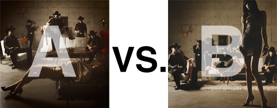
Remember when I did the original chasejarvisLIVE photo shoot way back in winter? If you recall, I was shooting the album cover image for alt/punk country band Brent Amaker and the Rodeo. We also did post production and editing on the images LIVE as well a few weeks after the shoot. Well now it’s time to print these suckers on a limited edition run of vinyl and there is somewhat of a debate on which image is better.
Simply put, and with no further explanation, I thought I’d ask for your thoughts. So which is better, A or B?
Vote in the comments. Also love to know ‘why’ if you care to explain. 500 px wide images after the jump…
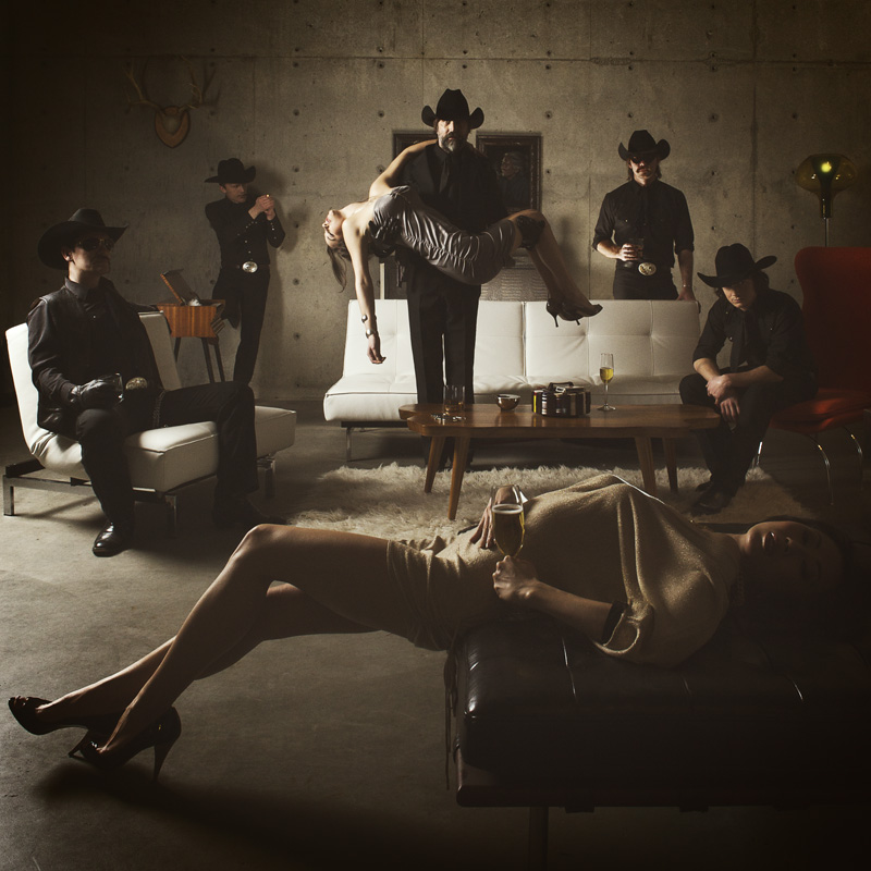
[ also, reminder that if you like music and you like chasejarvisLIVE, I’m hosting rising hip hip star RA Scion (of Common Market and Victor Shade) TODAY in 90 minutes at 10:30 pacific/1:30 eastern (GMT – 8). Interview with RA and Village Voice/Time Out/Stranger cultural critic Charles Mudede, plus RA performs LIVE at the end of the show. Hope to see you http://www.chasejarvis.com/live today….]A. With the foreground lady laying down…
OR.
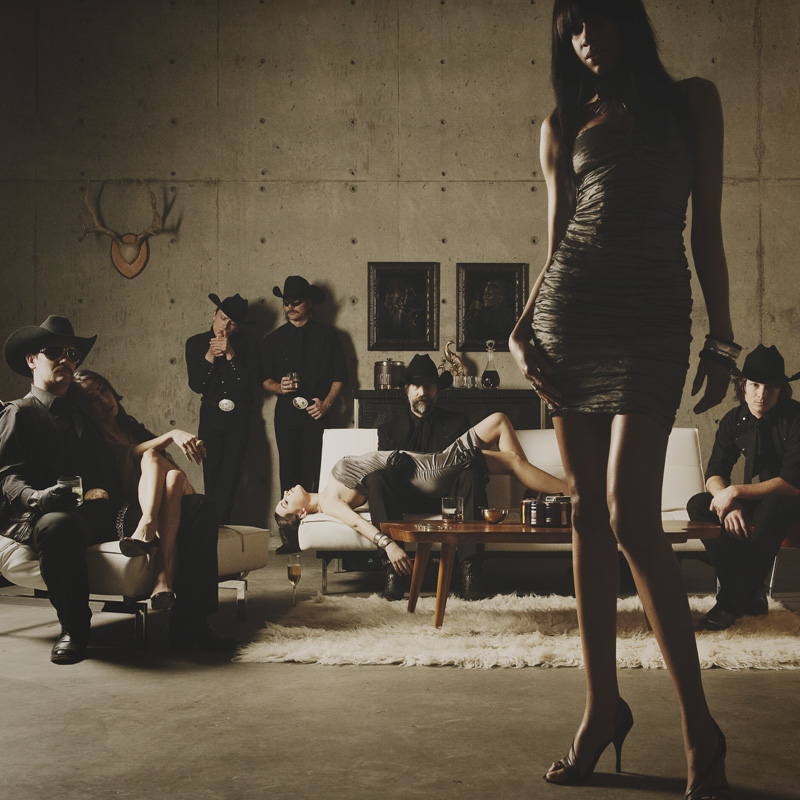
B. With the foreground lady standing up…
Love to hear your thoughts.













A,because has better composition, on B both men on the sides are cut.
easily b is my favorite. a seems more contrived and b more natural.
A, definitely ’cause in this photo the lady is just a background and the main subject is actually the band.
Both have me wishing you’d do a reshoot. Technically they’re great. Artistically they’re good. If the job is to sell records, I have a real problem with the concept and design of both.
But if I had to pick, well…
In photo A, the situation is ambiguous: the women could be dead, and the band could be pervy serial killers (no, the foreground wine glass doesn’t fix it).
In photo B, even though the front woman is dominating the frame, at least she isn’t running for her life. So the situation scans as stylish and harmless vogueing.
So I’d go with picture B.
B !!!
The composition of B (horizontal vs. vertical elements vs. empty space) is in my opinion better than A.
A is a little bit crowded.