

Remember when I did the original chasejarvisLIVE photo shoot way back in winter? If you recall, I was shooting the album cover image for alt/punk country band Brent Amaker and the Rodeo. We also did post production and editing on the images LIVE as well a few weeks after the shoot. Well now it’s time to print these suckers on a limited edition run of vinyl and there is somewhat of a debate on which image is better.
Simply put, and with no further explanation, I thought I’d ask for your thoughts. So which is better, A or B?
Vote in the comments. Also love to know ‘why’ if you care to explain. 500 px wide images after the jump…
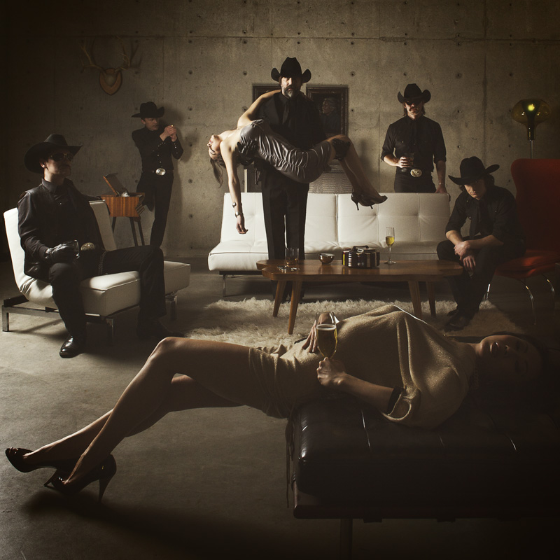
[ also, reminder that if you like music and you like chasejarvisLIVE, I’m hosting rising hip hip star RA Scion (of Common Market and Victor Shade) TODAY in 90 minutes at 10:30 pacific/1:30 eastern (GMT – 8). Interview with RA and Village Voice/Time Out/Stranger cultural critic Charles Mudede, plus RA performs LIVE at the end of the show. Hope to see you http://www.chasejarvis.com/live today….]A. With the foreground lady laying down…
OR.
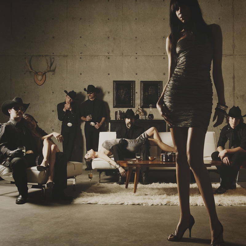
B. With the foreground lady standing up…
Love to hear your thoughts.













I think that “B” is the winner by a long way!!
I find that in photo “A” the man holding the girl is the main focus(key) of the shot, this is not good as it looks like he is uncomfortable holding that girl. Also the 2 guys to HIS left have the same expression as he does so it looks posed not random. The 2 guys to HIS right look random and this is ok , i kind of like the guy playing with his lighter(good point). As for the girl in the foreground she stands out last imo and i dont think this is the intent. She looks hot but only in body, i think this may be due to lack of light to her eye area. I think as a viewer she needs some eye detail.
As for photo”B” the center man is still the key but for some reason the 2nd thing to catch my eye is the girl in the front of the frame not the girl he is holding. So my eye goes from him to main frame girl then the girl he is holding. Then it wanders to the other guys in the frame, when my eye hits the guy to the main frame girls left , i notice he is looking directly at the camera. this is great as it just keeps me in the frame!!! SO then my eye wanders to the other end of the frame and boom this guy is looking directly too, but not so obvious, But this keeps me in on this side of the frame too!!!. i then see the 2 guys to his left and they both look natural, the last thing i notice is the girl laying on the guy( image left ). then my eyes do it over again and again and again.
Great shot?? Not sure?? but it does keep me interested.
I’d say option B. Having the lady laying down kind of distracts from the group in the background.
A A A for sure. B just don’t do it for a band cover
Neither!
Picture A seems like a bad 70’s C&W band with a couple of drunk hookers.
Picture B is better, but the girls seems very out of place, with one being passed out, another hanging out with her BF and the one in the foreground about to leave the place.
Yes – neither – unless its a Rohypnol advert? In which case, A.
B. Without a doubt.
A feels a little forced and the guy on the left looks/feels uncomfortable.