Chase Jarvis Chase Jarvis
  • Photos
  • Projects
  • About
  • Blog
  • Book
Chase Jarvis Chase Jarvis
  • Photos
  • Projects
  • About
  • Blog
  • Book

Which Photo Is Better: A or B ?

chase jarvis photo brent amaker

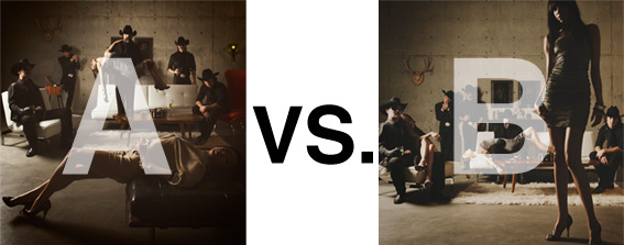
Remember when I did the original chasejarvisLIVE photo shoot way back in winter? If you recall, I was shooting the album cover image for alt/punk country band Brent Amaker and the Rodeo. We also did post production and editing on the images LIVE as well a few weeks after the shoot. Well now it’s time to print these suckers on a limited edition run of vinyl and there is somewhat of a debate on which image is better.

Simply put, and with no further explanation, I thought I’d ask for your thoughts. So which is better, A or B?

Vote in the comments. Also love to know ‘why’ if you care to explain. 500 px wide images after the jump…

[ also, reminder that if you like music and you like chasejarvisLIVE, I’m hosting rising hip hip star RA Scion (of Common Market and Victor Shade) TODAY in 90 minutes at 10:30 pacific/1:30 eastern (GMT – 8). Interview with RA and Village Voice/Time Out/Stranger cultural critic Charles Mudede, plus RA performs LIVE at the end of the show. Hope to see you http://www.chasejarvis.com/live today….]

A. With the foreground lady laying down…
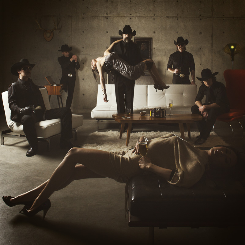
Rodeo "A" - by chase jarvis

OR.

B. With the foreground lady standing up…
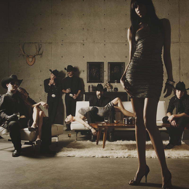
amaker "B" by chasejarvis

Love to hear your thoughts.

Related Posts

10 Things Every Creative Person (That’s YOU) Must Learn
051026_ChaseJarvis_einstein_writing_vlrgwidec
Writing Makes Photographers More Creative — 5 Easy Tips
Daniel Pink: The Power of Regret
Chris Hutchins of Chase Jarvis LIVE
Chris Hutchins: All the Hacks to Maximize Your Life
Chris Burkard on Chase Jarvis LIVE
The Wayward Path of Photographer Chris Burkard
Make Your Message Heard with Victoria Wellman

1,074 replies on:
Which Photo Is Better: A or B ?

Comments navigation

Previous
Next
  1. Pachito Marco Calabrese says:
    June 13, 2010 at 4:15 am

    B. The scenario seems stronger and more original.

  2. hidesy says:
    June 13, 2010 at 2:48 am

    B – better composition, better copyspace, girls look alive 😉

  3. Laurent says:
    June 13, 2010 at 1:40 am

    A. subject IS the band .. so A is better imho.

  4. Jamie Mazurek says:
    June 13, 2010 at 1:29 am

    Tthe ‘B’ holds a truer album cover format with consideration of copy and sleeves opening edge. ‘A’ with the centre lead standing demands too greater deal of realestate on the image relating to the later.

  5. Martina says:
    June 13, 2010 at 1:13 am

    B – the composition in A is boring, too symmetrical, no tension. Makes me yawn, 😉

Comments navigation

Previous
Next

Comments are closed.

BUY NEVER PLAY IT SAFE NOW!

Get weekly, curated access to the best of everything I do.

Popular Posts

google flow uiWhat is Google Flow? My honest review of their AI video editor
veo sensitive contentHow To Fix Veo 3’s “Sensitive Content” Warning
20251013_CJLIVE_CreativeEdge_Micro_Thumb_16x9_v2.5The Creative Edge Isn’t Vanishing — It’s Moving.
illustrator logoAdobe Illustrator’s AI features: An honest review
Asset 28AI image generatorThe Best AI Image Generators: A Guide For Creative Pros
weavy nano banana style referenceBest Generative AI Canvas Apps for Creative Professionals (Weavy, Flora, Freepik, etc)
upscaler thumbThe Best AI Image Upscaler for Creative Pros: 2026 Guide
nano banana edit thumbHow To Edit Images In Nano Banana Pro (inpainting)

© 2024 Chase Jarvis. All rights reserved.