I was in Paris last week. Part work, but mostly fun. Eating, drinking, being merry, and of course, snapping photos my iPhone–as I do everyday–with no end goal beyond staying creatively engaged.
I was just now kicking through photos from the trip and stumbled on a couple of snapshots I thought were interesting for various reasons. I’ve posted stuff like this before and was really excited by the resulting discussion, so I figured I’d throw it out there again… These are of course just snapshots, but even snapshots have merit. AND these photos are VERY different from one another…. So, simply put, I thought I’d ask for your thoughts, which is better, A or B? And why?
Vote in the comments. Also love to know ‘why’ if you care to explain. 500 px wide images after the jump…
[ASIDE, since Paris reminds me of good food… if you like chasejarvisLIVE, I’m bringing in 2 special guests TOMORROW (Wednesday) at 12 noon pacific/3:00 eastern time. The goal is to combine a few of my passions and share them with you: photography, food, the internet. As such, join me tomorrow to welcome….
Guest #1 Penny DeLosSantos: Food/Lifestyle/Travel and National Geographic photographer Penny DeLosSantos (@pennydelosantos). Well talk about photo, food, and travel…photographing in the world’s most suicide bombed markets in the middle east, travels to more than 40 countries, and the art of combining your passions into a career.
Guest #2 Barnaby Dorfman: Barnaby is a legendary tech guru turned entreprenuer who recently founded Foodista [@foodista] – the world’s leading online food encyclopedia/wiki and an overall amazing site. Combine food, tech, and storytelling and you get a thick slice of Barnaby. Hope to see you at http://www.chasejarvis.com/live tomorrow ….]
Now go vote on those photos below. Tell me what you think…
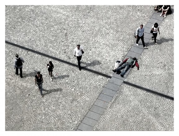
Here’s Photo A:

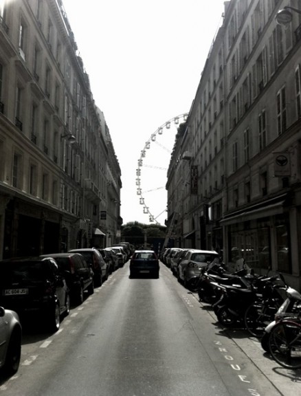
Here’s Photo B: 
Which is better and why?


A is better because it brings a question.
B is just an ordinary scene.
A is better. The composition is good, the lines and pattern on the ground are interesting and it inspires thought to think of what the man laying down is doing. Photo B just looks boring to me (no offense). Almost as if you just walked out of your hotel and took a picture.
I like photo A better. It has a more unique point of vue. Photo B is a little bit linear and boring
Eu, de novo. 🙂
Pensando melhor, não, eu não cortaria as pessoas sentadas no canto superior direito. Elas representam, dentro do contexto posto em meu comentário anterior, a omissão contemplativa.
Roberto.
Olá Chase!
Prefiro a foto “A”. Sua mensagem é impactante: um bandido (personagem, claro) caído como se morto a tiros, todos passam e ninguém lhe oferece socorro/ajuda. No piso, o cruzamento das linhas e o mosaico são fundamentais ao resultado final. Eu teria optado por cortar as pessoas sentadas no canto superior direito.
Sucesso e saúde!
Roberto – Cuiabá (MT) – Brasil