I was in Paris last week. Part work, but mostly fun. Eating, drinking, being merry, and of course, snapping photos my iPhone–as I do everyday–with no end goal beyond staying creatively engaged.
I was just now kicking through photos from the trip and stumbled on a couple of snapshots I thought were interesting for various reasons. I’ve posted stuff like this before and was really excited by the resulting discussion, so I figured I’d throw it out there again… These are of course just snapshots, but even snapshots have merit. AND these photos are VERY different from one another…. So, simply put, I thought I’d ask for your thoughts, which is better, A or B? And why?
Vote in the comments. Also love to know ‘why’ if you care to explain. 500 px wide images after the jump…
[ASIDE, since Paris reminds me of good food… if you like chasejarvisLIVE, I’m bringing in 2 special guests TOMORROW (Wednesday) at 12 noon pacific/3:00 eastern time. The goal is to combine a few of my passions and share them with you: photography, food, the internet. As such, join me tomorrow to welcome….
Guest #1 Penny DeLosSantos: Food/Lifestyle/Travel and National Geographic photographer Penny DeLosSantos (@pennydelosantos). Well talk about photo, food, and travel…photographing in the world’s most suicide bombed markets in the middle east, travels to more than 40 countries, and the art of combining your passions into a career.
Guest #2 Barnaby Dorfman: Barnaby is a legendary tech guru turned entreprenuer who recently founded Foodista [@foodista] – the world’s leading online food encyclopedia/wiki and an overall amazing site. Combine food, tech, and storytelling and you get a thick slice of Barnaby. Hope to see you at http://www.chasejarvis.com/live tomorrow ….]
Now go vote on those photos below. Tell me what you think…
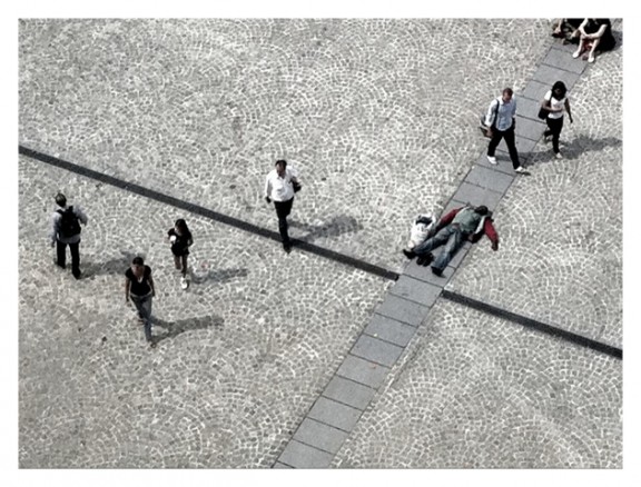
Here’s Photo A:

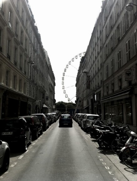
Here’s Photo B: 
Which is better and why?


A – It leaves you guessing as to what the H the guy on the floor is doing there. It’s got nice lines too and its not predictable like B. B is an echo of what we always see, A is more creative in my opinion. 🙂
B does little for me for me. The lines of buildings are asymmetrical already, without needing the wheel in the background, so I don’t really think there’s any real juxtaposition going on I can get interested in. Sure the composition tends to lead the eye, but to where? Simply a rather grubby wall and a hedge – nothing special there, in fact almost a dead end. Plus it’s blocked by a car anyway so perhaps I can’t even go down there. I certainly don’t appear able to go to the wheel that way because of the wall. So it just makes me want to turn around and try another street. Also it’s too dark, as there is too much dynamic range in the image to have been captured on the camera.
A on the other hand is great. Contrasts of the 6 people walking, 3 stationary; 5 walkers going the same direction, the other walker going in exactly the opposite direction. There are a couple sitting just on the edge near the corner, but they are not really in the image as you can only see their legs, more sort of spectators like us. There is the symmetry of the repeated circle patterns in the tiles, and simplicity of the whole background canvas being very plain. But then you have those lines crossing the image, perpendicular, one thick one thin, almost contradictory, and crossing near a golden point. Plus the line the walkers make combined with the other lines creates those lovely triangles, triangles everywhere in fact! Not to mention the mysterious and slightly comedic element of the lone man lying there, asleep? (Dead?) Seeming completely out of place in that environment, and ignored by everyone around him. And in fact you could almost think it was black and white image were it not for his red sleeves visible. Contrast and juxtaposition again. It’s very simple, beautifully composed. With contrasts and harmony, and many questions, and I feel many stories.
To me, B is just some uninviting street with some cars parked along it, but A is a work of art that speaks to me. I would buy A.
Photo A wins it for me, largely because of the human element. Any photograph that tells a story about humans I’m going to relate to much more than an architectural photograph.
The long straight parallel lines of the buildings receding towards the curved wheel is a clever juxtaposition, but a little contrived.
The angle that the man is lying at compared to the direction that people are walking is clever in a much more organic way. You’ve captured a unique moment compositionally. Furthermore, looking down on people is a more interesting viewpoint than a photograph taken at street-level. The uniqueness of the viewpoint makes for a much more engaging photograph.
I wonder which you prefer, and why?
Photo A definitely! Contrast between movement and static. 2nd thing is that you captured it at the precise moment without extraneous intrusion to the scene. That said, it would’ve been better if the people at the top right be cropped off.
I like A as I love the line and also the aspect – looking straight down! I live in Paris and have a similar shot looking off the Center Pompidou. Good stuff Chase, you are the man