

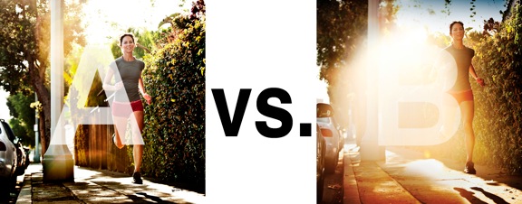
I was just recently commissioned for a campaign and shot about 1000 images to capture final image for this well known sports company. In the end, it came down to the two images above. As is usually the case, the final image is tough to choose, with lots of factors under consideration, lots of stakeholders picking their favorite. There was much debate.
I’ve posted stuff like this before and was really excited by the resulting discussion, so I figured I’d throw it out there again… WHICH IS BETTER, A or B?
Vote in the comments. Love to know ‘why’ if you care to explain your thoughts. 600 px wide versions of each image after the jump…hit [‘continue reading’ below]. After you all weigh in, I’ll tell you which one was used and why.
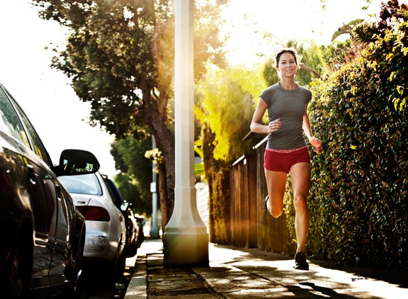
This is PHOTO A, below.
THIS is PHOTO B, below.
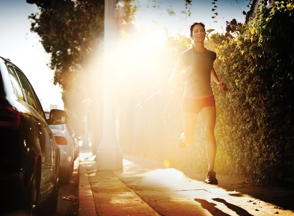












For me B is the winner I like the dreamlike quality that this image has, she is floating in his own dream.
You need to dream to win.
Regards
B totally.
In A the subject is looking to the camera, and her neck is tight…
B is the one… but I think that it would be better…
A. Great use of tone, crisp feeling but… ordinary.
B. More graphic, increased floating of the model with more visible shadows, the flare adds a supernatural feeling to the image… as if she’s passing through a threshold or stepping in from another dimension.
If this is a commercial shot, B should be the wise decision for there is natural space available for commerical graphics.
B – get’s your attention. Buy, buy buy…
hum… from my point of view it depends of what kind of idea you want to express with this photo.
Photo A – its better if you simply want to give an idea of running, exercise, it´s a good shot for a commercial of a simple bottle of water
Photo B – it´s a most powerful picture, the light gives the idea of explosion, strong, and at the same time she seems to flow in the air.
It´s a better photo for an energy drink.
BAZINGA!!! 😀