

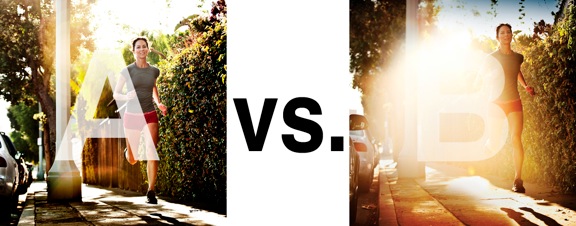
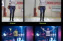
I was just recently commissioned for a campaign and shot about 1000 images to capture final image for this well known sports company. In the end, it came down to the two images above. As is usually the case, the final image is tough to choose, with lots of factors under consideration, lots of stakeholders picking their favorite. There was much debate.
I’ve posted stuff like this before and was really excited by the resulting discussion, so I figured I’d throw it out there again… WHICH IS BETTER, A or B?
Vote in the comments. Love to know ‘why’ if you care to explain your thoughts. 600 px wide versions of each image after the jump…hit [‘continue reading’ below]. After you all weigh in, I’ll tell you which one was used and why.
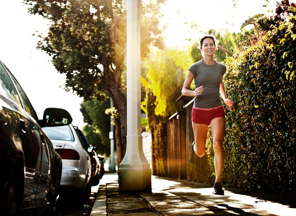
This is PHOTO A, below.
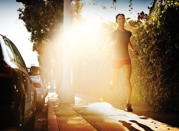
THIS is PHOTO B, below.











For a campaign, A
For my office wall B
Since I’m not working on the campaign, give me B
i prefer B artistically, but i imagine A would be better commercially as the product is of greater focus
I would say A is better than B. However, A is still not my favorite due to the lamp post that seems to split the image into 2. Plus, the post seems fighting to be the center of subject with the running woman in the photo. I don’t know the real condition of the place where the photo was taken but I would wait until the woman 3-4-5 feet away from the post. I think it would create some separation between the woman and the post, and hopefully the woman will stands out more than the post.
I love the atmosphere that is shown on the edges of a flare this size, which is funny because it’s the same thing that I don’t like about the flare, it’s size. More than this though, I believe it’s the center-punched position that is too ‘in my face’.
Both images hold my interest, but I’ll pick A this go around 🙂
For me, the vote Goes to A, we could never forget that we are selling something, this cases, sport clothes, almost the hole light thats getting out in the B, in smashing the subject and the details on it..
So the A for me… Chase.