Chase Jarvis Chase Jarvis
  • Photos
  • Projects
  • About
  • Blog
  • Book
Chase Jarvis Chase Jarvis
  • Photos
  • Projects
  • About
  • Blog
  • Book

Which Photo is Better: A or B?

Runner.jpg

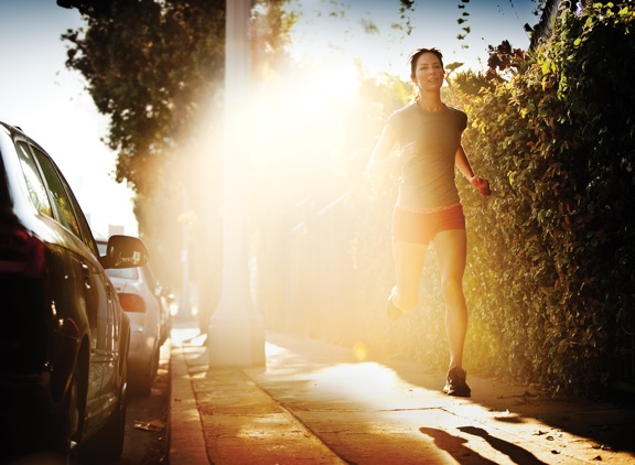
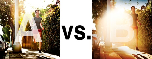
I was just recently commissioned for a campaign and shot about 1000 images to capture final image for this well known sports company. In the end, it came down to the two images above. As is usually the case, the final image is tough to choose, with lots of factors under consideration, lots of stakeholders picking their favorite. There was much debate.

I’ve posted stuff like this before and was really excited by the resulting discussion, so I figured I’d throw it out there again… WHICH IS BETTER, A or B?

Vote in the comments. Love to know ‘why’ if you care to explain your thoughts. 600 px wide versions of each image after the jump…hit [‘continue reading’ below]. After you all weigh in, I’ll tell you which one was used and why.

This is PHOTO A, below.
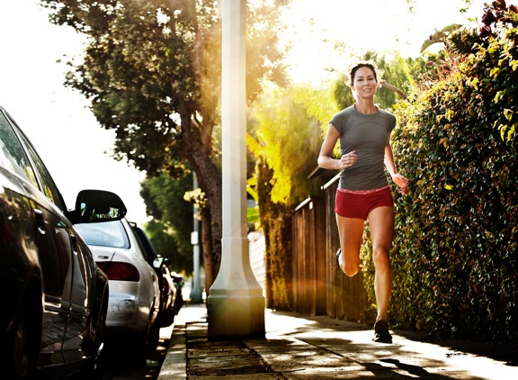
 

Runner A

THIS is PHOTO B, below.


Runner B

Related Posts

10 Things Every Creative Person (That’s YOU) Must Learn
051026_ChaseJarvis_einstein_writing_vlrgwidec
Writing Makes Photographers More Creative — 5 Easy Tips
Daniel Pink: The Power of Regret
Chris Hutchins of Chase Jarvis LIVE
Chris Hutchins: All the Hacks to Maximize Your Life
Chris Burkard on Chase Jarvis LIVE
The Wayward Path of Photographer Chris Burkard
Make Your Message Heard with Victoria Wellman

1,351 replies on:
Which Photo is Better: A or B?

Comments navigation

Previous
Next
  1. Laust says:
    January 10, 2012 at 1:50 pm

    I’m not sure any of them are that good.
    A’s composition doesn’t make much sense to me. Why do we need to see the cars, the lamp post and the trees when it’s obvious that that the message is in the right side of the picture; the running girl.
    Therefore i think that B is the better alternative as the flare removes much of the unnecessary info but ideally I’d crop A much closer and only deal in the running woman on the pavement with the bush as background. And then of course not as much flare. That much flare is also just a cheap attempt at making the picture more interesting.

  2. Ian Paterson says:
    January 10, 2012 at 1:33 pm

    Photo “A” would be the best image.

    Flare can be attractive if it is done with in this case some symmetry to it, photo “B” in my opinion does not have that.

  3. Tudor says:
    January 10, 2012 at 1:13 pm

    I would definitely choose A because the flare is less distracting. In picture A you can see more of the image instead of having that big lens flare that cover most part of the frame and also I like more her face expression, it looks like she is smiling in A that in the B where she’s looking slightly tired.

  4. Lynn says:
    January 10, 2012 at 12:36 pm

    B

  5. PhotovisionProject says:
    October 8, 2011 at 3:17 pm

    for your purpose definitely A.

    I think B has a superior aesthetic value, the light flare is amazing. But for a commercial sport shot I would go for A.

Comments navigation

Previous
Next

Comments are closed.

BUY NEVER PLAY IT SAFE NOW!

Get weekly, curated access to the best of everything I do.

Popular Posts

20260401_CJLIVE_CostOfOverplanning_Micro_Thumb_16x9_v2.5The Hidden Cost of Overplanning
Fluffy-Monsters.max-1080×1080.format-webpHow to Use Nano Banana Pro for Free (Without a Watermark)
veo sensitive contentHow To Fix Veo 3’s “Sensitive Content” Warning
Asset 33squarespace framerSquarespace vs Framer: Which Website Builder is Right for Creatives?
lora thumbHow To Use LoRAs in Weavy (vs ComfyUI)
google flow uiWhat is Google Flow? My honest review of their AI video editor
style xfer thumbHow to Clone Any Image Style With Nano Banana Pro & Weavy (style transfer)
How-does-Stable-Diffusion-workWhat Is Stable Diffusion: A Guide for Creative Professionals
Asset 12runwayRunway AI: Honest review for creative professionals
weavy nano banana fully restyledChange the Pose of Any Photo with Nano Banana & Weavy

© 2024 Chase Jarvis. All rights reserved.