

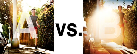
I was just recently commissioned for a campaign and shot about 1000 images to capture final image for this well known sports company. In the end, it came down to the two images above. As is usually the case, the final image is tough to choose, with lots of factors under consideration, lots of stakeholders picking their favorite. There was much debate.
I’ve posted stuff like this before and was really excited by the resulting discussion, so I figured I’d throw it out there again… WHICH IS BETTER, A or B?
Vote in the comments. Love to know ‘why’ if you care to explain your thoughts. 600 px wide versions of each image after the jump…hit [‘continue reading’ below]. After you all weigh in, I’ll tell you which one was used and why.
This is PHOTO A, below.
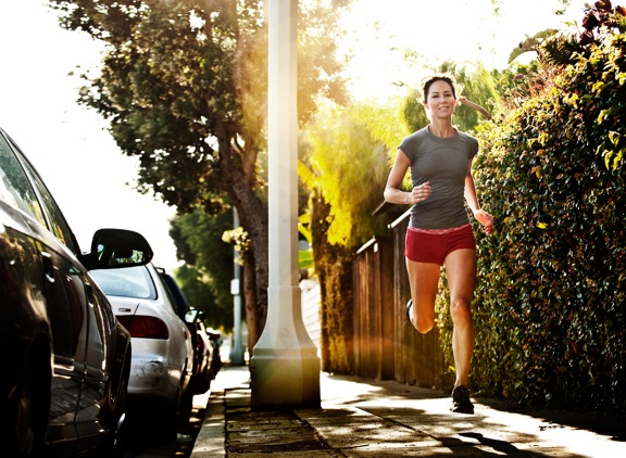
THIS is PHOTO B, below.
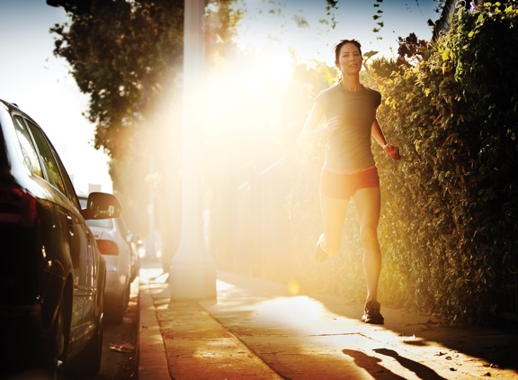












Will many people have said A and focused on the fact that the foot ware or what she is wearing is what suppose to be what is the main focus. This may and may not be the case.
I am going to say B is the choice of the client because even though it has a larger Flare and yes maybe distracting in of it’s own. It also gives a space to place a “product”. The photographer of these two photos states he represents a sports company. He does not say what type of sports company or what their product is, so even if it s the shoe they may want to put a shoe in the flare so that you may get an up close view of their product. If not then they need some place they can place their product where it is HIGHLIGHTED. The running model is the background so to speak.
A
B
When I first saw the pics at the top, I liked B better right away. It has a different, ethereal thing going for it. But, when I scrolled down, I wasn’t so sure. I think I’d like B better with a different crop. Take out the cars and/or move the flare from the center. But, that’s me. Both great shots.
A is my choice as it brings out the details and having mentioned its for a sport company, I could see the details like shoes and the jersey better than B.