

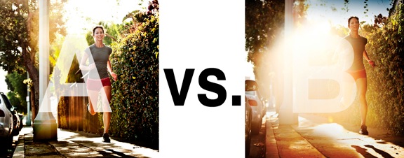
I was just recently commissioned for a campaign and shot about 1000 images to capture final image for this well known sports company. In the end, it came down to the two images above. As is usually the case, the final image is tough to choose, with lots of factors under consideration, lots of stakeholders picking their favorite. There was much debate.
I’ve posted stuff like this before and was really excited by the resulting discussion, so I figured I’d throw it out there again… WHICH IS BETTER, A or B?
Vote in the comments. Love to know ‘why’ if you care to explain your thoughts. 600 px wide versions of each image after the jump…hit [‘continue reading’ below]. After you all weigh in, I’ll tell you which one was used and why.
This is PHOTO A, below.
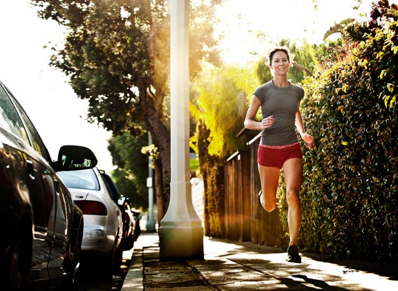
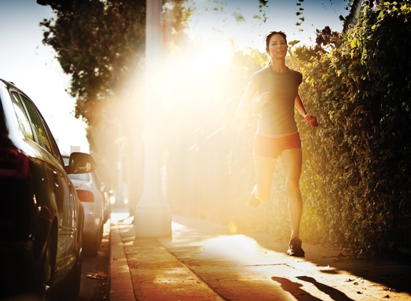
THIS is PHOTO B, below.












I WOULD SAY PHOTO A BUT WITHOUT THE RUNNER LOOKING AT THE CAMERA
Technically, probably, A. But I love the vibe, grit, and feel of B. 🙂
B no contest. A is overkill.
My vote goes for A. The flare in the second photograph has taken up quite a large part of the photograph and is almost intruding onto her her face. Would have great If I had several overlapping circles of less bright flare, the one’s we get when we don’t put on our lens hood.
I’ve gotta say B – B is what it feels like to run in the morning. Seeing that image as a runner makes me want to get out there and run. If they’re selling clothes or shoes or whatever it doesn’t matter, it’s the feeling of running. I’m not drawn to the model in B, I see her but then with the lens flare focus more on the feeling of the image which is “get out and run” and “wear our stuff” from the company just by putting their logo in it.