

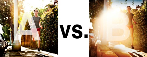
I was just recently commissioned for a campaign and shot about 1000 images to capture final image for this well known sports company. In the end, it came down to the two images above. As is usually the case, the final image is tough to choose, with lots of factors under consideration, lots of stakeholders picking their favorite. There was much debate.
I’ve posted stuff like this before and was really excited by the resulting discussion, so I figured I’d throw it out there again… WHICH IS BETTER, A or B?
Vote in the comments. Love to know ‘why’ if you care to explain your thoughts. 600 px wide versions of each image after the jump…hit [‘continue reading’ below]. After you all weigh in, I’ll tell you which one was used and why.
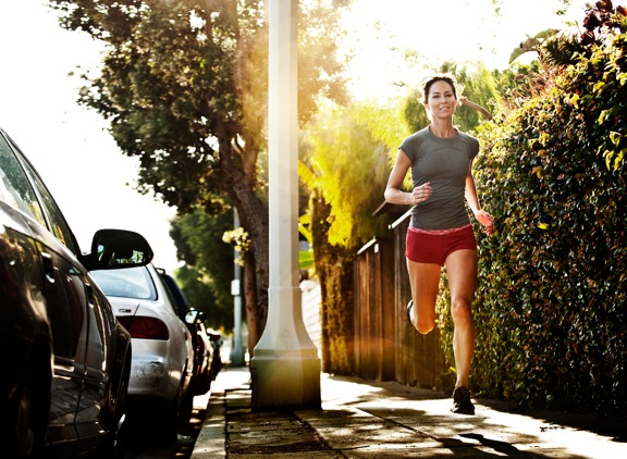
This is PHOTO A, below.
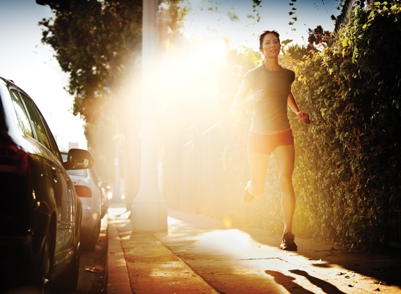
THIS is PHOTO B, below.








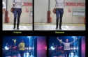



The B is the best for sure ! Because there is something more poetic, more in the moment and more accidental that makes the picture 1000 times more interesting and more beautifull. But I’m 100% sure the A was selected for the campaign ! Why ? Because the companie want there products to be visible. (Is it a good choice ? It depend on many thing)
Ok I would typically pick A. But I can argue the side for B for a sports company. I see less of a light happy smiling face in B vs A. A looks like she’s out for just a nice run. Enjoy the day.
B – I see someone running to train. Her face isn’t a grimace – but it isn’t smiling either. The sun is beating at her back, pushing her on. She only see what’s in front of her and her goal.
A is definitely better. B has the loveliest flare but it simply doesn’t belong in the pic. Perhaps if it is framed somewhere near the beach or seascape, or a desert then B has a fighting chance.
my choice is picture B ! picture A have too many distractions: the cars on the left and that light pole in the middle. in a campaign of sports company the photographer has to focus on the obejcts that the company will sell!
i love so much the idea of the flare on picture B but i think it is a little bit too big. it should be moved on the left a bit!
although i think A is a better photo with less distraction. But having work with advertising agency, they could use B and put some text on the flare. Again, I think it’s just a matter of preference here.