

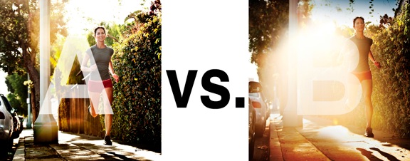
I was just recently commissioned for a campaign and shot about 1000 images to capture final image for this well known sports company. In the end, it came down to the two images above. As is usually the case, the final image is tough to choose, with lots of factors under consideration, lots of stakeholders picking their favorite. There was much debate.
I’ve posted stuff like this before and was really excited by the resulting discussion, so I figured I’d throw it out there again… WHICH IS BETTER, A or B?
Vote in the comments. Love to know ‘why’ if you care to explain your thoughts. 600 px wide versions of each image after the jump…hit [‘continue reading’ below]. After you all weigh in, I’ll tell you which one was used and why.
This is PHOTO A, below.
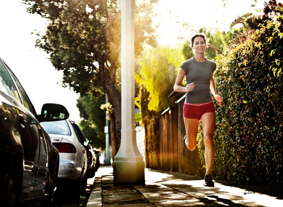
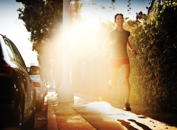
THIS is PHOTO B, below.











A is better – I like the composition, great “hair” backlight.
The flare on B is nice for newspapers, magazine, advert – they can place the graphic or text inside the flare. But for me it’s too much:).
i pick B
‘Cos too much storys in A
Photo B.
Because in photo A the model has a not pretty looking halo around her head and she isn’t capturing much attention. In the photo B the big bright light captures your attention and brings it to the model and the halo is gone. It also takes you away from the cars unlike in photo A.
without knowing the underlying vision it is difficult, but it is still easily B
the blurred background in A is distracting, also its composition would make any text/graphic overlay problematic & you eyes are all over the picture.
In B the “glare” draws your eyes immediately to the center, blurs out distractions forcing the viewer to look exactly where the artists/marketer wants it
A looks better, just too much flare in B, B reminds me of overdone HDR.