
Many of us in the creative community, miss the grit of the darkroom, the unpredictability of a letterpress, the happy accidents of a photocopier running out of toner. We want that analog warmth, not digital perfection.
The problem? Most “distressed typography / bad photocopy” filters and presets look fake and cheap – especially in AI.
So today, we’re going to look at how to create authentic, grungy ink bleed and halftone effects using AI – specifically Nano Banana Pro inside of Weavy.ai and rebuilding the IRL analog process, step by step.
Why Weavy instead of the Gemini app?
Our goal is to take a crisp, vector-style logo and ruin it – beautifully. Why not just use the Gemini web app? You could, in theory.
But for this specific workflow, I’m using Weavy because I want total control. When you’re trying to replicate a physical process – like ink bleeding into paper – you need to control the steps. If you try to do it all in one-shot it with a “mega-prompt,” you’re rolling the dice. If it doesn’t look right, you have to start over from scratch.
And importantly, we’re working with exactly the same base logo asset the whole time – crucial for client signoff.
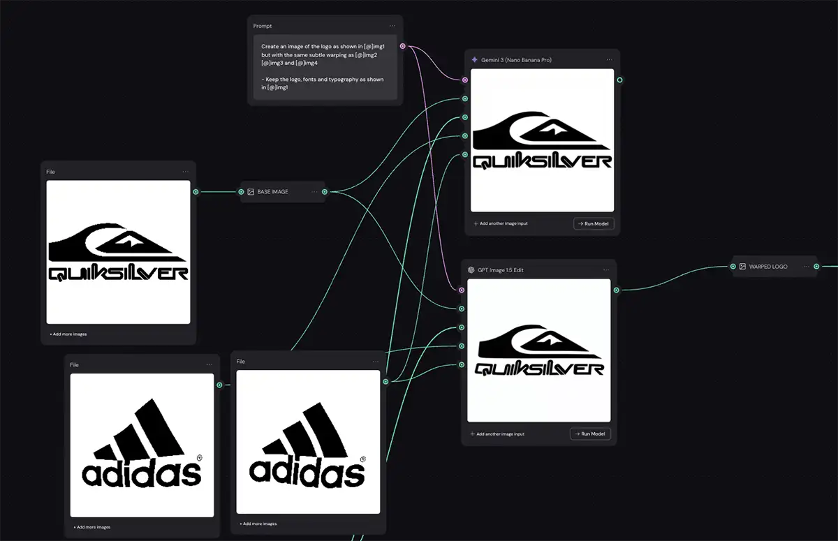
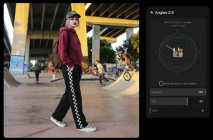
In Weavy, we can build a node-based workflow (Krea AI or Flora work for this too). We can tweak the warp, then tweak the bleed, then tweak the halftone, all independently – full control.
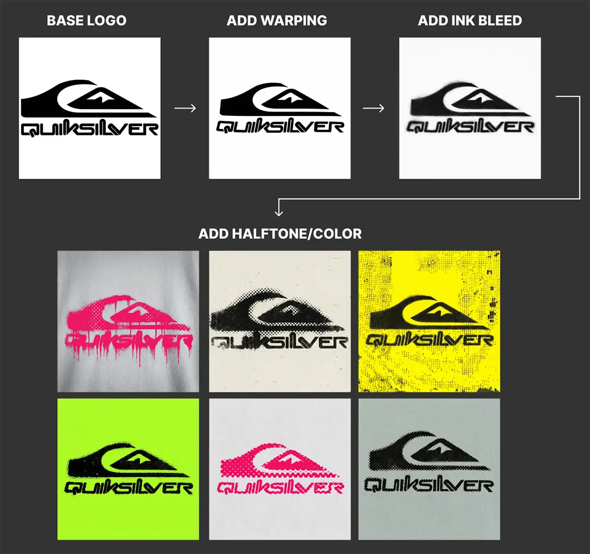
Step 1: Add Subtle Warping
Warping is the secret sauce. Before we add texture, we need to break the geometry. Digital lines are perfect; analog lines are not. We want that subtle distortion you get when you pull a piece of paper through a hot photocopier, not a cheap AI preset.
I took the Adidas logo into Photoshop, used the Liquify tool with a large brush (~2000 pixels in this case, with a 2400px image), and just nudged the center of the image. I didn’t go crazy – just enough to make it look like it was printed on cheap paper.
I used that warped image as an image input style reference in the Nano Banana Pro node.
-
Prompt: A simple style transfer prompt, nothing fancy:
- “Create an image of the logo as shown in [@]img1 but with the same subtle warping as [@]img2 [@]img3 and [@]img4– Keep the logo, fonts and typography as shown in [@]img1″
-
The Key: It’s all about the reference image you feed it.
-
Pro Tip: Sometimes ChatGPT Image Edit 1.5 actually does a slightly better job at this specific warping step than Nano Banana. I encourage you to experiment with your tools—try both and see which one gives you that natural “drag.”
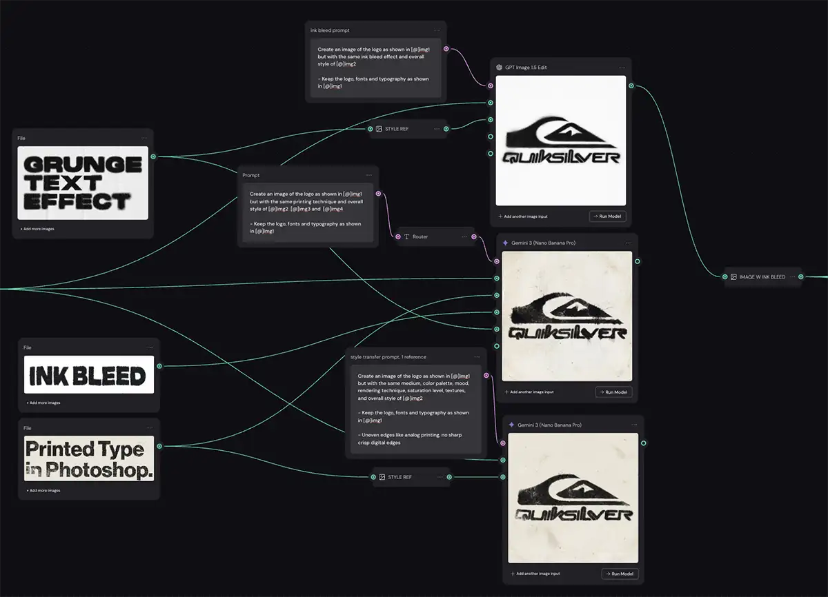
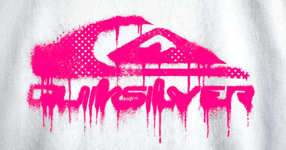
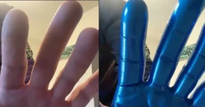
Step 2: The Ink Bleed Effect
Now that our shape is slightly imperfect, we need to mess up the edges. We want that “ink soaking into the fiber” look.
The Technique:
Again, we are using Nano Banana Pro. I jumped on Pinterest and found examples of heavy ink bleed – type that looks like it’s been photocopied a hundred times, or badly offset/letterpress printed.
Here is the trick: Crop your reference images. If you give the AI a massive poster as a reference, it might get confused by the composition. I cropped the reference images down to just the texture I wanted – a corner of a letter, a smudge of ink, etc.
Use your warped image from Step 2 as the input here- we’re stacking effects, just like layers in Photoshop.
For the sake of organization I use a router node to connect each step, but that’s optional.
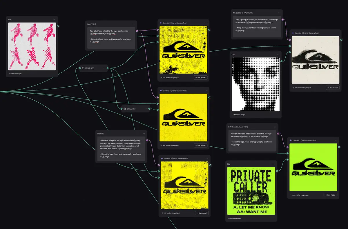
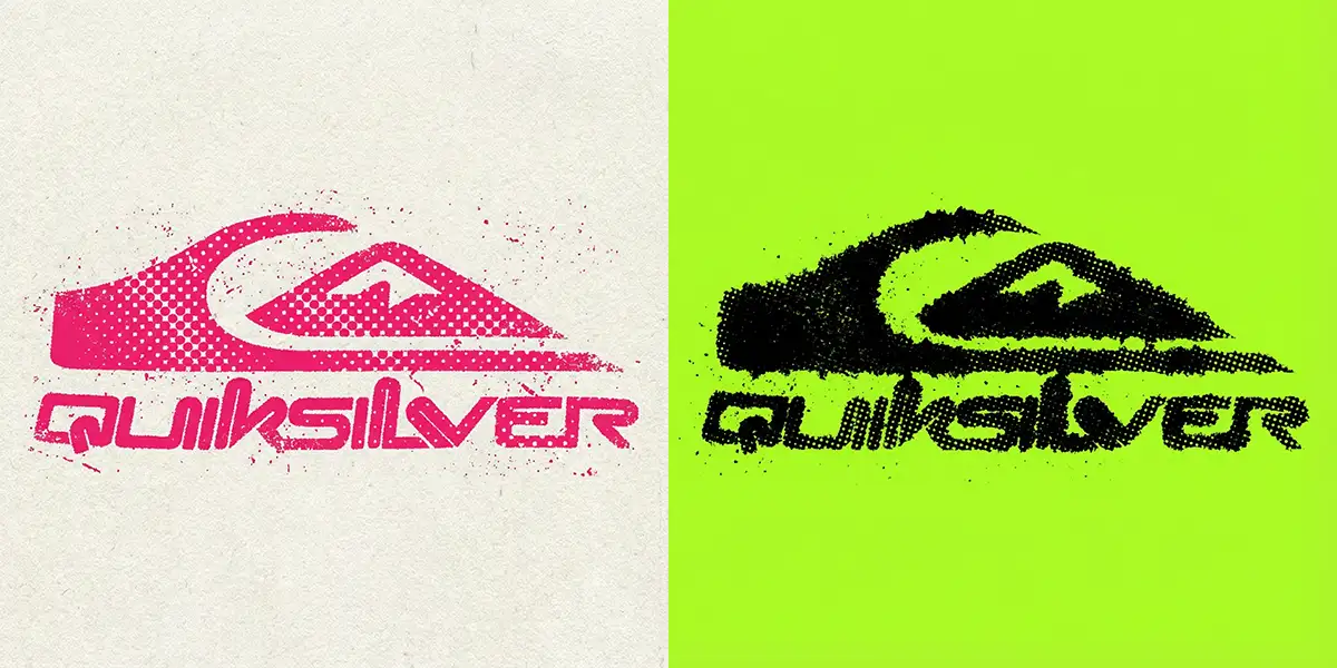
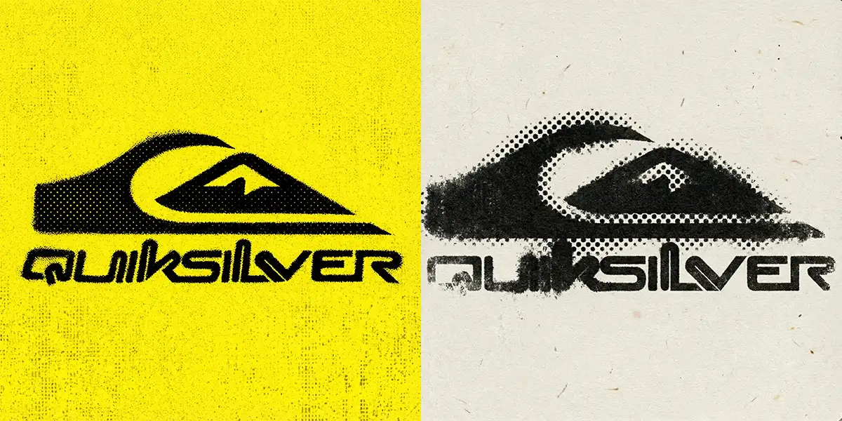
Step 3: Halftone and Color
This is where the effect really takes shape, and we introduce that half-tone pattern and (optionally) some color.
I went back to Pinterest and found images with cool halftone patterns – dots, lines, distress… anything that looks cool. I cropped them in various ways to focus on the dot patterns.
For the prompt, I tried two different approaches:
-
Generic Style Transfer: Just telling the AI “make it look like this image.”
- “Create an image of the logo as shown in [@]img1 but with the same medium, color palette, mood, printing technique, distortion, saturation level, textures, and overall style of [@]img2– Keep the logo, fonts and typography as shown in [@]img1″
-
Specific Prompting: Explicitly asking for “halftone effect” and “ink bleed” in the text prompt.
- “Add an ink bleed and halftone effect to the logo as shown in [@]img1 in the style of [@]img2 . – Keep the logo, fonts and typography as shown in [@]img1″
Embrace the “Happy Accident.”
Just like in a real darkroom, you never really know what you’re going to get. And that’s a good thing. I tried a few different combinations of prompts and reference crops. Some were gorgeous, some were a disaster, but that’s the creative process… just ride the wave!
If you want to get out of a creative rut, you have to be willing to let the process surprise you.
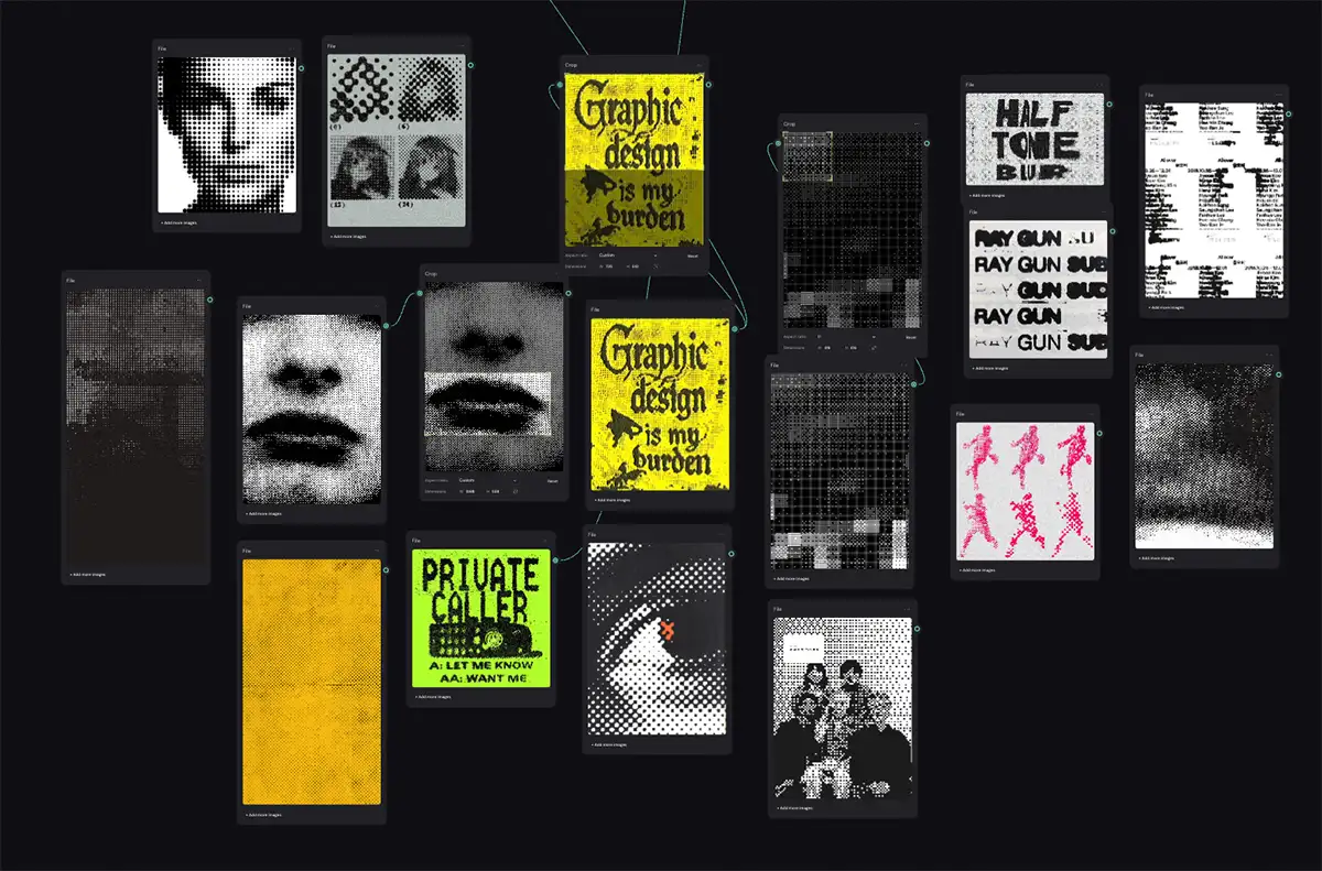
A small subset of my halftone reference images and how I experimented with cropping
Important Technical Note: Resolution
Make sure you specify 4K output in the Nano Banana Pro node settings. You want as many pixels as possible to resolve those tiny halftone dots. You can always use an upscaler later (like Topaz Gigapixel), but it is always better to start with high-resolution source material.
PS – More on Nano Banana Pro:
-
- How to repose a model
- How to do style transfer in Nano Banana
- Nano Banana FAQs
- Does JSON prompting work?
- How to master Nano Banana prompting
- Nano Banana vs ChatGPT Image 1.5
- How to use Midjourney with Nano Banana Pro
- Remove the Nano Banana watermark
- Set up a virtual product shoot with Nano Banana
- Create a VHS effect
- Add texture to a logo


")

")
