—
Since each of my staff are experts in their own right, fielding a growing amount of questions from you fine folks–and it’s nice to get a change in perspective–you’ll be seeing more and more posts from these talented people in weeks and months to come. Today, Scott takes the reins and answers a popular question about making great black & white images, with a case study to show you how. Take it away Scotty…
—
The world is not black and white…but the Seattle 100 post production is.
Following up on the popular guest blog post I penned about the sand jumper image, I thought I’d use this platform to respond to the string of questions I’ve been getting about how we got the striking high contrast black and white aesthetic in the Seattle 100 project.
In the tradition of this blog, this is not going to be a tutorial, rather a theoretical discussion with some visual aids to help illustrate. Post production, like photography is a vast set of tools which give an artist infinite ways to arrive at a finished product. Do not get caught up in the tools, they’re just tools.
Glad that’s out of the way. Now, here’s the theory of the Seattle 100 post production…
- Make the whites white and the blacks black.
- Emphasize interesting textures and features.
- De-emphasize distracting textures or features (see #1).
- Build contrast by adding layers (this can be very incremental).
- Black and white is a friendly medium, don’t be afraid.
- ‘Because it looks cool’ is a perfectly acceptable reason to do something.
Now a bit of the nitty gritty. I’ll dissect the layers briefly in order to illustrate the concept of creating real blacks and whites, and building contrast with layering. Before any of that is done there is a quick retouch process to remove surface blemishes. Since these are portraits and not glamour shots, the point of the retouching is just to be friendly with little bumps and blemishes, not to change the character or structure of the person in the image.
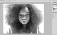
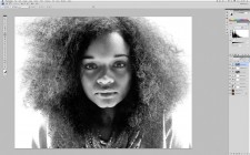
Next comes the conversion from color to black and white. I used a black and white adjustment layer set to yellow filter. The yellow and red filters tend to be very kind to skin, and generate strong contrast, a good initial starting point.
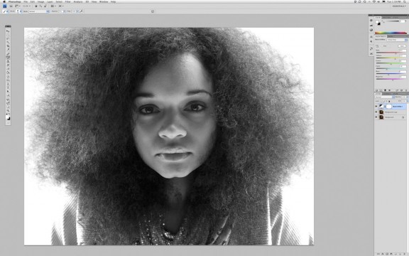
Converted to monochrome with black & white adjustment layer set to yellow filter. Yellow filter helps to make smooth skin.
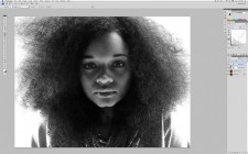
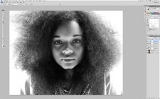
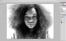
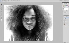
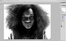
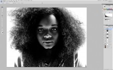
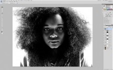
The rest of the final look is developed using only a series of levels and curves layers with some strategic use of masking in order to emphasize the good and hide the bad.
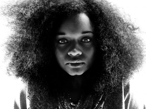
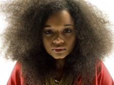
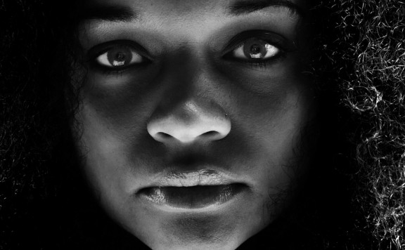
Take a look at the series of images. On one hand, there is a drastic difference in terms of the impact of the image. On the other hand, all of the elements were there in the original. The direct striking gaze, the smooth dark skin framed in darkness, the exquisite wild hair. All of the post production efforts were aimed at enhancing the image by drawing the eye to the most compelling parts of the portrait.
If you were to pick this image apart you’d find that the blacks are very much black, there’s no data in the areas that appear black. The same goes for the white. Those tones serve as the absence of detail so that your attention is drawn to the person in the frame. Conversely, you’ll also find that there is detail in every single pixel of her skin, eyes, nose, and lips. These are the areas that Chase was working hard to capture in the image, and those are the areas that are highlighted in the post production.
Each final image in the book was given it’s own custom retouching, and the techniques varied quite a bit depending on the person and circumstances. What did not vary was the aesthetic concept, which served as a constant guide in both the photographic and post production processes. The real trick is not to figure out the how, there are always a thousand ways from A to B. I could have substituted channel mixer layers, dodging and burning, retouch brushes in Aperture, etc. for the curves and levels techniques I used. The real key is to develop a vision, and then do whatever works for you in order to execute. To check out the rest of the Seattle 100 images visit www.chasejarvis.com/seattle100.
Scott Rinckenberger









Thanks for sharing your process, Scott!
Just so I’m clear, in all of the steps you mention, you’re making new adjustment layers, right? So you have multiple Curves and Levels layers? I’m fairly new to adjustment layers and still figuring out what I can do with them.
Claire,
You’re right on the mark. I’m making new adjustment layers. This helps to build more depth in the blacks and whites, and each layer is fine tunable via masking, opacity, blend modes, etc. Once you have a grasp on the layers concept, you’ll be unstoppable in PS.
Thanks for your expertise….nice to see and hear how things are done.
Scott, love the post mate!!! Note to Chase: We need to see more of Scotts amazing post production! Note to Scott, do you do the Color correction(b/w) for Chase’s video, cos that is great too, and we would loved to see you post that too. Note to chase again: we love you and the team dude! Thanks for sharing.
Rahim
Thanks for sharing! B&W are my favorite
Why don’t use Aperture to get your images in black & white?
Eliano,
Great question. In this photo, Aperture 3 would have done a great job. In a number of other images that we selected for the Seattle 100 book we had a need to do some more complex retouching that was best suited for Photoshop, although that line is continually getting pushed toward Aperture. I generally look at a project as a whole and go with the software solution that will cover all of the bases.