Chase Jarvis Chase Jarvis
  • Photos
  • Projects
  • About
  • Blog
  • Book
Chase Jarvis Chase Jarvis
  • Photos
  • Projects
  • About
  • Blog
  • Book

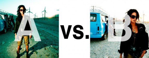
Which Photo is Better: A or B?

Alrighty. Regardless of the fact that this A or B series (here, here, and here) has been really interesting for us, helpful, and popular with you (the last such post received over 1000 comments in 24 hours)…

This time it is of even greater interest for us. You see, we’re doing some image editing around here and we’ve stumbled into a little internal debate about which one of these two images is actually better, A or B. [You might remember these shots from the Nikon D7000 campaign…]

Hearing from you will help really help us. No qualifiers, don’t worry about our objectives, or the “assignment”. We want to know which one of these shots you like better. And please tell us in the comments below, not via twitter. Raw preference. Period. If you can add some “why”, that would be nice too. Full 600 pixel wide images after the jump. Hit ‘continue reading’ below [and btw, I’ve got a $1 gentlemen’s bet riding with Erik about which one will win, so don’t let me down!]…

After you all weigh in, I’ll tell you which one I like, which one I thought you’d like, and why.

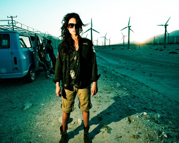
This is image A, below:
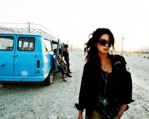
This is image B, below:
So which photo is better? A or B?

Related Posts

10 Things Every Creative Person (That’s YOU) Must Learn
051026_ChaseJarvis_einstein_writing_vlrgwidec
Writing Makes Photographers More Creative — 5 Easy Tips
Daniel Pink: The Power of Regret
Chris Hutchins of Chase Jarvis LIVE
Chris Hutchins: All the Hacks to Maximize Your Life
Chris Burkard on Chase Jarvis LIVE
The Wayward Path of Photographer Chris Burkard
Make Your Message Heard with Victoria Wellman

1,204 replies on:
Which Photo is Better: A or B?

Comments navigation

Previous
Next
  1. don says:
    August 12, 2011 at 7:47 pm

    B. My eyes are just drawn to it more and it draws the focus right to the woman. Even though you see let of her, it draws me in more.

  2. David Clifford says:
    August 12, 2011 at 9:59 am

    I’m going w/B but it’s entirely subjective. A appears better as a thumbnail. As you view them both there is more emotion coming from the female model in B and the au natural light makes it appear to be a more candid moment plus the look is more contemporary which I like. Nice work Chase.

  3. Cécile says:
    August 8, 2011 at 7:35 pm

    A for its punch and the surounding informations. I went straight into it like in a movie, B is a nice portrait but for me no statement, nearly no life like a fake natural wanting to look too natural,

  4. alpha says:
    August 5, 2011 at 11:58 pm

    B

  5. David says:
    August 3, 2011 at 5:53 am

    B, seems more natural

Comments navigation

Previous
Next

Comments are closed.

BUY NEVER PLAY IT SAFE NOW!

Get weekly, curated access to the best of everything I do.

Popular Posts

logo texture thumbHow to add texture to a logo with Nano Banana Pro (style transfer)
Asset 7weavy freepikWeavy vs Freepik Spaces: A Guide to Node-Based AI for Creative Pros
higgsfield nano bananaNano Banana with No Watermark? Here’s how to remove it.
meta ai dockMeta AI: Is it the “free Midjourney”? My in-depth review for creative pros.
style xfer thumbHow to Clone Any Image Style With Nano Banana Pro & Weavy (style transfer)
midjourney base imageDoes JSON Prompting Actually Work? Tested with Nano Banana
weavy style cobraWhat the heck is Weavy (Figma Weave)? The 100% honest review…
weavy floraWeavy vs Flora: Which is better for creative pros?
google flow uiWhat is Google Flow? My honest review of their AI video editor
Asset 6weavy comfyWeavy vs ComfyUI: Which Is Better for Creative Pros?

© 2024 Chase Jarvis. All rights reserved.