


A while back I had Grammy Award Winner, Sir Mix-A-lot on chasejarvisLIVE. The guy is smart – dropped some pretty serious knowledge on the show [here’s the re-watch if you missed it].
At the end of the show, I shot the cover for his upcoming album, live, online. Here are the results.
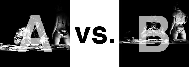
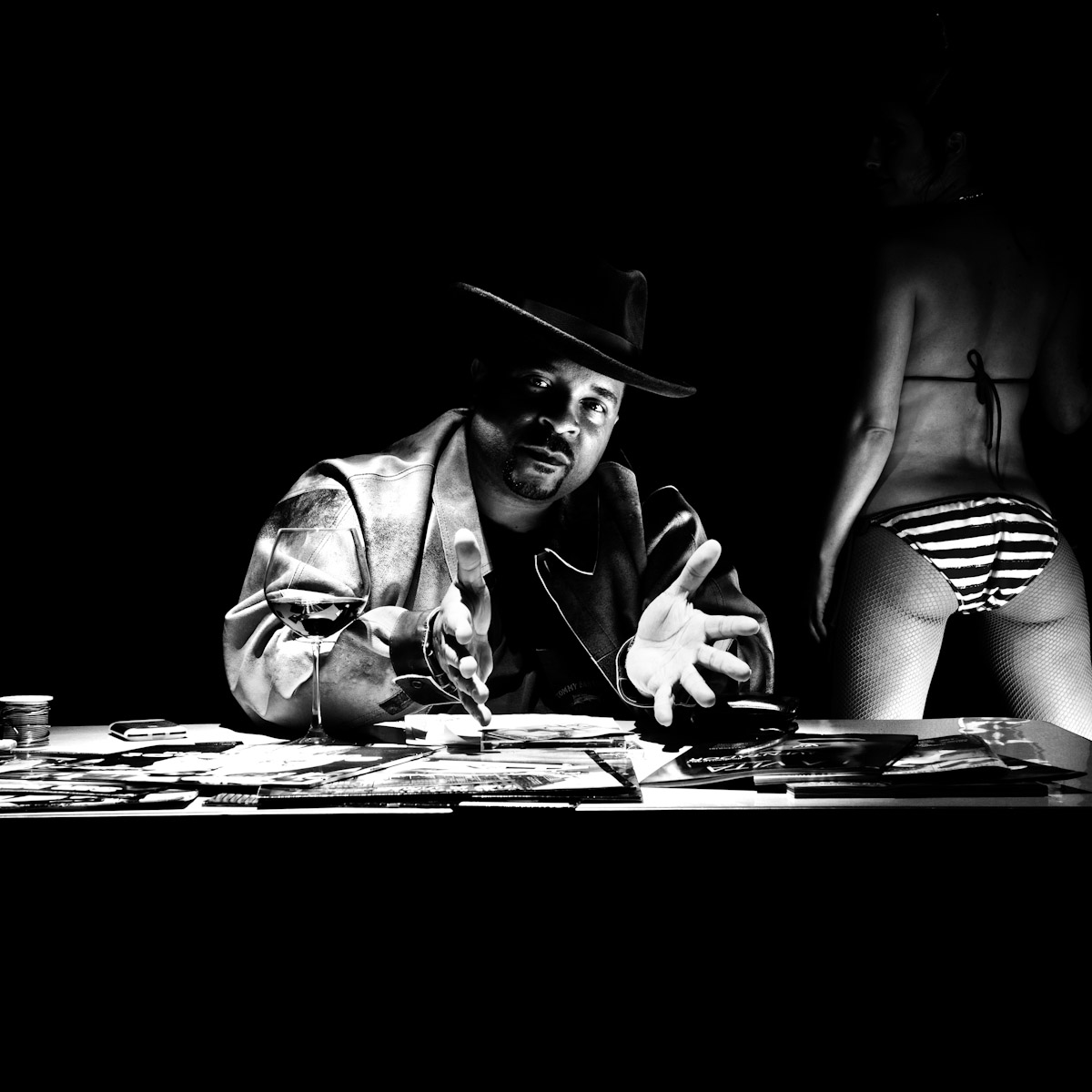
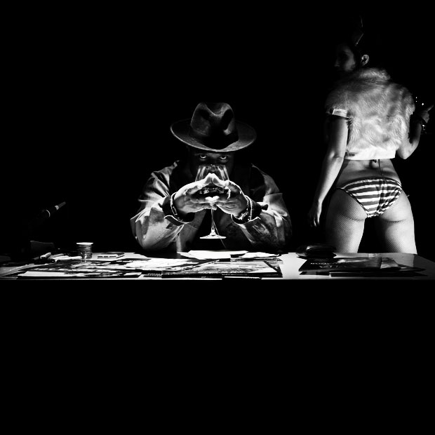
The lead one that shows his face is my fav, but there’s plenty of debate, because the other shot is tough and mysterious. I’ll resist the temptation to make any real case for one or the other, and I’ll let this is a straight up survey – which photo do you like better A (top) or B (bottom)? (please answer in the post, not via other social channels so we don’t have to chase your feedback – thx!)
Here is photo A:
Here is photo B:
Thanks for your input.
||And if you missed it: Here’s the chasejarvisLIVE episode with Mix||













B. Though I’d likee it even more if he just had steepled fingers, without that glass in his hands. I love the model’s fuzzy top, it softens the whole shot, in a good way.
A for sure. Baby’s got more back!
Seriously, A is clean and simple. The added wine glass to the face looks cool in B but I see it maybe a cropped, abstract, close up where you would have to study it a minute to figure out what it was inside the cd cover or something if anything. The jacket just doesn’t do anything. The image is still dirty.
B, I like the way my attention keeps getting drawn back to his eyes.
B I love the eyes.
I’m not sure it should be a matter of like and more a matter of purpose. What’s the objective? Both have their strengths and if the objective is clear then the more appropriate image will emerge.
Unless this is just an exercise to generate discussion, in which case I like ‘B’. It’s more unique. ‘A’ is a tad cliche’. Add a cigar and a stack of bills in front of him and you have your standard pimp imagery. Then again, maybe that’s your objective.