


A while back I had Grammy Award Winner, Sir Mix-A-lot on chasejarvisLIVE. The guy is smart – dropped some pretty serious knowledge on the show [here’s the re-watch if you missed it].
At the end of the show, I shot the cover for his upcoming album, live, online. Here are the results.
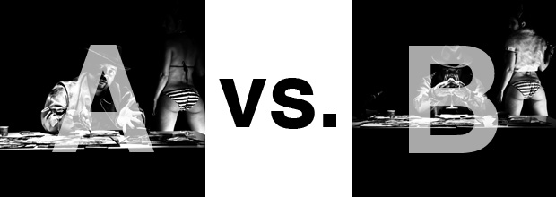
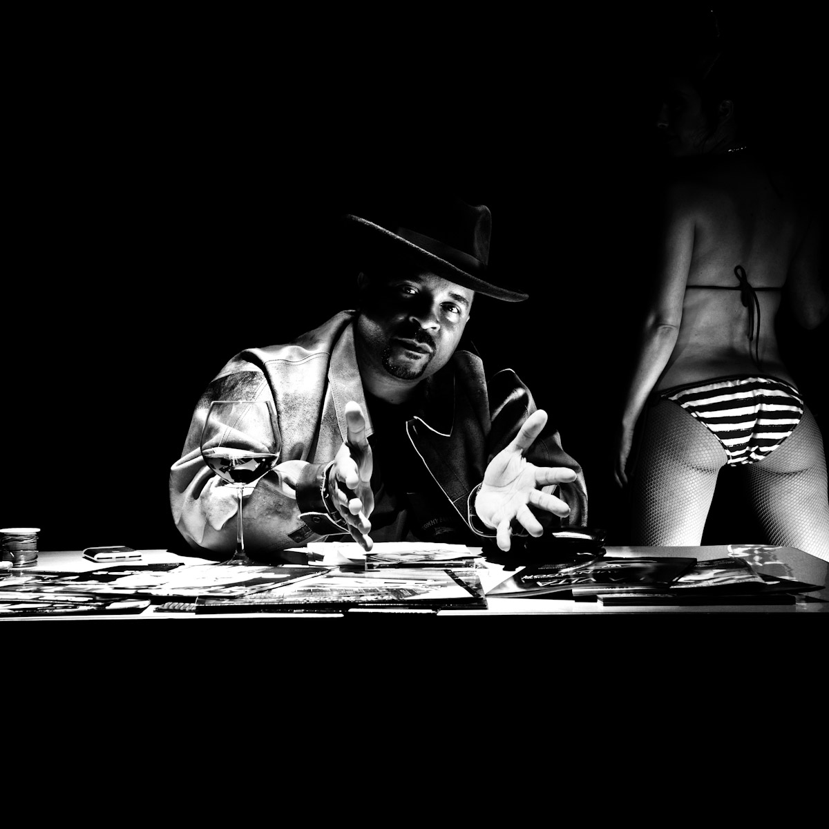
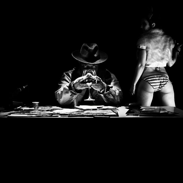
The lead one that shows his face is my fav, but there’s plenty of debate, because the other shot is tough and mysterious. I’ll resist the temptation to make any real case for one or the other, and I’ll let this is a straight up survey – which photo do you like better A (top) or B (bottom)? (please answer in the post, not via other social channels so we don’t have to chase your feedback – thx!)
Here is photo A:
Here is photo B:
Thanks for your input.
||And if you missed it: Here’s the chasejarvisLIVE episode with Mix||












Photo A, it implies open and frank communication and that’s what he does…… So photo A will sell more CD’s
Photo B , save it hopefully his new CD will “blow up” and you can use it to sell Courvoisier or Hennessy…….
Both shots are excellent and similar in composition and mood, but i really like A.
The viewer can see his face more, and it is really all about him, in the end. The light on his jacket pulls the eye up to his face and there is some openness like ‘come join me’ with his hands. Since the audience is his audience then I think A.
The second shot has too much mystery to it, that could be anyone with the glass and my eye goes more to the girls backside than him.
Depends on the message you’re conveying, but on an open playing field and for the edit/composition presented my feel is for A as it seems better balanced.
But … B would be miles ahead if the girl wasn’t in it.
Either PS her out (and the weird floating thing on the other side) or a 5×4 crop in on Mix-a-lot would be another quick solution …. and as a result it would be much much stronger.
CW
A…it has better balance and the girl’s top doesn’t distract like it does in image B
A. Leverage the facial recognition for the guy. They’re both awesome from a style perspective.