

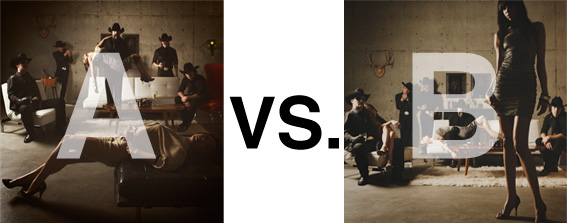
Remember when I did the original chasejarvisLIVE photo shoot way back in winter? If you recall, I was shooting the album cover image for alt/punk country band Brent Amaker and the Rodeo. We also did post production and editing on the images LIVE as well a few weeks after the shoot. Well now it’s time to print these suckers on a limited edition run of vinyl and there is somewhat of a debate on which image is better.
Simply put, and with no further explanation, I thought I’d ask for your thoughts. So which is better, A or B?
Vote in the comments. Also love to know ‘why’ if you care to explain. 500 px wide images after the jump…
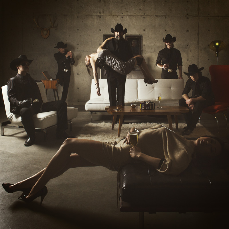
[ also, reminder that if you like music and you like chasejarvisLIVE, I’m hosting rising hip hip star RA Scion (of Common Market and Victor Shade) TODAY in 90 minutes at 10:30 pacific/1:30 eastern (GMT – 8). Interview with RA and Village Voice/Time Out/Stranger cultural critic Charles Mudede, plus RA performs LIVE at the end of the show. Hope to see you http://www.chasejarvis.com/live today….]A. With the foreground lady laying down…
OR.
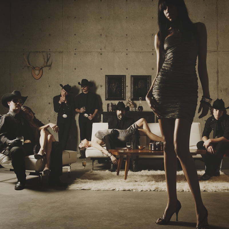
B. With the foreground lady standing up…
Love to hear your thoughts.











Definately B, stands out more. Guys are doing someting. But it also feels as if the woman in the foreground is the bandleader. If so, then B works great.
B for sure. More dynamic composition and framing.
I like B. Your eyes go straight to the lady in the foreground and take to the rest of the members of the band. Once you start looking at each of these, their poses and attitudes are more interesting: the guy carrying the lady in the middle looks better sitting (meaner and weirder), the guy on the left with the girl leaning on his side, the two guys in the background lighting a smoke and holding a drink also contribute to the weirdness of the scene
B for me. The models are what makes these images interesting. …and rightfully so. That’s what they do for a living. Album covers never really need to show off the band. Focusing on the visually “literal” aspect of an album cover by choosing the photo that best shows off the band, I think, misses the point of an album cover like this. Those dudes are just elements in the photos. It’s the models, man! They’re making this photo sing. So, for me, bigger is better.
I like A better. Although I feel the exposure could be bumped up a third stop. The foreground model is in a more flattering pose and is not overpowering the composition.
In B it looks like the shot is of the foreground model and there just happens to be an alt/punk country band in the background. If she [foreground] were a bit out of focus it think it could have worked better.
I would also like to add that I like the way that all the elements in shot A sort of form a circle that fills out the square-like frame. I feel that this is a better use of the space vs B. It has much better symmetry.
I think shot B’s asymmetry would work better with landscape dimensions.