

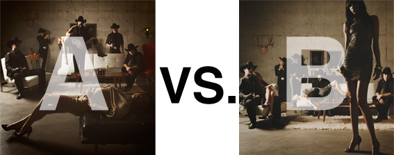
Remember when I did the original chasejarvisLIVE photo shoot way back in winter? If you recall, I was shooting the album cover image for alt/punk country band Brent Amaker and the Rodeo. We also did post production and editing on the images LIVE as well a few weeks after the shoot. Well now it’s time to print these suckers on a limited edition run of vinyl and there is somewhat of a debate on which image is better.
Simply put, and with no further explanation, I thought I’d ask for your thoughts. So which is better, A or B?
Vote in the comments. Also love to know ‘why’ if you care to explain. 500 px wide images after the jump…
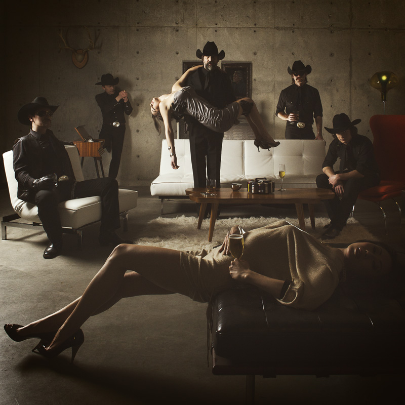
[ also, reminder that if you like music and you like chasejarvisLIVE, I’m hosting rising hip hip star RA Scion (of Common Market and Victor Shade) TODAY in 90 minutes at 10:30 pacific/1:30 eastern (GMT – 8). Interview with RA and Village Voice/Time Out/Stranger cultural critic Charles Mudede, plus RA performs LIVE at the end of the show. Hope to see you http://www.chasejarvis.com/live today….]A. With the foreground lady laying down…
OR.
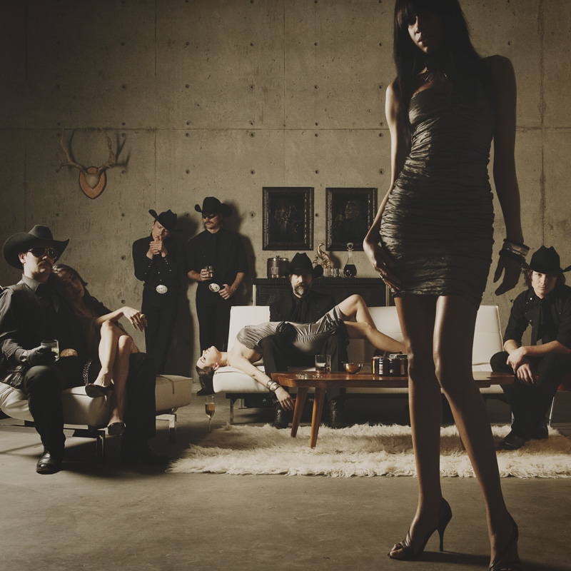
B. With the foreground lady standing up…
Love to hear your thoughts.













Call me square but I definitely go for the B.
In the A the girl in the first plan seems to be on awkward position somewhat unbalanced.
I also dislike the excessive poised position of the wine glass…
But that’s just my five cents.
Keep up the good work and thank you again for sharing.
Antonio
For me A works best as an album cover,it leads the eye to the band where as B tends to focus on the model in the foreground an remain there.
I like B for one main reason. A its like “here is a pic of a guys holding a woman in a crowded room” where as B is “here is a photo of a group of people and one guy just happens to have what could be a dead girl across his lap”. Which over all is more disturbing and odd because its just like “oh here is steve, don’t mind the dead body” haha
Knee Jerk Reaction is B
I felt distracted by the woman in the foreground. The vertical woman also adds contrast to the horizontal in the background which also draws attention to the main body of the work. The vertical woman is of interest but does not take away from the main subject.
Just my immediate thoughts.
Man I love your work.
Dale
B. I prefer only one horizontal line in B vs. the two created by the two women in A. And totally agree with Tania on commentary on A.