

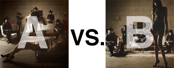
Remember when I did the original chasejarvisLIVE photo shoot way back in winter? If you recall, I was shooting the album cover image for alt/punk country band Brent Amaker and the Rodeo. We also did post production and editing on the images LIVE as well a few weeks after the shoot. Well now it’s time to print these suckers on a limited edition run of vinyl and there is somewhat of a debate on which image is better.
Simply put, and with no further explanation, I thought I’d ask for your thoughts. So which is better, A or B?
Vote in the comments. Also love to know ‘why’ if you care to explain. 500 px wide images after the jump…
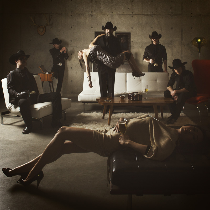
[ also, reminder that if you like music and you like chasejarvisLIVE, I’m hosting rising hip hip star RA Scion (of Common Market and Victor Shade) TODAY in 90 minutes at 10:30 pacific/1:30 eastern (GMT – 8). Interview with RA and Village Voice/Time Out/Stranger cultural critic Charles Mudede, plus RA performs LIVE at the end of the show. Hope to see you http://www.chasejarvis.com/live today….]A. With the foreground lady laying down…
OR.
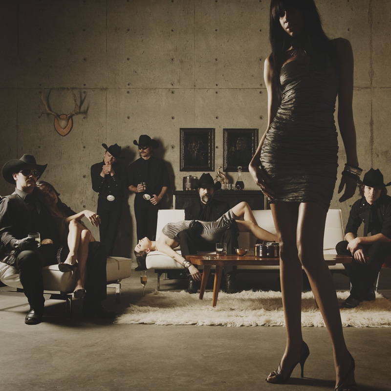
B. With the foreground lady standing up…
Love to hear your thoughts.













Hi everyone, between A and B, then A, in A the image is interesting and to take away the complete sinister look of the passed out girl, it is softened by the composition of the band members. ie it is complete posed and therefore not as creepy.
also in b, only because i shot a band photo similar to this but using one girl to the fore. I brought her so far forward that only her legs and body could be seen so that the band are clearly stated and the girl became a subject for the band and not viewer.
and Chase,thanks for the sharing all the great work.
What’s with the ‘dead’ girl? (Why do guys always like to put dead/submissive/injured/pass-out/prone girls in their photos…?) What is the band trying to communicate about themselves via this kind of imagery? What are YOU trying to communicate about the band…?
If the girl in B was sitting down in front of the coffee table, it would be the better shot. The only thing wrong with it is how she divides off the image and the guy to her right becomes sort of invisible. A has great composition too, but it would be more attractive (to me as a woman anyway) if the women were looking as cool as the guys rather than the ‘drunk hooker’ thing, but I don’t really want to comment on the subject matter since that could very well be what you were asked for!
A is intrigueing with the ‘fallen’ girl slumped in the guy’s arms, and definitely the one to go for. I love the composition overall.
B, by far. The subject comes out from the background much better.