

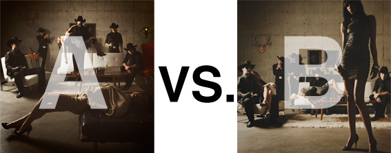
Remember when I did the original chasejarvisLIVE photo shoot way back in winter? If you recall, I was shooting the album cover image for alt/punk country band Brent Amaker and the Rodeo. We also did post production and editing on the images LIVE as well a few weeks after the shoot. Well now it’s time to print these suckers on a limited edition run of vinyl and there is somewhat of a debate on which image is better.
Simply put, and with no further explanation, I thought I’d ask for your thoughts. So which is better, A or B?
Vote in the comments. Also love to know ‘why’ if you care to explain. 500 px wide images after the jump…
[ also, reminder that if you like music and you like chasejarvisLIVE, I’m hosting rising hip hip star RA Scion (of Common Market and Victor Shade) TODAY in 90 minutes at 10:30 pacific/1:30 eastern (GMT – 8). Interview with RA and Village Voice/Time Out/Stranger cultural critic Charles Mudede, plus RA performs LIVE at the end of the show. Hope to see you http://www.chasejarvis.com/live today….]A. With the foreground lady laying down…
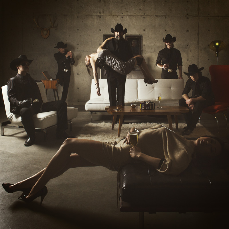
OR.
B. With the foreground lady standing up…
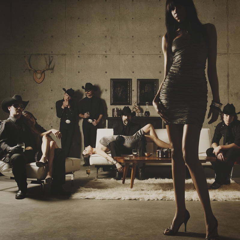
Love to hear your thoughts.












A is perhaps a better photograph, technically speaking.
B is better as a CD cover, because the negative space for text and the “mystery” it creates with the 3rd female.
Just my 2 pennies from across the pond.
Both are great, though for the purpose, B is probably better, since there is a nice bit of white space you can use for artist name and album name, without losing the punch of the image
Oops. Accidently posted as anonymous 😀
Hi Chase,
both pics a great. I like very much the scenery, colors and ambience. Nevertheless both have some that for my taste don’t make them excelent.
A: It is too dark and I’m saying this with my calibrated monitors. The face of the girls gets lost. Either you brighten up the scene or sth that would come even better is to leave the head outside the frame
B: I think this picture is my favourite. But although it is very interesting the cowboy on the girls left side it is to near to her hip. I also don’t like the cutted feet. the cutted head I like
In B I also would like to see the version where you take the girl more into the foreground only showing her legs. this would create mystery and more emphasis on the cowboys. but these is not the point here.
Nevertheless this are small things which don;t need to be taken care of. So if one of them need to be chosen it would be B
A- If the photo shoot is for the band
B- if the photo shoot is for the girl standing in the foreground.
‘B’ would be my choice. Everyone looks more relaxed and I get a greater sense of the members personalities. I do however find the model in the foreground a little distracting. I think if her facial features were darkened even more, she would act as a better divide.
Hope this helps.
Chris 🙂