

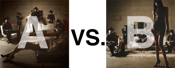
Remember when I did the original chasejarvisLIVE photo shoot way back in winter? If you recall, I was shooting the album cover image for alt/punk country band Brent Amaker and the Rodeo. We also did post production and editing on the images LIVE as well a few weeks after the shoot. Well now it’s time to print these suckers on a limited edition run of vinyl and there is somewhat of a debate on which image is better.
Simply put, and with no further explanation, I thought I’d ask for your thoughts. So which is better, A or B?
Vote in the comments. Also love to know ‘why’ if you care to explain. 500 px wide images after the jump…
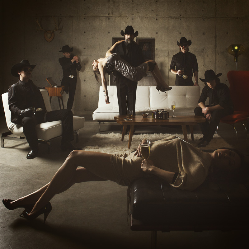
[ also, reminder that if you like music and you like chasejarvisLIVE, I’m hosting rising hip hip star RA Scion (of Common Market and Victor Shade) TODAY in 90 minutes at 10:30 pacific/1:30 eastern (GMT – 8). Interview with RA and Village Voice/Time Out/Stranger cultural critic Charles Mudede, plus RA performs LIVE at the end of the show. Hope to see you http://www.chasejarvis.com/live today….]A. With the foreground lady laying down…
OR.
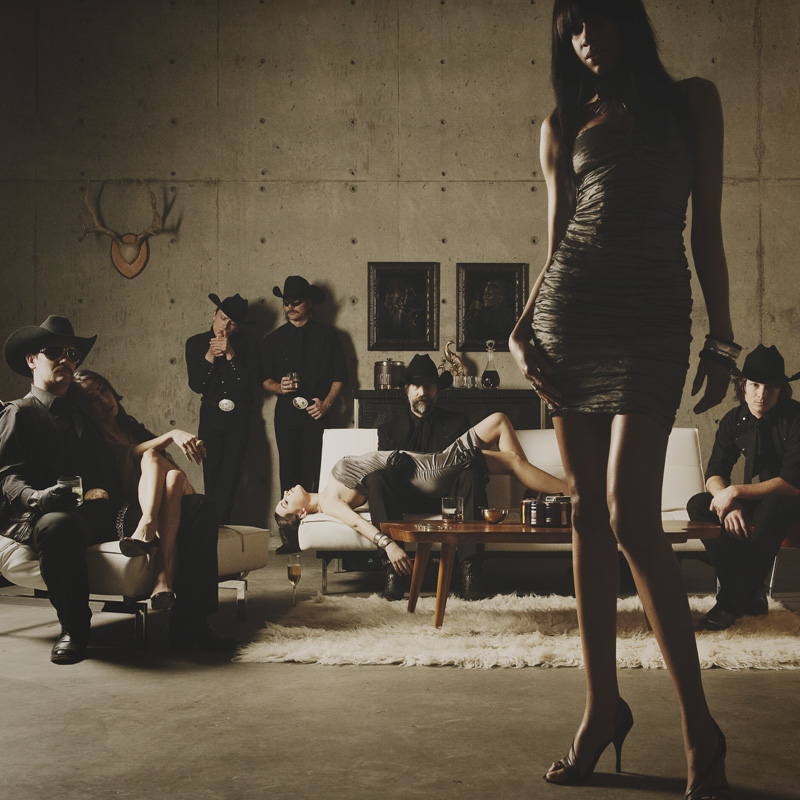
B. With the foreground lady standing up…
Love to hear your thoughts.













B is SO MUCH BETTER
A is almost boring because of the nearly symmetric composition.
B has a very strong composition, gets a much more deep perspective and has many beautiful elements in it: The Lady in the front looks much hotter, and the two guys at the wall totally rock.The only thing which is better in A is that the Sofa-guy doesn’t sit down there.
B is better by far. While A’s arrangement looks a bit cluttered and boring, B stands out differently, mainly because of the standing girl … further, its a bit more obvious theres a story going on in B
As a photography/graphic designer I cannot stress enough the need to consider the requirements the team behind the design of the album layout when it comes to choosing the cover photograph.
To a photographer it is a simple question of A versus B and the assessment of which image is a better use of space, light, etc. But the need to place the artist’s name, album title, and any other information really needs to talked about before the choice of the final image is made. The team in charge of that design should be involved in the process since it will weigh heavily on how the finished product impacts viewers.
Good treatment of type styling and placement on either image could elevate the finished cover to a superb example of design & photography working in harmony while poor design decisions can pull your carefully crafted images down with them.
Is there a design team involved at this point in the process? And if so, have they brought any constructive insight into which photograph might be more appropriate for the finished product and therefore, superior?
For what it is worth, my design instinct tells me image B would be easier to work with, but the challenges of image A would be a hell of a lot more fun to tackle.
Hi Chase
B IS THE ONE !
In my opinion, picture A and B are both good quality picture, but picture A is more interesting.
Picture A is more emphasizing in the group of man inside the picture. As when people see the picture, their eyes will easily fall into the man standing in the middle of the picture. But then in picture B, the first point people will see is the girl in the foreground as it is outstanding and the most obvious object seen in the picture.
The lighting of the picture also different as in picture A, the lighting is more concentrated in the middle of the picture and then in picture B the lighting is spread in all the picture.