
Replicating analog imperfections in a digital space has always been the holy grail. And let’s be honest: most “VHS effects” out there are bad. You know the ones—they just slap a scanline overlay and some chromatic aberration on a perfectly sharp image. It looks like a filter. It doesn’t look real.
Today, I’m going to walk you through a workflow that nailed this effect so perfectly it actually surprised me,
The goal here isn’t just to make a cool image; it’s to give you control over the process so you aren’t just gambling with a random seed.
Setting up the workflow
I’m using Nano Banana Pro for the base generation and Flux 2 Flex for the texture, all inside a node-based canvas called Weavy.ai (though you could use Flora, Freepik, or similar tools).
Why do it in steps in Weavy? Control – you can’t reliably oneshot a great image.
AI is probabilistic. You never really know what you’re going to get. If the AI nails the surfer but misspells the text, you have to re-roll the whole thing and you might lose that perfect wave.
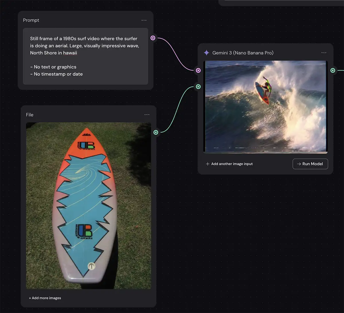
Step 1: The Base Image
Tool: Nano Banana Pro
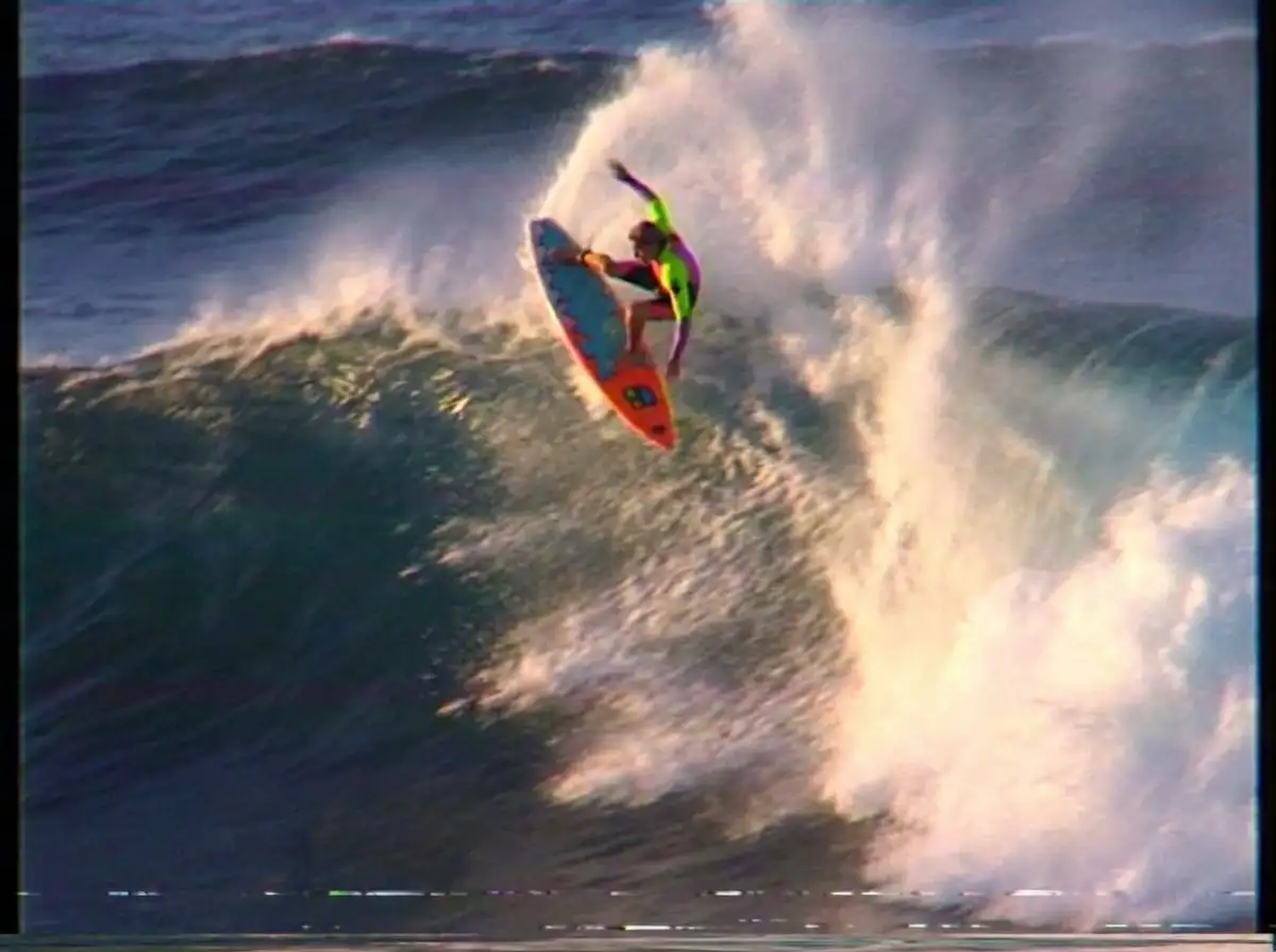
First, we generate our raw material. I wanted a classic 1980s surf vibe—visually impressive, big wave, North Shore Hawaii style.
I used a reference image of a vintage three-fin thruster board because I dig the graphic, but that part is optional. Add any specific pieces of gear or other items you want in the shot.
The Prompt:
Still frame of a 1980s surf video where the surfer is doing an aerial. Large, visually impressive wave, North Shore in hawaii. – No text or graphics – No timestamp or date
The Result: Nano Banana Pro gave us a great composition. It even has a subtle VHS look already because of the “1980s surf video” prompt, but it’s not quite there. It’s too clean. The dynamic range is too good. But that’s fine—this is just our foundation.
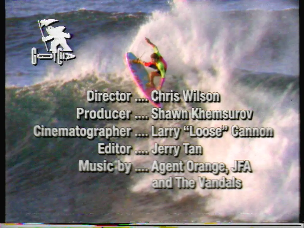
Step 2: The Graphics Layer
Tool: Nano Banana Pro
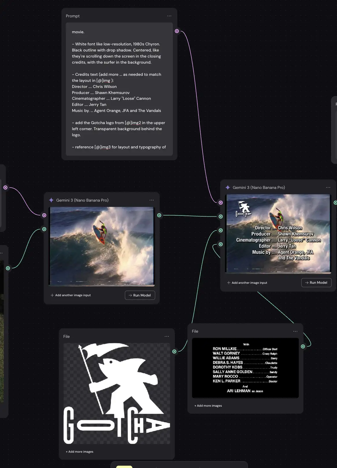
This is where the node-based workflow shines. Instead of hoping the AI “imagines” the text correctly, we add the text and logos as a separate layer.
I added the “Gotcha” logo and a block of credits text. By doing this separately, I can tweak the font, the spelling, and the position without changing the surfer image. If I decide I want the director to be “Chris Wilson” instead of “Alan Smithee,” I just change the text node. I don’t have to re-generate the wave.
At this stage, the image looks like a high-res digital mockup. The text is razor-sharp, almost like Photoshop. That’s about to change.
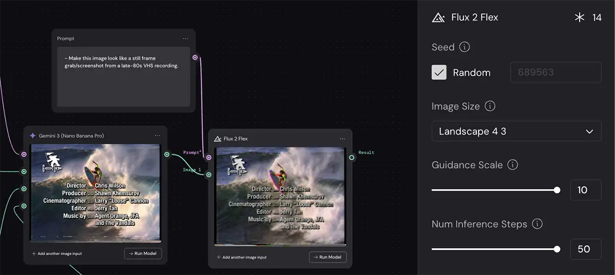
Step 3: Adding the VHS effect with Flux
Tool: Flux 2 Flex
Now for the magic. We are going to feed our clean, composited image into an Image-to-Image model to degrade it.
I tested this with almost every model out there—Seedream Edit, Reve, OpenAI Image 1.5, Flux 2 Pro, Higgsfield. Surprisingly, Flux 2 Flex blew them all away.
The Lesson: Always test different models. Just because a model is the “newest” or “most expensive” doesn’t mean it’s the best at specific stylistic tasks like analog degradation.
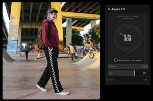
The Settings
This part is critical. If you leave everything on default, the AI might try to “fix” your image and make it look modern again.
-
Guidance Scale (Set to Max/10): This tells the model how strictly to follow your prompt. Since our prompt is about degrading the image, we want the model to listen closely. High guidance forces those artifacts to appear.
-
Inference Steps (Set to Max/50): This controls how many “passes” the AI makes to generate the image. For noise, grain, and complex textures like “dot crawl,” you need high inference steps. If this is too low, the noise will look like mushy digital artifacts rather than crisp analog grain.
The Prompt
I tried a massive, paragraph-long prompt describing every single artifact (tracking error, tape dropouts, luma ringing, etc.).
Guess what? It looked terrible. It looked like a parody of a VHS tape.
Then I tried this simple prompt:
Make this image look like a still frame grab/screenshot from a late-80s VHS recording.
Boom. It was perfect.
The Lesson: Never assume that “more detailed” equals “better.” Sometimes, giving the model a broad creative direction allows it to access its internal training data on what “VHS” looks like more naturally than if you try to micromanage every pixel.
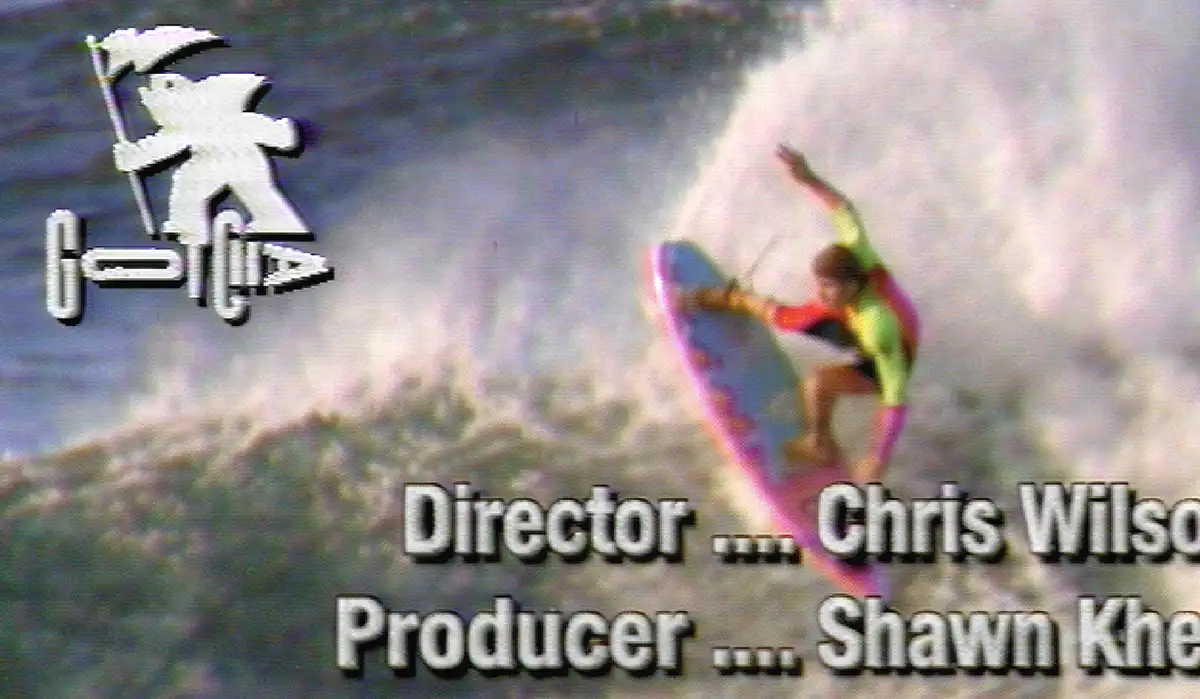
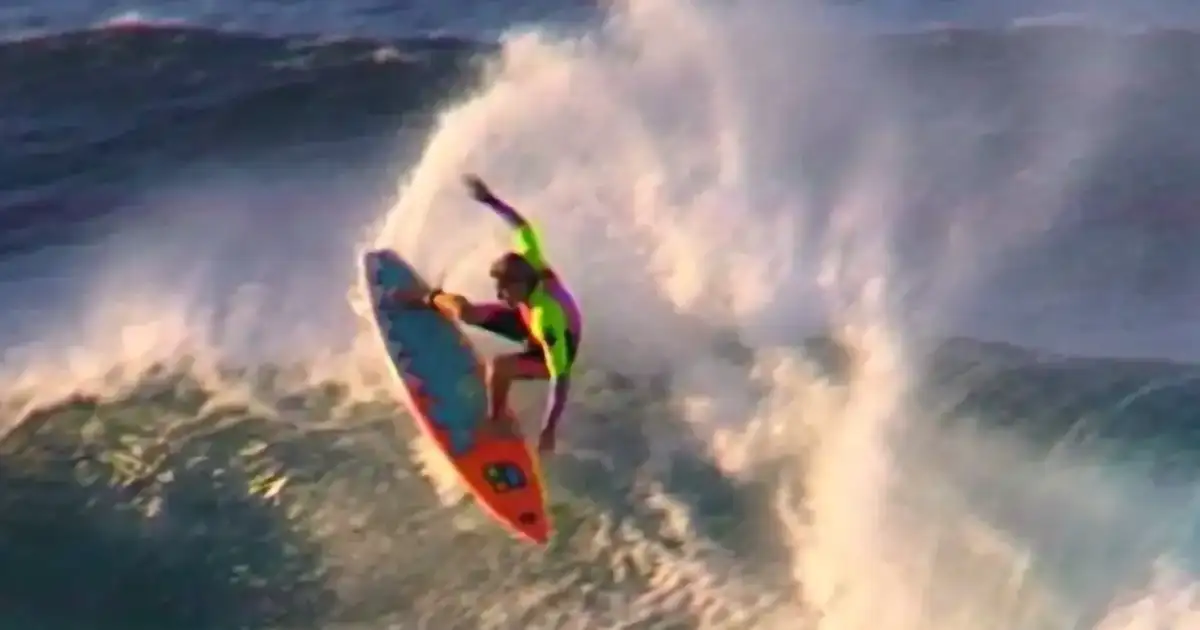
Analyzing the final VHS effect
Look closely at the final result from Flux 2 Flex.
-
The Text Bleed: The white text isn’t white anymore. It’s bleeding slightly into the background, and the edges are shimmering. This is exactly what happens when you record high-contrast text onto magnetic tape.
-
Color Smear: The reds and oranges on the surfer and the board are “smearing” slightly to the right. That’s authentic NTSC color artifacts.
-
Head Switching Noise: There’s that subtle band of distortion at the very bottom of the frame. It’s a flaw, but it’s the right flaw.
It prioritizes authenticity over legibility. That is the key to the aesthetic. If you can read the text perfectly, it’s not VHS.
PS – More on Nano Banana Pro:
- How to repose a model
- How to do style transfer in Nano Banana
- Nano Banana FAQs
- Does JSON prompting work?
- How to master Nano Banana prompting
- Nano Banana vs ChatGPT Image 1.5
- How to use Midjourney with Nano Banana Pro
- Remove the Nano Banana watermark
- Set up a virtual product shoot with Nano Banana
- Nano Banana pricing
- Add texture to a logo


")


")


? The 100% honest review...")

