

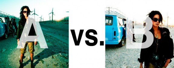
Alrighty. Regardless of the fact that this A or B series (here, here, and here) has been really interesting for us, helpful, and popular with you (the last such post received over 1000 comments in 24 hours)…
This time it is of even greater interest for us. You see, we’re doing some image editing around here and we’ve stumbled into a little internal debate about which one of these two images is actually better, A or B. [You might remember these shots from the Nikon D7000 campaign…]
Hearing from you will help really help us. No qualifiers, don’t worry about our objectives, or the “assignment”. We want to know which one of these shots you like better. And please tell us in the comments below, not via twitter. Raw preference. Period. If you can add some “why”, that would be nice too. Full 600 pixel wide images after the jump. Hit ‘continue reading’ below [and btw, I’ve got a $1 gentlemen’s bet riding with Erik about which one will win, so don’t let me down!]…
After you all weigh in, I’ll tell you which one I like, which one I thought you’d like, and why.
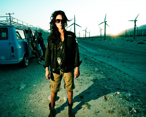
This is image A, below:
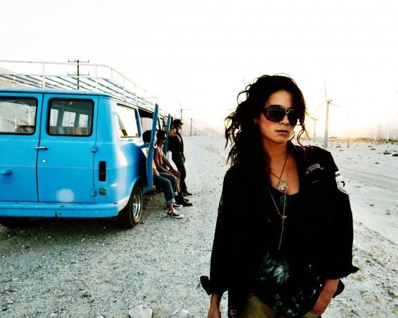
This is image B, below:
So which photo is better? A or B?











B.
Everytime i look at A, my eye runs from the left side of her face down to that obnoxious shadow and back again. I can tell there is some interesting stuff happening in the background, but its kinda like trying to watch TV with someone standing in front of you.
I would LOVE to see a version of A where the light source was basically shot over the top of the model’s head, -eliminating the secondary focal point on the ground- so her face is subtly lit by the falloff of the light source. Then i believe the eye would travel to her face, then through the background story… anyhow, that’s my .02.
cheers
B – the lack of light n the sun side of her face in A is disturbing and I love the positive feeling of sunlight coming thru the windmills on B – the van and passengers is complimentary as well and can be a blurred out negative space if needed w/minimal post processing, also the model’s body language is more open and inviting
B
B.
A, too me, just looks over-produced and posed. The first thing I notice when looking a A is the color and lighting. “Why is everything so green?” “Why is she standing in a spotlight?” “Why is she standing like that at all?”
B is all about the girl and the story (the composition flows naturally to the guys behind). The pose doesn’t look as forced, and the bright (non-colored) background emphasizes the fact they’re in the desert.
So B tells me a story, while A tells me someone was experimenting his lighting and mood-enhancing in Photoshop.
B, hands down–attitude, composition, lighting