Chase Jarvis Chase Jarvis
  • Photos
  • Projects
  • About
  • Blog
  • Book
Chase Jarvis Chase Jarvis
  • Photos
  • Projects
  • About
  • Blog
  • Book

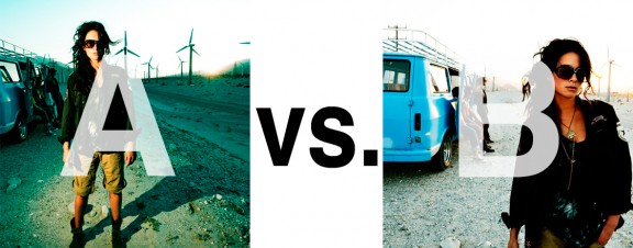
Which Photo is Better: A or B?

Alrighty. Regardless of the fact that this A or B series (here, here, and here) has been really interesting for us, helpful, and popular with you (the last such post received over 1000 comments in 24 hours)…

This time it is of even greater interest for us. You see, we’re doing some image editing around here and we’ve stumbled into a little internal debate about which one of these two images is actually better, A or B. [You might remember these shots from the Nikon D7000 campaign…]

Hearing from you will help really help us. No qualifiers, don’t worry about our objectives, or the “assignment”. We want to know which one of these shots you like better. And please tell us in the comments below, not via twitter. Raw preference. Period. If you can add some “why”, that would be nice too. Full 600 pixel wide images after the jump. Hit ‘continue reading’ below [and btw, I’ve got a $1 gentlemen’s bet riding with Erik about which one will win, so don’t let me down!]…

After you all weigh in, I’ll tell you which one I like, which one I thought you’d like, and why.

This is image A, below:
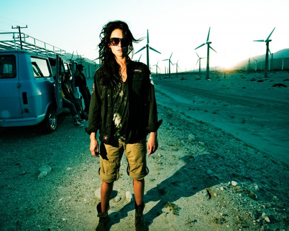
This is image B, below:
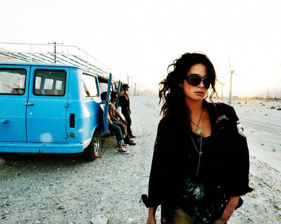
So which photo is better? A or B?

Related Posts

10 Things Every Creative Person (That’s YOU) Must Learn
051026_ChaseJarvis_einstein_writing_vlrgwidec
Writing Makes Photographers More Creative — 5 Easy Tips
Daniel Pink: The Power of Regret
Chris Hutchins of Chase Jarvis LIVE
Chris Hutchins: All the Hacks to Maximize Your Life
Chris Burkard on Chase Jarvis LIVE
The Wayward Path of Photographer Chris Burkard
Make Your Message Heard with Victoria Wellman

1,204 replies on:
Which Photo is Better: A or B?

Comments navigation

Previous
Next
  1. Eric Ferrar says:
    February 16, 2011 at 9:14 am

    I like them both but B is my pick. In the words of Mr. Maisel “Light gesture and color” .
    Also if you were tryining to sell sunglass’s a close up shot of Lidsay would be better.

  2. Paul Lettieri says:
    February 16, 2011 at 9:13 am

    B is better. The model does not look like she knows what to do with her hands in A. I also don’t like that she partially obscures the folks in the van.

  3. kyle brasier says:
    February 16, 2011 at 9:12 am

    A- I love the fact that the subject is unatualy lit and the whole scene is a bit under exposed

  4. Jonathan Yearsley says:
    February 16, 2011 at 9:08 am

    B

    I prefer the natural colour and tone. The fact that you can see all of the models face and also the guys in the van. Seeing more of the surroundings puts the model into better context and perhaps helps tell the story more.

    I also like the blown out skyline, just allowing the turbines to creep into the exposure.

  5. mattbeaty says:
    February 16, 2011 at 9:07 am

    Add the turbine and sky color from A to B and you’ve got yourself a winner. As is, I’m gonna have to say A

Comments navigation

Previous
Next

Comments are closed.

BUY NEVER PLAY IT SAFE NOW!

Get weekly, curated access to the best of everything I do.

Popular Posts

Fluffy-Monsters.max-1080×1080.format-webpHow to Use Nano Banana Pro for Free (Without a Watermark)
google flow uiWhat is Google Flow? My honest review of their AI video editor
weavy style cobraWhat the heck is Weavy (Figma Weave)? The 100% honest review…
comfyuiWhat the heck is ComfyUI? And is it right for creative pros?
style xfer thumbHow to Clone Any Image Style With Nano Banana Pro & Weavy (style transfer)
higgsfield angles uiHiggsfield Angles 2.0 is here: My 100% Honest Review
midjourney screen in dark roomMidjourney FAQs: The Essential Guide for Creative Pros
nano grain thumbHow To Add Film Grain With Nano Banana Pro (3 methods)
Asset 24freepik logoWhat Is Freepik Spaces? And Is It Good For Creative Pros?
vibe motion thumbHiggsfield Vibe Motion Is Here: My Honest Review for Creative Pros

© 2024 Chase Jarvis. All rights reserved.