


Alrighty. Regardless of the fact that this A or B series (here, here, and here) has been really interesting for us, helpful, and popular with you (the last such post received over 1000 comments in 24 hours)…
This time it is of even greater interest for us. You see, we’re doing some image editing around here and we’ve stumbled into a little internal debate about which one of these two images is actually better, A or B. [You might remember these shots from the Nikon D7000 campaign…]
Hearing from you will help really help us. No qualifiers, don’t worry about our objectives, or the “assignment”. We want to know which one of these shots you like better. And please tell us in the comments below, not via twitter. Raw preference. Period. If you can add some “why”, that would be nice too. Full 600 pixel wide images after the jump. Hit ‘continue reading’ below [and btw, I’ve got a $1 gentlemen’s bet riding with Erik about which one will win, so don’t let me down!]…
After you all weigh in, I’ll tell you which one I like, which one I thought you’d like, and why.
This is image A, below:

This is image B, below:
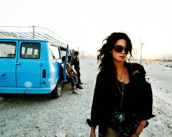
So which photo is better? A or B?













I like them both but B is my pick. In the words of Mr. Maisel “Light gesture and color” .
Also if you were tryining to sell sunglass’s a close up shot of Lidsay would be better.
I prefer B.
It fills more of the frame, whereas frame right of A is just dead space. The girl seems to be moving, or have some kind of intention instead of standing stock still. Also I find the light halo on the ground around the model really distracting in A — When I see a picture I don’t want to be aware of the lighting, I want to be wowed by the photo. The presence of the halo takes me out of the picture and into my own head.
A!!
I like it better because the lighting is better, and the background makes the photo a lot more interesting. In photo B, the background highlights are completely blown out which bothers me
B… More natural composition