

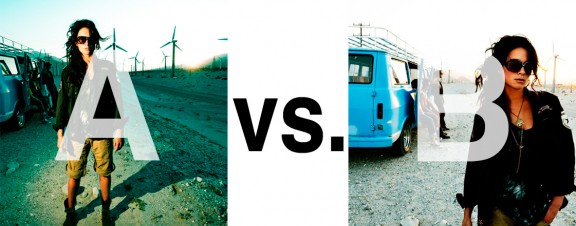
Alrighty. Regardless of the fact that this A or B series (here, here, and here) has been really interesting for us, helpful, and popular with you (the last such post received over 1000 comments in 24 hours)…
This time it is of even greater interest for us. You see, we’re doing some image editing around here and we’ve stumbled into a little internal debate about which one of these two images is actually better, A or B. [You might remember these shots from the Nikon D7000 campaign…]
Hearing from you will help really help us. No qualifiers, don’t worry about our objectives, or the “assignment”. We want to know which one of these shots you like better. And please tell us in the comments below, not via twitter. Raw preference. Period. If you can add some “why”, that would be nice too. Full 600 pixel wide images after the jump. Hit ‘continue reading’ below [and btw, I’ve got a $1 gentlemen’s bet riding with Erik about which one will win, so don’t let me down!]…
After you all weigh in, I’ll tell you which one I like, which one I thought you’d like, and why.
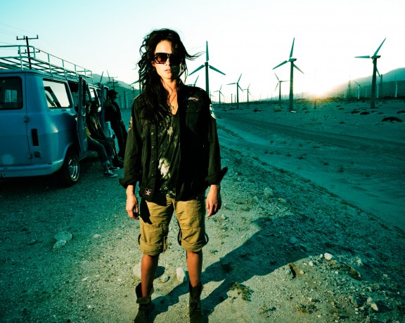
This is image A, below:
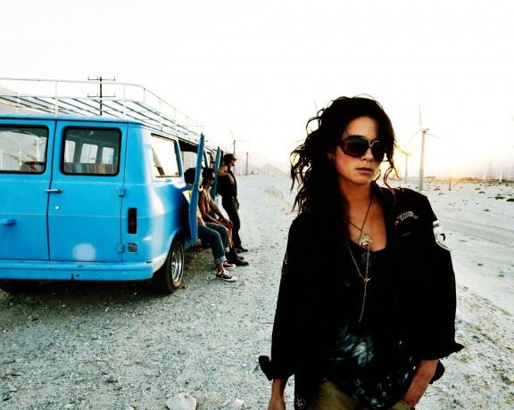
This is image B, below:
So which photo is better? A or B?












Most definitely B. A contains alot of stuff that in my honest opinion just distracts from the image… B gives you something to focus on
B.
I prefer the impact of a higher contrast..
A for color, environment, B for naturalness, model position / dynamism, more natural lighting. And neither because they’re both clearly fake. I mean, a girl like that walks by and NONE of the guys in the van looks after her? That’s not really likely, is it?
A!!!
The Shot is more colplete with “A” due to the lighting, everything seems to mesh better and it looks like the subject is part of the picture unlike “B” where it looks like the shot was an after thought. Also the lighting and shadows are far better with “A”. But that is just my 2 cents…
~CMD
B is the better photo, imo. Here’s why:
First of all, as you mentioned that this is a promotional campaign for Nikon, the goal (presumably, and amongst other things) is to show that the camera can handle a high dynamic range. B displays this a lot better than A does.
Second, the color, lighting, and contrast in B is more ‘sell-able” than A. As a consumer and photographer, I would want to see that a camera is capable of reproducing color and contrast effectively. B does this more effectively than A. Her face in B is also less contrasty, making her look more inviting. Also, the color juxtaposition is more favorable in B than in A.
Third, pose & composition. There is too much crammed into the left side of the frame in A. I don’t really get an understanding that it is indeed a van to her left. Despite trying to create effective leading lines with the road and the slope of the van’s roof (framing her between them), the hard shadow she’s casting negates the intended effectiveness of the pre-mentioned framing. My eye gets dragged out to the right of frame into a ‘dead-zone’ of the image. Also in A, her straight-on pose makes me a bit uncomfortable (sorry!). With B, my eye stays locked on the subject, framed by both the van and the windmill. The darkness of her jacket prevents my eye from getting pulled out of the frame. Her head sits nicely just above the horizon too. The composition is tight, without being rigid and I can still wander around the photo without losing the subject.
That’s pretty much it…:)