


A while back I had Grammy Award Winner, Sir Mix-A-lot on chasejarvisLIVE. The guy is smart – dropped some pretty serious knowledge on the show [here’s the re-watch if you missed it].
At the end of the show, I shot the cover for his upcoming album, live, online. Here are the results.
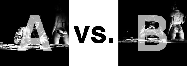
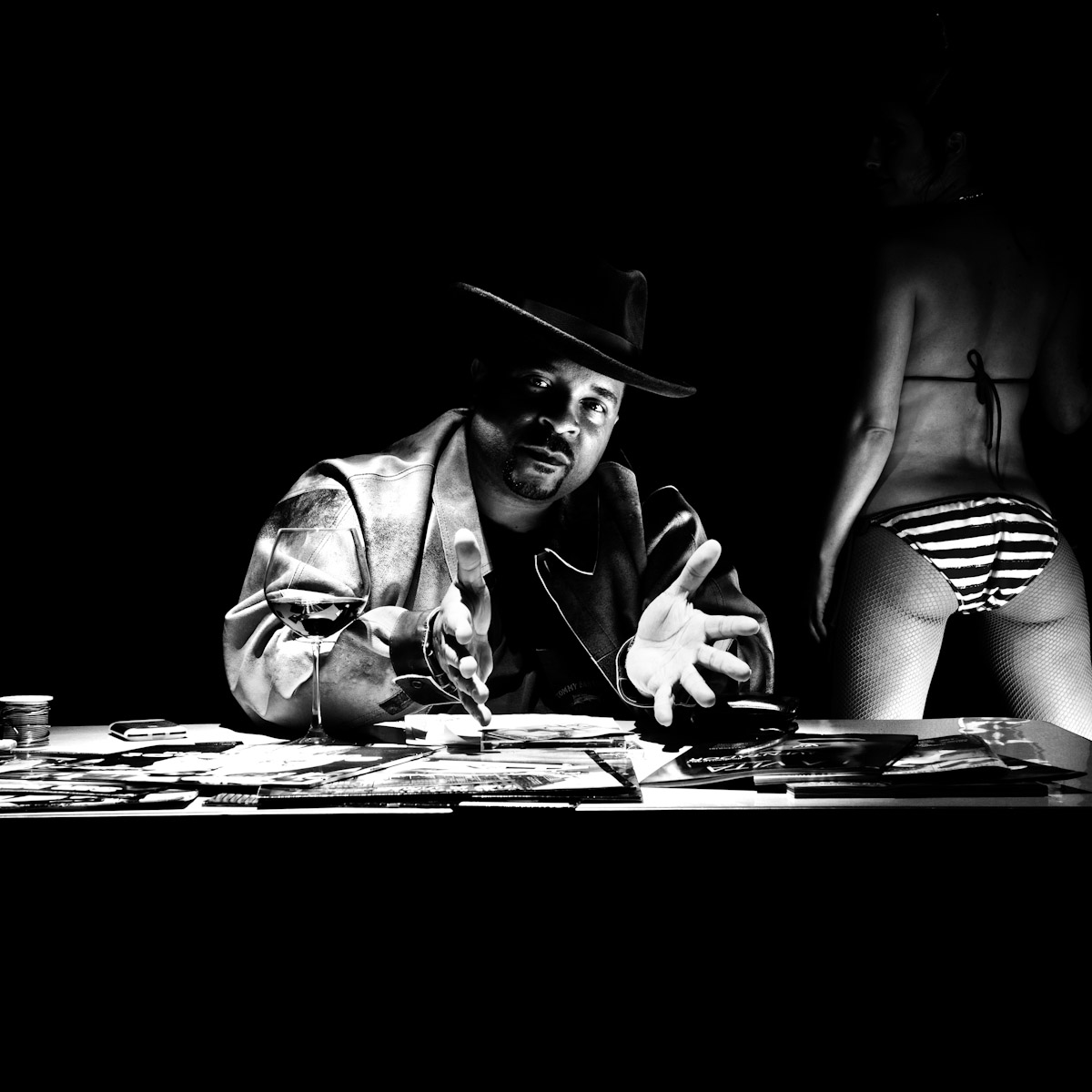
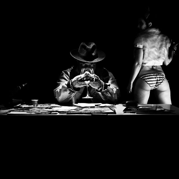
The lead one that shows his face is my fav, but there’s plenty of debate, because the other shot is tough and mysterious. I’ll resist the temptation to make any real case for one or the other, and I’ll let this is a straight up survey – which photo do you like better A (top) or B (bottom)? (please answer in the post, not via other social channels so we don’t have to chase your feedback – thx!)
Here is photo A:
Here is photo B:
Thanks for your input.
||And if you missed it: Here’s the chasejarvisLIVE episode with Mix||










A..!
I couldn’t put my finger on what bothered me about B initially, but I think B doesn’t do it for me because he looks like he is hiding behind the glass. I suppose one could interpret that as mysterious, but it reads as hiding to me. It’s also the body language between A and B – in the first picture, his shoulders are wide and he owns the space. In the second one, because his shoulders are rounded from having to hold the glass in front of his face, it makes him look shorter and again, like he is hiding.
Tough call though, I see what you mean.
Photo A
Has to be A).
Only needs one face!
I would buy A, like his face gesture.
I like the composition and lighting of B, but I like Mix more in A.
I like that he’s identifiable, more accessible to the viewer in A.
I don’t like that the model is headless (but I kinda’ do, just a part of me does). I don’t like that his right hand is straight towards the camera and it looks weird to me.
I like B because it’s moody, all key components are lit well, I like that his eyes are peeking through. I don’t like that his face is hidden (but again, part of me does hehe).
I watched this whole cjLIVE… I loved it. Both are great photos, Sir Chase. 😀