


A while back I had Grammy Award Winner, Sir Mix-A-lot on chasejarvisLIVE. The guy is smart – dropped some pretty serious knowledge on the show [here’s the re-watch if you missed it].
At the end of the show, I shot the cover for his upcoming album, live, online. Here are the results.
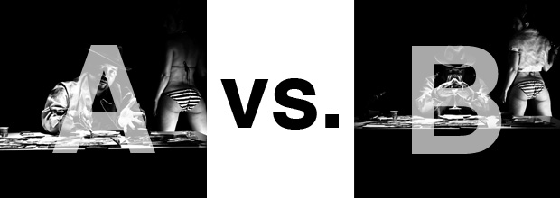
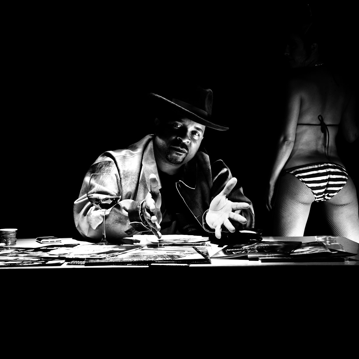
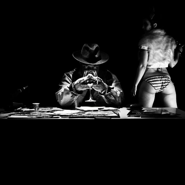
The lead one that shows his face is my fav, but there’s plenty of debate, because the other shot is tough and mysterious. I’ll resist the temptation to make any real case for one or the other, and I’ll let this is a straight up survey – which photo do you like better A (top) or B (bottom)? (please answer in the post, not via other social channels so we don’t have to chase your feedback – thx!)
Here is photo A:
Here is photo B:
Thanks for your input.
||And if you missed it: Here’s the chasejarvisLIVE episode with Mix||












A for sure. I don’t like the way he’s hiding behind the glass in B as if he’s some cartoon evil overlord plotting his next retarded idea for world domination. The girl in B is better, and the wider angle has some attraction, but it doesn’t make up for it.
Depends on the album style. Context is EVERYTHING.
But as a photo….
B is a more striking photo, but the panties across her butt looks sloppy.
However, “A” fits his style a bit more, unless he’s going after a more 1930’s noire feel in his new album.
I’d like to see a composite of the two. I’d use Sir from A and woman from B.
I like A a lot, butt I also like B. Butt then again A is really strong, butt B is more intense.
(all butts aside, A)
A. No doubt!