


A while back I had Grammy Award Winner, Sir Mix-A-lot on chasejarvisLIVE. The guy is smart – dropped some pretty serious knowledge on the show [here’s the re-watch if you missed it].
At the end of the show, I shot the cover for his upcoming album, live, online. Here are the results.
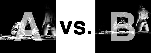
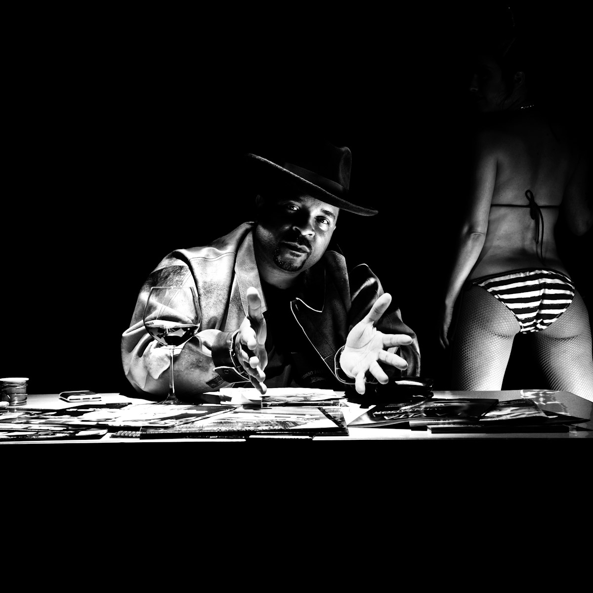
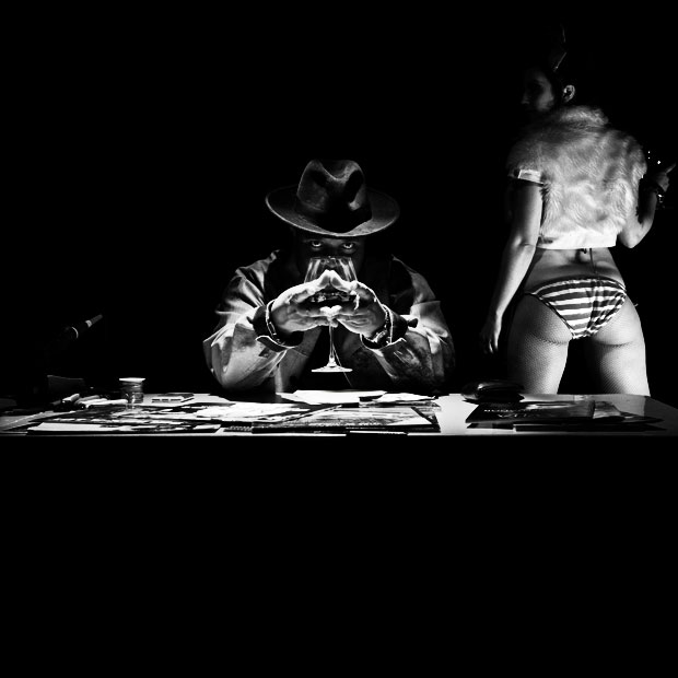
The lead one that shows his face is my fav, but there’s plenty of debate, because the other shot is tough and mysterious. I’ll resist the temptation to make any real case for one or the other, and I’ll let this is a straight up survey – which photo do you like better A (top) or B (bottom)? (please answer in the post, not via other social channels so we don’t have to chase your feedback – thx!)
Here is photo A:
Here is photo B:
Thanks for your input.
||And if you missed it: Here’s the chasejarvisLIVE episode with Mix||










THey both look a little unbalanced to me, I would of ditched the girl and gone in closer. That shape created by his hands in B looks awkward, so if its a choice A
They are both great shots, but I prefer ‘A’ more as its more expressive, in b he seems a little hidden behind the glass
A (But with the girls head from B)
Photo A. It sitll has some of the mystery, even toughness of B, but it is more welcoming and the viewer immediately senses the mood. In B, the viewer spends time trying to interpret the wine glass in front of face before being able to step back and appreciate the larger image and to find/experinece its mood or atmosphere.
Simply put A