

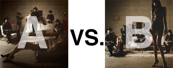
Remember when I did the original chasejarvisLIVE photo shoot way back in winter? If you recall, I was shooting the album cover image for alt/punk country band Brent Amaker and the Rodeo. We also did post production and editing on the images LIVE as well a few weeks after the shoot. Well now it’s time to print these suckers on a limited edition run of vinyl and there is somewhat of a debate on which image is better.
Simply put, and with no further explanation, I thought I’d ask for your thoughts. So which is better, A or B?
Vote in the comments. Also love to know ‘why’ if you care to explain. 500 px wide images after the jump…
[ also, reminder that if you like music and you like chasejarvisLIVE, I’m hosting rising hip hip star RA Scion (of Common Market and Victor Shade) TODAY in 90 minutes at 10:30 pacific/1:30 eastern (GMT – 8). Interview with RA and Village Voice/Time Out/Stranger cultural critic Charles Mudede, plus RA performs LIVE at the end of the show. Hope to see you http://www.chasejarvis.com/live today….]A. With the foreground lady laying down…
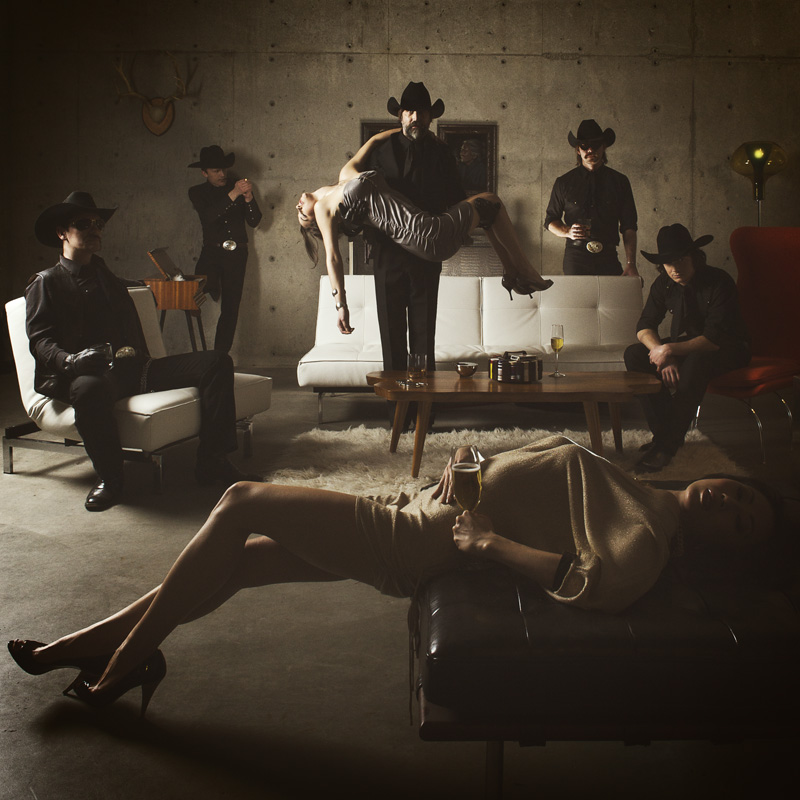
OR.
B. With the foreground lady standing up…
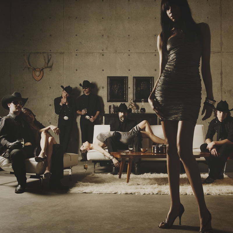
Love to hear your thoughts.











I love your work, but I have to say neither for this vote.
B is more interesting / stronger composition, but both are disturbing, objectify women and A especially looks like a scene of sexual violence. Is the woman in the background passed out? Dead? Yikes.
In the digital age of buying music, the cover art is not as important as it used to be. So I go with A, because it is more about the band.
But if this is 1995, and I am in Tower records with a $20 burning a hole in my wallet, then B is going to cause me to pull this CD out of the bin and take a look.
Great photos either way. I know they look much better in print than they do on my cheap LCD screen at work.
M.D.
I like A because of the circular grouping for vinyl, but B has the extra space for text if there is any and reveals more face on band. B also has sort of a classic rock-n-roll feel with the woman’s body position. But I’m trying to visualize the whole record covered with the photo. I dunno, I guess it depends on how it looks round and what they want. I like both images though. Screw it. “B”
Chase I love your work and your work ethic. You are continually bringing much needed street cred to a struggling industry/profession. Props… and thank you.
As for A or B. I find both options painfully forced and posed. Un-Chaselike. I can feel the tension on the set as you’re asking guys who aren’t models to be natural and not posed… but it’s not working. I want to add a motion blur or something to give some dynamic to the awkwardness. The models add an element of editorial, but too painstakingly placed. B is better for this reason. I’d crop horizontally just above the picture frames and just below the carpet. A, looks like a clock face with a contrived pose at every 7.5 minutes.
B would probably sell more albums, draws more attention than A. Do you pick what would sell more or what you like more? Probably in most cases unfortunately what would sell!