


I was in Paris last week. Part work, but mostly fun. Eating, drinking, being merry, and of course, snapping photos my iPhone–as I do everyday–with no end goal beyond staying creatively engaged.
I was just now kicking through photos from the trip and stumbled on a couple of snapshots I thought were interesting for various reasons. I’ve posted stuff like this before and was really excited by the resulting discussion, so I figured I’d throw it out there again… These are of course just snapshots, but even snapshots have merit. AND these photos are VERY different from one another…. So, simply put, I thought I’d ask for your thoughts, which is better, A or B? And why?
Vote in the comments. Also love to know ‘why’ if you care to explain. 500 px wide images after the jump…
[ASIDE, since Paris reminds me of good food… if you like chasejarvisLIVE, I’m bringing in 2 special guests TOMORROW (Wednesday) at 12 noon pacific/3:00 eastern time. The goal is to combine a few of my passions and share them with you: photography, food, the internet. As such, join me tomorrow to welcome….
Guest #1 Penny DeLosSantos: Food/Lifestyle/Travel and National Geographic photographer Penny DeLosSantos (@pennydelosantos). Well talk about photo, food, and travel…photographing in the world’s most suicide bombed markets in the middle east, travels to more than 40 countries, and the art of combining your passions into a career.
Guest #2 Barnaby Dorfman: Barnaby is a legendary tech guru turned entreprenuer who recently founded Foodista [@foodista] – the world’s leading online food encyclopedia/wiki and an overall amazing site. Combine food, tech, and storytelling and you get a thick slice of Barnaby. Hope to see you at http://www.chasejarvis.com/live tomorrow ….]
Now go vote on those photos below. Tell me what you think…
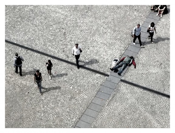
Here’s Photo A:
Here’s Photo B: 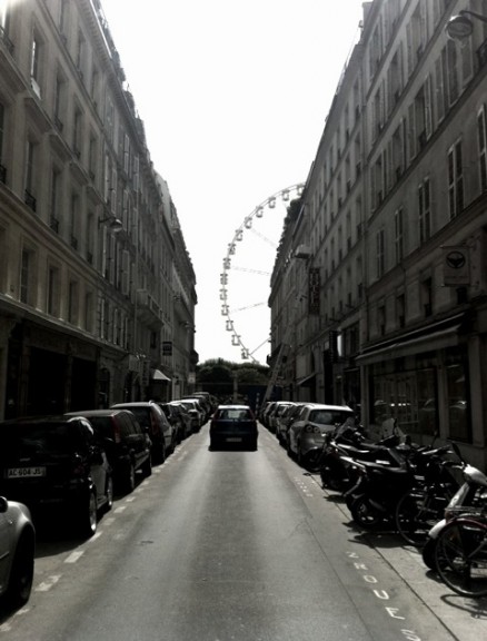
Which is better and why?












Photo B – For a snapshot it has a great photographic feel to it. You kinda know where it is, but you haven’t maybe have seen it from this angle. And you have the street to give you a line
I’m going to go with B. It’s like the light at the end of the tunnel – freedom awaits. The forced perspective is great, and there’s something to see in the distance that’s worth seeing. The geometry of it all is great too. The car leading away looks like they’re headed there. Leaving the clutter behind.
I agree with this. I too liked B more as it renders more depth. The two parallel buildings represent this tiny world and the giant wheel at the end as if leading to our goal. There is some truth hidden in this photo.
As far as A is concerned it has something missing and not complete. The man sitting at the top right corner is half visible which is disturbing.
I totally agree with Mike. Photo B invokes my imagination. I could easily see photo B framed at the end of a long hallway. To see this at the end of a long day of work would be refreshing. I envision myself on the journey to the end and getting on the ferris wheel to be in a place to see the world in a different view.
Photo A… like the drama.
Photo A is more interesting. It rises questions, what has happened and what happens next?
i prefer photo A. the angle of the shot, the line going through the middle draws your eye in, the guy lying down makes you wonder whats going on in the scene and opens up my curiosity about THAT moment.
Photo b is just a ferris wheel to me and doesnt talk to me other than to remind me of visits to the london eye.
I have to completely agree with this point of view, exactly my thoughts. photo A is much more interesting
I agree, too. I’d add that B looks like something I would have shot and then wondered why.
I also agree with Drew on photo A, exactly how I felt.
Photo A gives more depth than just the visual presentation.
Photo B is nicely shot, good overall composition with storytelling result. But never the less, photo A is still deeper in its interaction.