


I was in Paris last week. Part work, but mostly fun. Eating, drinking, being merry, and of course, snapping photos my iPhone–as I do everyday–with no end goal beyond staying creatively engaged.
I was just now kicking through photos from the trip and stumbled on a couple of snapshots I thought were interesting for various reasons. I’ve posted stuff like this before and was really excited by the resulting discussion, so I figured I’d throw it out there again… These are of course just snapshots, but even snapshots have merit. AND these photos are VERY different from one another…. So, simply put, I thought I’d ask for your thoughts, which is better, A or B? And why?
Vote in the comments. Also love to know ‘why’ if you care to explain. 500 px wide images after the jump…
[ASIDE, since Paris reminds me of good food… if you like chasejarvisLIVE, I’m bringing in 2 special guests TOMORROW (Wednesday) at 12 noon pacific/3:00 eastern time. The goal is to combine a few of my passions and share them with you: photography, food, the internet. As such, join me tomorrow to welcome….
Guest #1 Penny DeLosSantos: Food/Lifestyle/Travel and National Geographic photographer Penny DeLosSantos (@pennydelosantos). Well talk about photo, food, and travel…photographing in the world’s most suicide bombed markets in the middle east, travels to more than 40 countries, and the art of combining your passions into a career.
Guest #2 Barnaby Dorfman: Barnaby is a legendary tech guru turned entreprenuer who recently founded Foodista [@foodista] – the world’s leading online food encyclopedia/wiki and an overall amazing site. Combine food, tech, and storytelling and you get a thick slice of Barnaby. Hope to see you at http://www.chasejarvis.com/live tomorrow ….]
Now go vote on those photos below. Tell me what you think…
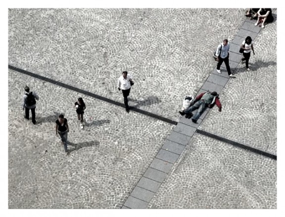
Here’s Photo A:
Here’s Photo B: 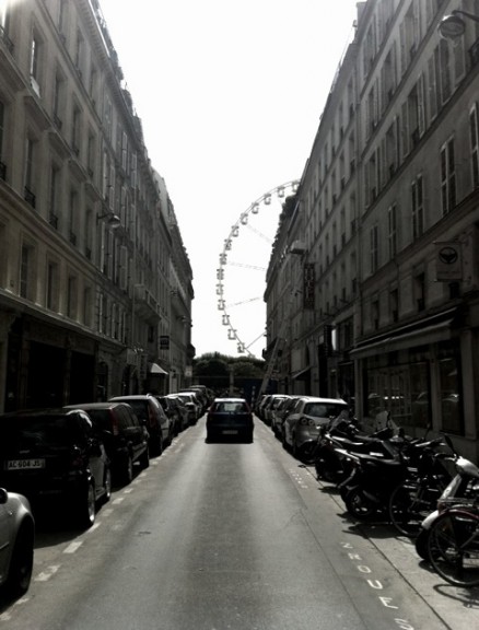
Which is better and why?













I like A. The distinct lines and the pattern of the tiles make it more appealing to me. The people walking are intersecting with the lines. And there is a guy sleeping on the ground, he is in conflict with the walkers but in harmony with the lines.
A – as others have mentioned, although I like the leading lines of B I haven’t found any subject of interest. As you work you way through the photo left to right top to bottom we follow the people and find our interesting subject partway through. With B, I never find it. Yes the Ferris Wheel is nice but as others have mentioned it looks like a “holiday snap”. One last point, people in general like the feeling of open space vs. confined. I feel part of the reason people like A is that it feels less confined vs. B which you get a sense of tension from the tall buildings. Just my 2 cents… 😉
A, absolutely. I like that it’s subtle and I had to look twice to see the man lying down — evokes a more emotional response than B.
Honestly, Neither.
They both have a pattern interruption – the man and the wheel, which causes one to ask “What happened?” or “Where am I?”. But neither really jump out and capture attention. I hope I’m not viewed as a troll…far from it.
Just my 2 cents.
Thanks for the post.
MW
B has more immediate impact, but I think that is because some of the elements are familiar to us, even if the composition is new. A has more depth, and obviously greater potential for social comment. The crucifix echo is a nice touch – pulls up ideas of the Samaritan story etc.